About CMS Splay Carousel
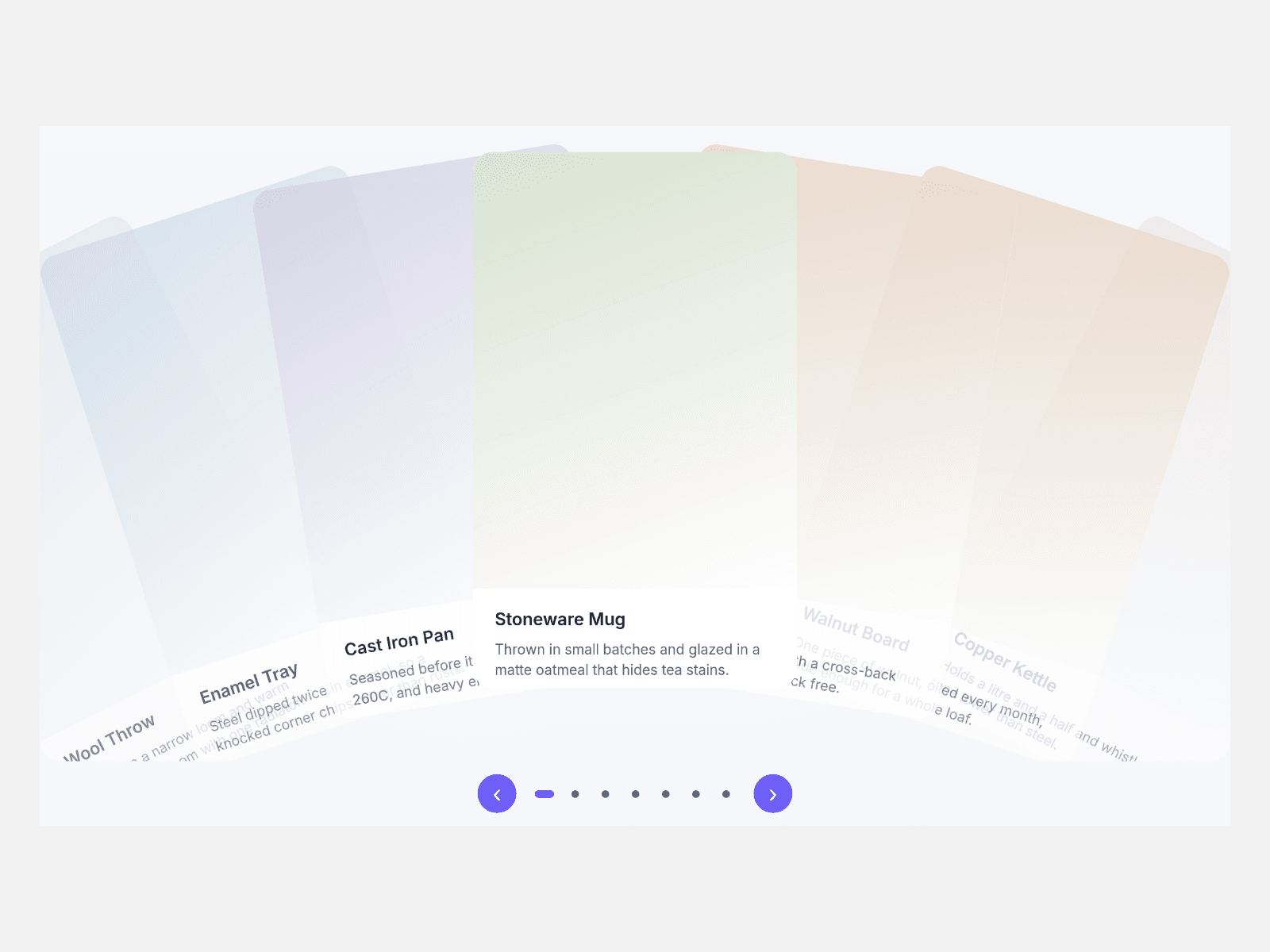
Use it with CMS in three steps: 1. Drop a Collection List into Cards (CMS) and turn off its Pagination. 2. Every loaded item becomes a card in the fan, and the dots, arrows and keys follow the item count. 3. If you want captions, name the layers inside the item Title, Body and Image; the fan then styles them and reads Title for screen readers.
The fan shows copies of your CMS items. Links inside an item still work, but Framer hover and press effects and interactive components inside an item do not run in the fan. A Load more button is not shown.
Cards fan around one pivot below the track: the middle card stands upright, each card beside it leans out further and fades.
Key features
- Real CMS cards: one per item, updated when the list changes.
- Turn off Style CMS Layers to keep your own card design.
- Drag, horizontal wheel, arrow keys, dots and arrow buttons.
- Autoplay that pauses on hover or keyboard focus.
- Endless loop or stop at the ends.
- Reduced motion: cards arrive without animation.
What you control
- Cards (CMS) slot, or hand-made Items with title, caption, image, alt text, link and tint
- Spread, pivot, lift, spacing, edge fade, card width, narrow width and breakpoint, ratio, radius
- Autoplay, loop, arrows, dots, colours, font, text size, max width, alignment and labels
The narrow card width applies once the page has loaded in a window narrower than Narrow Under; the canvas always shows the wide layout.