Y’all were obsessing over auto-layouts while I focused on actual creativity. AI can already build a perfect layout in two seconds, but it can’t replace original vision.
Focus on what machines can’t do. 💡

Web3 & Fintech UI/UX that looks expensive & scales effortlessly. 12+ yrs exp. Trusted by YC founders.
Y’all were obsessing over auto-layouts while I focused on actual creativity. AI can already build a perfect layout in two seconds, but it can’t replace original vision.
Focus on what machines can’t do. 💡
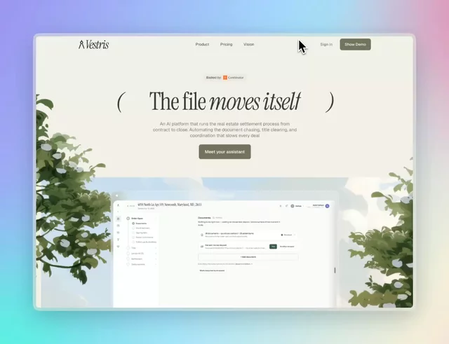
Vestris is an AI platform that automates real estate pre-closing — from contract to closing-ready. This site pairs a warm, illustrated aesthetic (watercolor countryside scenes, custom typography) with a functional product walkthrough: an 11-step interactive breakdown of how the AI processes a file end to end. Built for a fintech/proptech audience that wanted to feel approachable rather than corporate — a good reference for combining editorial storytelling with real product UI inside the same page.
Not gonna lie, I’m proud of this one.
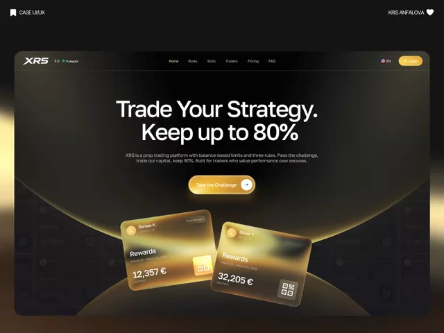
Every illustration on this XRS landing page — the glows, the icons, the gradient orbs — hand-built from scratch. No stock 3D packs, no generic asset libraries.
Finally able to share it. Worth the wait. 🖤✨
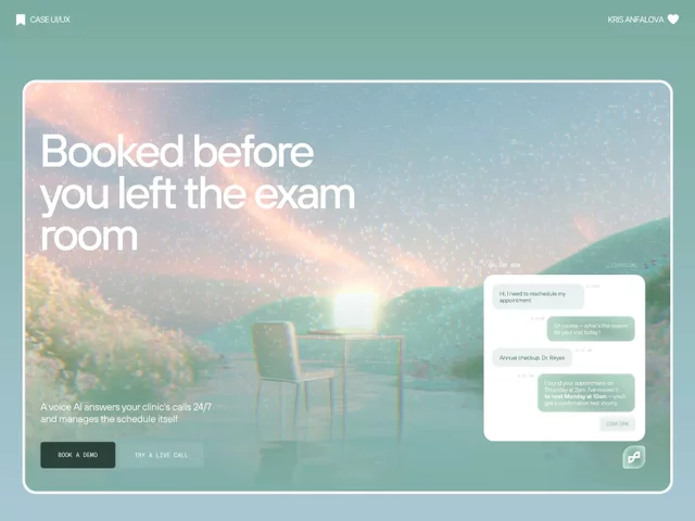
Healthcare SaaS usually defaults to clinical blue and stock photos of stethoscopes.
For Nurse, I went the opposite direction — a soft, almost dreamlike hero — because an AI that handles patient calls should feel calm, not corporate.
Trust doesn’t have to look sterile.
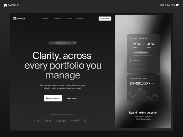
Most fintech dashboards drown you in numbers.
For Meridial, I designed a system where the one thing that matters — portfolio drift — always surfaces first, no matter how many clients an advisor is tracking.
Signal over noise, even at 200+ portfolios. ⚪
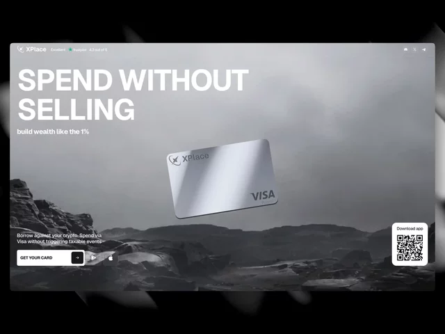
Premium fintech doesn’t have to mean sterile dashboards and blue gradients.
For XPlace, I leaned into a moody, cinematic desert backdrop + bold type instead of the usual “trust us, we’re a bank” visual language.
Turns out finance can have atmosphere. 🖤 Build with Framer 🫶
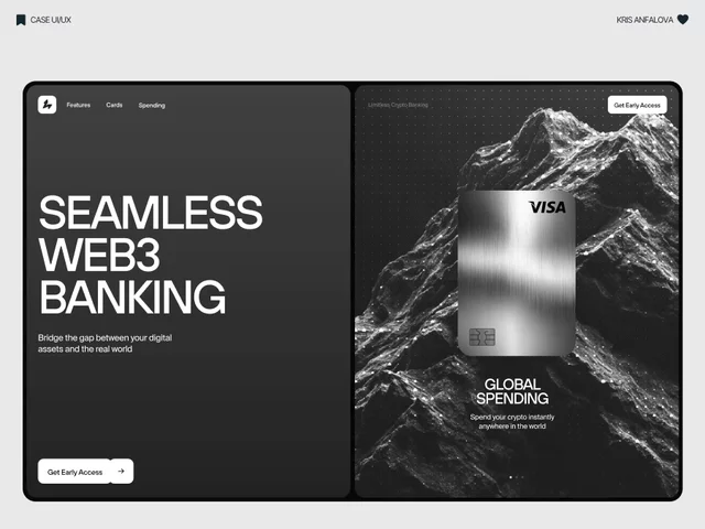
Web3 banking is the future, but most crypto platforms still look terribly complex and outdated.
I decided to fix that. Here is my landing page concept for a seamless Web3 bank: blending premium dark-mode minimalism with fluid 3D topography to bridge the gap between digital assets and the real world.
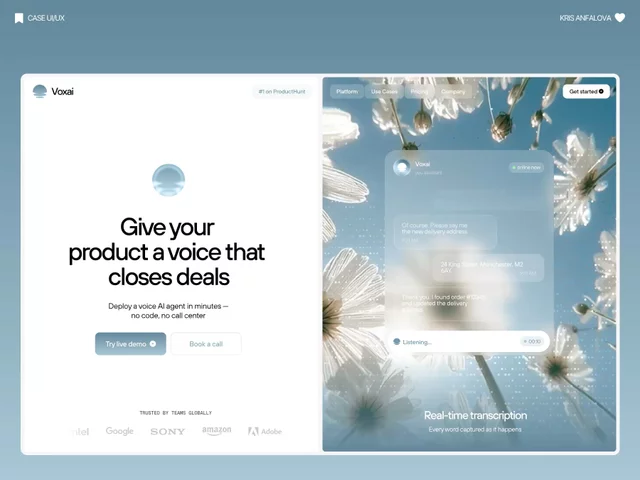
AI voice agents are booming, but their websites look terribly cold and robotic.
I decided to fix that. Here is my landing page concept for Voxai: blending high-conversion minimalism with organic glassmorphism to make AI feel actually human and approachable.
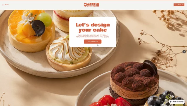
Another day spent developing a Framer template. Today, I decided to create a mini-template for independent coffee shops that includes options for ordering pastries and custom cakes online. I spent 2,000 credits on this form, and I’m happy with the result.
Giving back to the Framer community! 🎁 My newest template is 100% FREE for this week only. Grab your copy, duplicate it, and let's see what you build! 🚀
Find in my profile
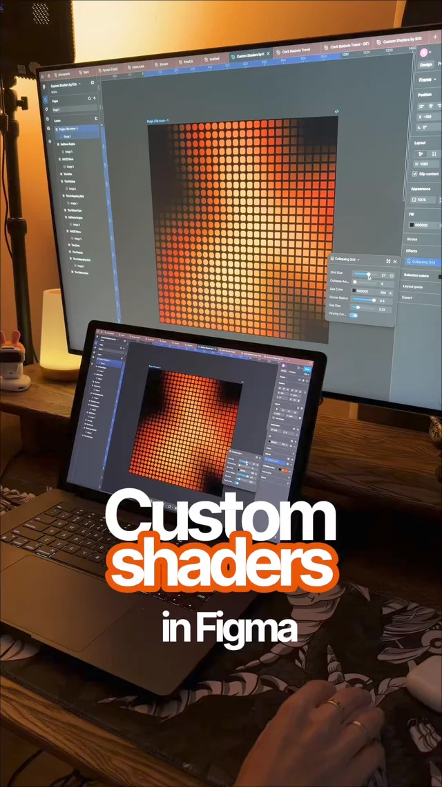
Need a quick way to style your images directly in Figma?
Check out this custom Retro & Texture Effects pack! 6 unique visual engines built natively:
👾 Dither Noise
🏁 Modular Grid
💈 Vertical Scanlines
🔴 Pop-Art Halftone
📟 ASCII Waves
💥 High-Contrast Duotone
100% customizable & scalable
Link: https://www.figma.com/community/file/1657415863151629988/custom-shaders-by-kris
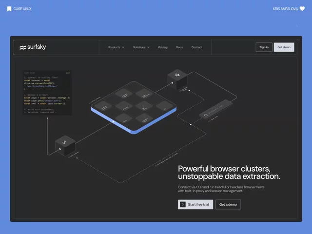
Sneak peek! 👀 Here’s an early sketch of the animation and illustration UI design for a new developer SaaS platform.
Still refining the details, but I’ll be dropping the full project very soon! Stay tuned.
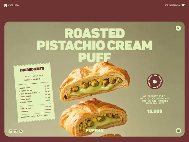
Exploring some smooth transitions and scroll interactions for a pastry shop design. 🍰
Really love how the "Reveal the Puff" mechanic turned out. What do you guys think?
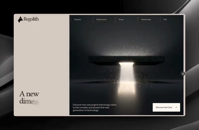
What the website for a Product Hunt 'Product of the Day' could look like today. But honestly, it's pretty sad over there right now—99% of the winning products are just built with Claude 🫠
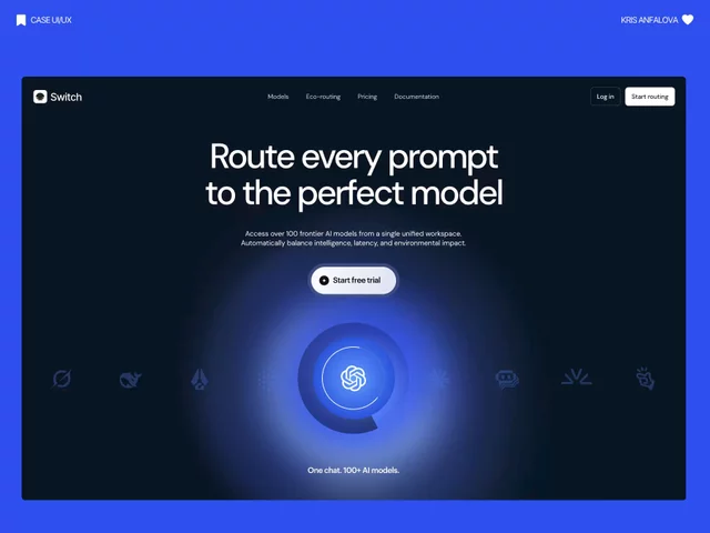
My husband said I do "vibe design," and he does "vibe coding." And yes, we’re both professionals in design and code.
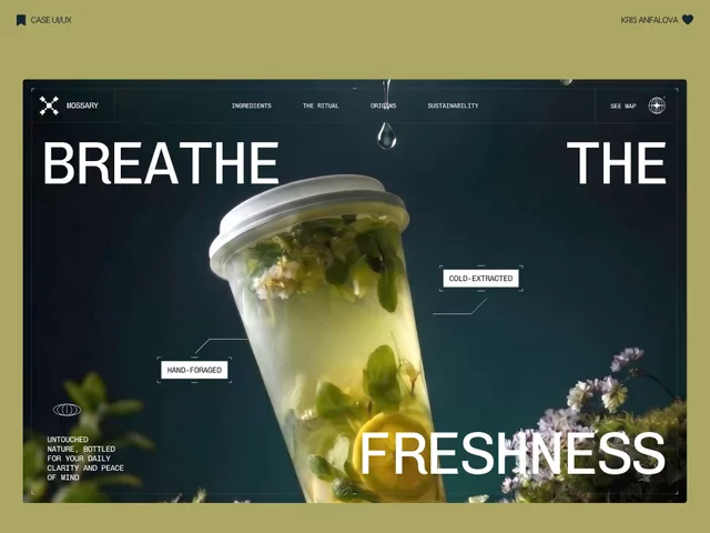
12 years of freelancing, multiple accelerators, but yesterday was a first. The project I UI designed just officially launched in Y Combinator 🔥
The feeling is unreal!
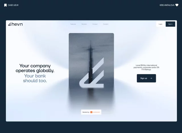
This week, another one of my designs appeared on the main page Contra.
By the way, it got a lot of reactions. Thank you 🙌 And yes, I love it - this is my favorite Dribbble shot lately.
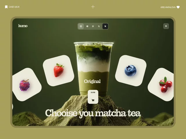
AI generation is mathematically perfect, but "perfect" usually just means plastic. The soul of a premium UI lives in the human touch and intentional imperfections