About Aisol Peek Carousel
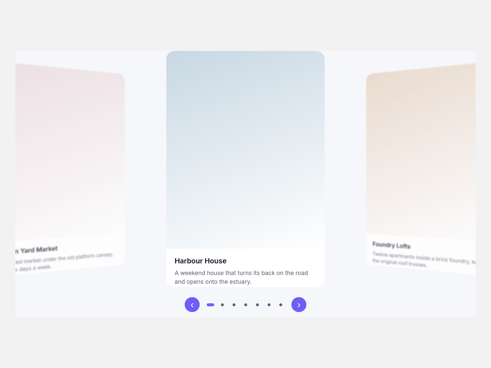
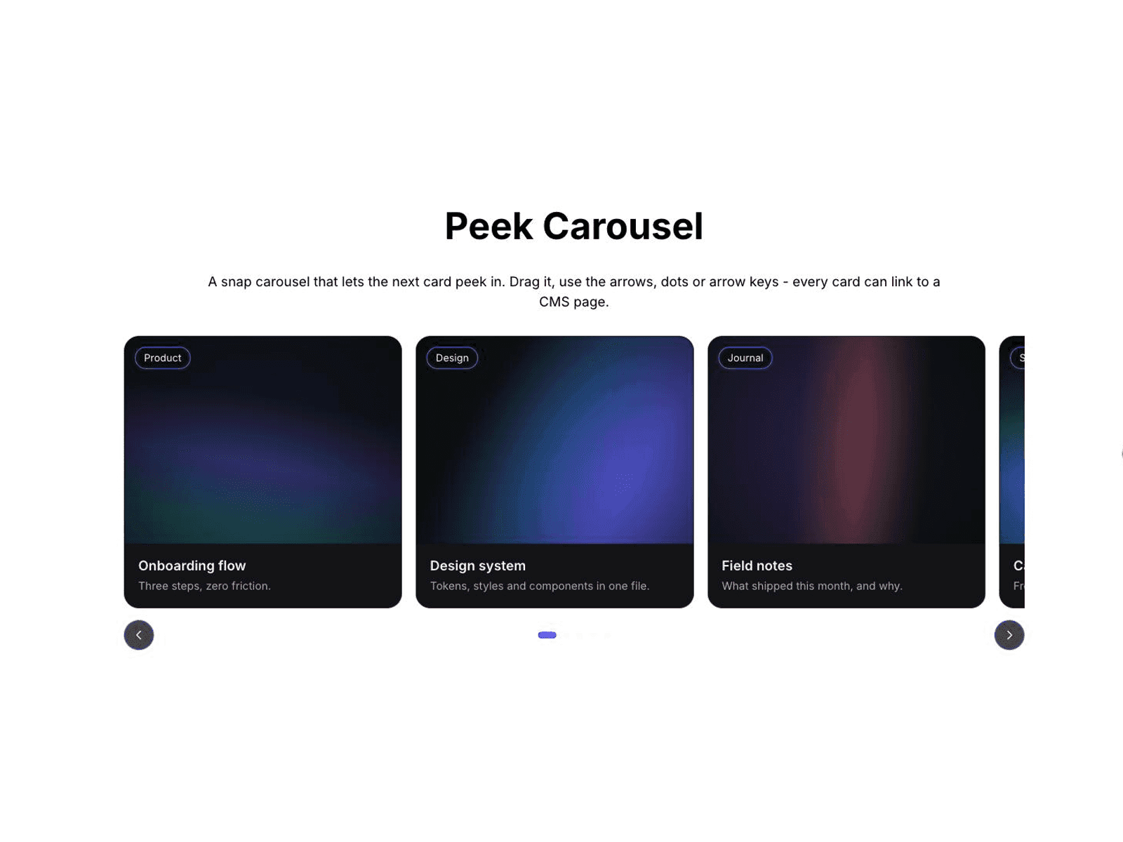
Aisol Peek Carousel is a snap carousel where the next card peeks in from the edge. Move it by mouse drag, touch swipe, the arrow buttons, the dots or the keyboard.
Keyboard: press Tab to focus the carousel, then use Left and Right arrows to move one position, Home for the first and End for the last. The keys also work while a card link or a button inside the carousel has focus. A hidden status line tells screen readers "Slide 2 of 3" after each move. The arrows and dots are real buttons with names such as "Next slide" and "Go to slide 2 of 3".
Mouse drag settles on the nearest card when you let go, and a drag that ends on a linked card does not open the link. A plain click still opens it.
Each card has an image, image alt text, title, caption, badge, link and a New tab switch. The link can point to a CMS page. An older "Image URL (legacy)" field is still read when the image picker is empty.
Controls:
- Cards, and Label (the name screen readers hear)
- Per view: 1 to 5 cards. At most 2 below 900px wide and 1 below 560px
- Peek, Gap, Radius, Ratio
- Arrows and Dots: show or hide. There is one dot per scroll position
- Autoplay and Every (seconds). Autoplay pauses while the pointer is over the carousel, while focus is inside it, in background tabs and when reduced motion is on
- Loop, Font, Card BG, Accent
With reduced motion, moves jump instead of scrolling smoothly. On the canvas and in static exports, the carousel shows its first cards without any effect.