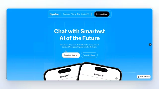
Syntra, in motion.
An AI chatbot and mobile app template conversation UI and device mockups on every page, so the product shows itself before the copy explains it.
11 pages, CMS blog, full style guide. Live on the Marketplace now.

Creative Director @ Fluxory Studio. I design premium, conversion-focused websites in Framer for ambitious founders and creative brands.
Syntra, in motion.
An AI chatbot and mobile app template conversation UI and device mockups on every page, so the product shows itself before the copy explains it.
11 pages, CMS blog, full style guide. Live on the Marketplace now.
Working on a new template design's locked, Framer build starts today.
Pawora is for vets, groomers, and pet daycare an industry that usually gets soft pastels and stock photos of golden retrievers. This one goes the other way.
Honest feedback welcome, especially on the colour 👇
Shipped a new template Syntra, an AI chatbot and mobile app site.
11 pages: CMS blog with post template, pricing with plan comparison, contact form with thank-you page, full style guide.
Device mockups and conversation UI carry every page the idea being visitors should see the product working before they read anything about it.
Preview → syntra-app.framer.website
Scroll-through of ScaleFlow SaaS a B2B SaaS template I shipped this week.
14 pages: CMS blog with post template, pricing comparison table, career page, full style guide.
Structured around the buyer's decision sequence rather than section variety, so there's less to delete after remixing.

Shipped a new template ScaleFlow, a B2B SaaS marketing site.
14 pages: CMS blog, pricing comparison table, career page, full style guide.
Structured around the buyer's decision sequence rather than section variety problem, proof, product, price, people. Less to delete after remixing.
Preview → scaleflow.framer.media
Stilla, in motion.
Warm light shifting as you scroll, a practice selector settling into place, soft fade-ups throughout. The hard part with wellness is that calm can't feel dead motion has to be there without announcing itself.
12 pages, CMS-powered services, Figma included.

New one's live Stilla, a wellness and yoga template.
The whole category is beige serifs and someone meditating on a cliff. I went the other way: warm light pulled from the photo, and a practice selector in the hero.
Quietly proud of one thing services run on CMS, same as the blog. Adding a class is a content update, not a design job. 12 pages, Figma included.
Working on a new one health, wellness, and yoga.
Every site I opened while researching had the same beige palette, the same soft serif, the same photo of someone meditating on a cliff. Calm, but interchangeable.
This one leans into real light instead. The practice selector on the right is the part I keep rebuilding still moving things around.
Photo-led or type-led hero, though? I keep going back and forth.
Finlance, in motion.
The card floats, the balance ticks up, the trust bar scrolls quietly underneath. Small movements, none of them competing for attention.
Fintech is the one category where motion has to feel calm. Anything too eager and the whole thing starts to feel like it's selling you something.
13 pages, CMS blog, Figma file included.
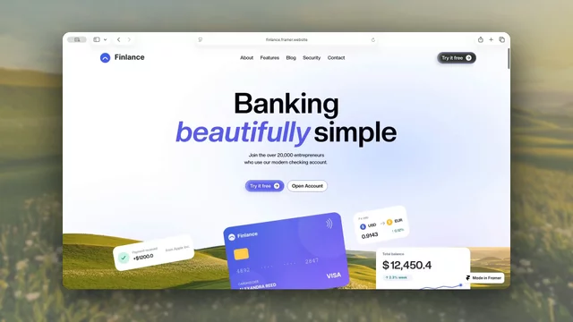
Six templates in, this is the first one I've put a price on.
The deciding factor wasn't the design it was the Security page. Most fintech templates skip it, and it's the one page a financial product can least afford to be missing. Once that was built, the scope stopped feeling like something I could give away.
13 pages, CMS blog, Figma file included.
Still not sure where the line sits between free and paid though. Curious how others decide it.
Virexon, in motion.
The whole site rests on one gradient a slow ember that never fully cools. Everything else stays dark so the orange actually has somewhere to land.
Restraint was the harder part. Dark sites tempt you to light everything up.
Free to remix → framer.link/ahROZ7R

New one's live: Virexon, a free AI template.
The hard part wasn't the design it was refusing to sound like every other AI site. No "transform your workflow," no "unlock intelligent automation." Just what the system does, then how.
One thing I keep going back and forth on: AI sites almost always go dark. I did too here but I'm not sure it's the right call anymore. Would you have gone light?
Free to remix →https://framer.link/ahROZ7R
See it live → virexon-ai.framer.website
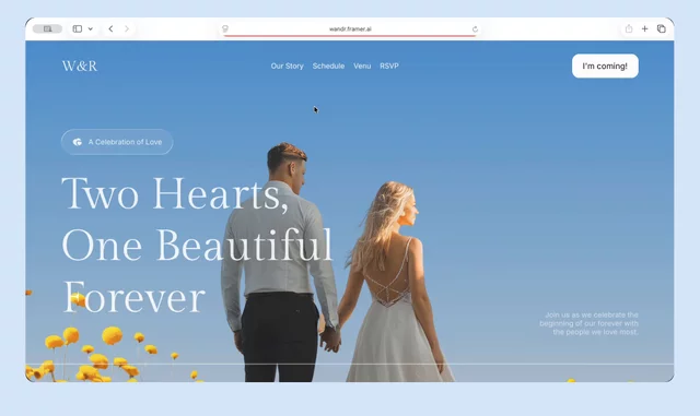
Something I didn't expect: the wedding template turned out to be my most remixed one 120+ in two weeks, now sitting at #496 on the marketplace.
I think it's because I refused to make it look like a wedding. No script fonts, no pastel overload. Editorial layout, lots of white space closer to a studio site than a florist's.
Couples wanted something that felt designed, not themed.
Free to remix → framer.link/DQLBpCm
Novra in motion.
I wanted the hero to land, not bounce. Oversized editorial type, floating imagery, an appear sequence that settles into place.
Then the scroll does the work. Text reveals line by line. Counters climb as you pass them. The work grid stays sticky while nine projects move through it.
Nothing loud. Just weight, timing, and restraint.
Seven pages, Figma file included. Free to remix.
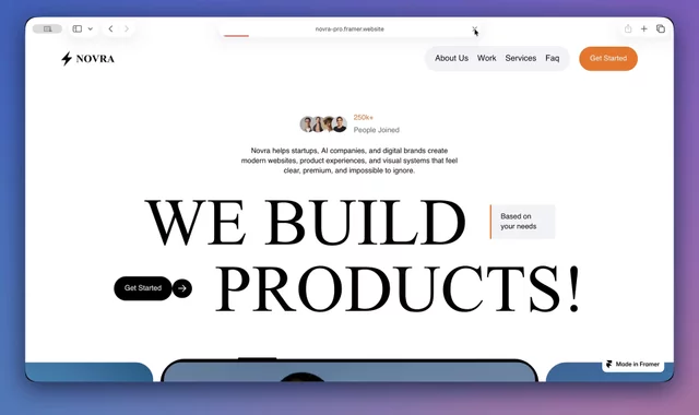
Novra's live a studio template for teams working with startups and AI companies.
Went bold and editorial again, but the real work was the nine-project grid. Nine case studies, all different shapes, all needing to sit next to each other and still look deliberate. Fixed the card system first, let the layout follow.
Seven pages, documented style guide, Figma file included.
Still not sure nine was right. Six might've been the stronger call curious what you'd have done.
A closer look at StoryFluence in motion 🎬
I built it for UGC creators and content agencies who want to stand out. Most creator sites go clean and minimal, so I went the opposite way bold, editorial, high-energy. Full 4-step process, testimonials, FAQ, and a documented style guide.
Would love to hear what you think!
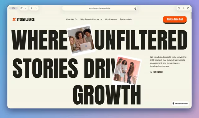
New template's live StoryFluence, made for UGC creators & content agencies 🎬
Went bold and editorial on this one instead of the usual minimal look. Documented style guide, clean components, Figma file included.
Would love to hear what you think!
One week ago I launched W&R Celebration my first @Framer template. I honestly had no idea if anyone would care.
A week later:
→ 40+ remixes
→ 18,898 impressions
→ 428 views
→ 72 followers in the Framer community
Grateful for everyone who checked it out, remixed it, and left feedback 🙏 Already deep into the next one.
Just finished building W&R Celebration my first Framer template and I recorded the whole process.
It started with collecting inspiration, then exploring two hero directions before locking one in Figma. From there it was a full rebuild in Framer: clean named layers, reusable components, a documented style guide, and every page down to a custom 404.
Honestly the process is where the quality comes from the final look is just the last 10%.
Here's the whole thing, from blank canvas to live

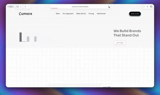
A little motion for Lumora Studio ✨
My latest template bold, editorial design for agencies, studios & freelancers. Work showcase, services & pricing. Free for a limited time, would love your feedback!