Tanjim IslamStudio


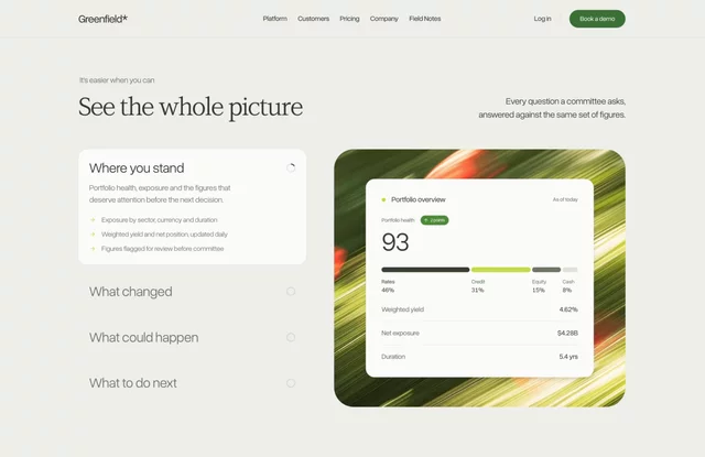
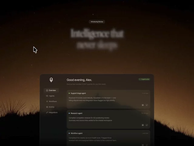
I built a website for a product that does not exist. Meridian - an AI agent infrastructure platform I invented before I designed a single section.
Free on the marketplace very soon 🔜 stay tuned

Who said @Framer agents can only build websites?
Product UI, dashboards, the lot.
Remix link: https://framer.link/C5mjn54
Free to use. Made for you - https://framer.link/Y2fZLOu
Three case study cards on an AI platform site. E-commerce. Enterprise SaaS. Financial services.
That is not a portfolio. It is a filter.
Horizontal AI products have a positioning problem that no amount of design fixes. The product genuinely works for everyone, so the copy says "any workflow, any team, any industry," and the visitor reads that as "not built for me."
Three named industries solve it without narrowing anything.
A fintech ops lead scans the page, sees financial services, and stops. He is not thinking about the other two cards. He found his one.
The e-commerce buyer does the same thing on a different card. Same page, three different arrivals.
→ Name industries, not use cases
→ One metric per card, with the vertical attached
→ Three is enough, six starts looking like a directory
The instinct with a horizontal product is to stay general so nobody is excluded. In practice, generality excludes everyone equally.
Specificity in the examples. Breadth in the product. Those can coexist on the same page, and most sites choose neither.
Free to use. Made for you - https://framer.link/cKeJMRb
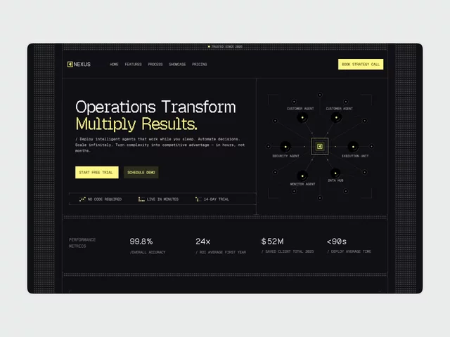
The dashboard in this template shows loads, drivers, and auto-dispatch rates.
Not "analytics." Not a chart with unlabelled axes. A logistics dispatch board.
That was a deliberate risk, and it is the thing I would defend hardest.
Generic AI templates all have the same hero mock - a purple gradient, three floating cards, numbers that mean nothing. It works for everyone, which means it convinces no one.
A visitor evaluating an AI product looks at the dashboard mock for about two seconds and asks one question: does this thing do work that resembles mine?
An abstract chart cannot answer that. A dispatch board can, and if the visitor runs a fleet, it just did.
→ Pick one vertical for the hero mock
→ Real column headers, real row labels
→ Make it swappable, but ship it specific
The counter argument is that specificity narrows the audience. In practice, vagueness narrows it more. Nobody has ever recognised themselves in a placeholder.
Specific is easier to change than convincing.
Happy weekend 🫰
Three commission emails from Framer this morning. Small numbers, but they made my weekend better. Thank you, @Framer 🫶
The interesting part: they came from a free template. Not a sale.
Free templates are on my profile. Take the one that fits your business. 📈

Take it. No purchase, no email, no catch - just duplicate it 👉 https://framer.link/flekKau
Six faces with names and job titles on a cleaning company website.
Not stock. The actual people who will be in your house on Tuesday.
Think about what is being bought here. A stranger gets a key to your home while you are at work. Nobody is comparing service lists at that point — they are deciding whether to be uncomfortable.
James Wilson, Office Cleaning Lead. Now there is a person, not a company.
When the service happens inside someone's home, the team page is the trust page.
Grab it for free now - https://framer.link/CVlmpWG
Six awards, no badges.
The standard is a row of gold laurel graphics. I built a table instead: award, issuing body, arrow.
Badges are unreadable at a glance. Tables get read, because reading is what tables are for.
And a wall of laurels says please notice we were recognised.
A quiet list just says we were.
Confidence is a design decision, not a personality trait.
Grab it now for free - https://framer.link/33OYPjT
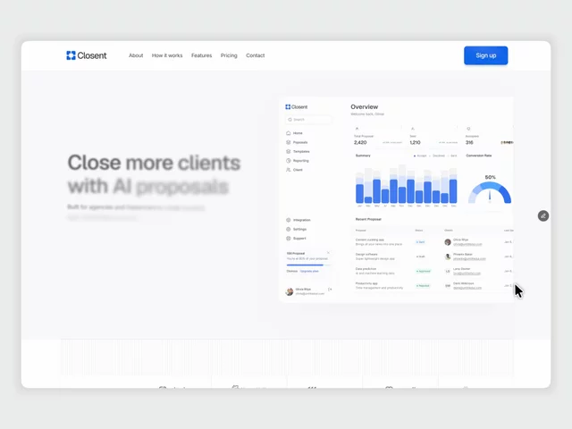
The comparison section is the most uncomfortable block on a SaaS homepage.
But the table is not about your competitor. It is about a buyer trying to justify the decision to someone above them. They need language they can paste into a message.
So compare against the current method, not a named rival. "Manual proposals" beats naming a company. And include one thing you do not do.
Attacking a competitor makes you look nervous. Comparing against the old way makes you look inevitable.
Grab it now - https://framer.link/9lYPgcF
Interior designers do not sell rooms. They sell the confidence to spend forty thousand on one.
That changes what the website has to carry.
A photography grid proves taste. Everyone's portfolio looks good in this category. It does not answer the question the client is actually holding, which is what happens between the first call and the day I get my house back.
So the process section outranks the gallery.
Consultation. Planning. Design. Execution. Four words, but they do the thing images cannot -they give a nervous person a shape to hold onto.
→ Name the stages, not the deliverables
→ Say roughly how long each takes
→ Show where the client makes decisions
→ Give each service its own page, because a commercial fit-out buyer and a kitchen renovation buyer are not the same person
Beautiful work gets you the enquiry. Structure gets you the signature.
It’s still free to grab now - https://framer.link/CVlmpWG
929 studios have used a template I nearly did not publish.
I sat on Norell for two weeks because I thought the typography was too plain next to what was ranking at the time. Everything on the front page was animated, layered, loud.
I published it plain anyway.
The plain one is the one that worked, and I still find that hard to internalise. Every time I start something new, the instinct is to add.
Restraint is not a style. It is a decision you have to keep making.
Rebuilt the demo video this week. A year later, the parts I fussed over have dated. The parts I left alone have not.

Grab it for free - https://framer.link/HRtmKoV
A number that counts up from zero when you scroll past it.
Every freelance portfolio has three of them. 50+ projects. 5 years experience. 100% client satisfaction.
I put them in this one too. Then I thought about who is actually reading them.
A client landing on a freelancer's site is asking one question: can this person handle my thing without me having to manage them?
"50 projects" does not answer that. It could be 50 logos for 20 dollars each.
What answers it is one project described properly. What the client needed, what you built, what happened after. One story beats three counters, every time.
So the counters stayed, but they are not the proof. The CMS project pages are.
→ Counters set scale
→ Case studies build trust
→ Only one of those closes a client
If you are building a portfolio and you only have time for one section, skip the stats. Write up a single project properly instead.
Grab it for free - https://framer.link/kl0sur8
I put real prices on an agency template. 3,200. 6,500. 12,000.
Most studios will tell you this is a mistake. Every project is different. Pricing depends on scope. Publishing a number caps what you can charge.
I think all of that is a defence of an uncomfortable conversation.
Here is what actually happens when there is no price on the site.
A founder with 4,000 to spend books a call. You spend forty minutes discovering he cannot afford you. He spends forty minutes learning the same thing. Nobody wanted that call.
Meanwhile the founder with 15,000 assumes you are expensive or cheap based on nothing, and half the time he guesses wrong and never enquires at all.
A number does two jobs at once:
→ It disqualifies people before they take your afternoon
→ It tells serious buyers you have done this enough to know what it costs
You do not need a fixed price. "From 6,500, four weeks, eight pages" is enough. The word from carries all the flexibility you need.
The studios who publish prices are not the ones with nothing to hide. They are the ones who stopped wanting calls from people who were never going to buy.