Mokujiro Studio
Mokujiro Studio

Mokujiro Studio

Mokujiro turns complexity into clear, useful Framer templates and components designed to feel effortless in use.

Creator4 Listings
Mokujiro Studio
Mokujiro Studio3w

Subtractive design

The graph in the hero of mokujiro.com is an iteration of MokuGraph, the d3 force graph component I sell for Framer. I rebuilt it around what the studio offers instead of every tool I use.

What I changed for this site

- Positions are calculated, not simulated. A pure function puts the hub at the centre and spaces each ring evenly around it, ordered by which parent a node hangs off. The simulation only holds nodes on those targets, so the layout is identical on every load.

- Rings are true circles sized to the shorter side of the frame, so the four arms match in every direction.

- Four tiers, separated by size and opacity. Only the hub and the four entry points are meant to be read; the other 23 show the shape.

- One link per entry point. A second link on one node made the rule invisible, so it came out.

What MokuGraph already does, before you change anything

- Click a node and a drawer opens with the title, description, tags and related nodes, each clickable.

- Side drawer on desktop, narrower on tablet, bottom sheet under 480px. You do not build that three times.

- Touch is handled: pinch to zoom, tap to highlight, tap again to open.

- Every visual property sits in the panel, including the physics: link distance, charge, connection strength, node size.

- D3 is bundled. No runtime network requests, nothing to install.

- 12 templates modelled on real AI architectures, or paste your own JSON.

Two things that cost me a day

- Framer keeps every breakpoint in the DOM and hides the inactive ones, so the same elementId exists three times. Pick the one with a height before you scroll to it.

- A stretched instance can hand your component the string "100%" as its width. Compare that to a number and the check fails silently.

That is the part you are actually buying when you buy a component instead of building one.

The graph in this post: mokujiro.com

The component: mokujiro.com/products/mokugraph
Mokujiro Studio
Mokujiro Studio1mo

mokujiro.com is now bilingual: English by default, Japanese at /ja.

What I used in Framer

- Localization add on for the ja locale. hreflang, canonicals and the sitemap per locale came for free.

- CMS localization for case studies, products, lab and services. Text fields got Japanese, slugs and images stayed shared.

- useLocaleInfo in code components. The language switcher, banner, hero graph and approach tabs carry an en / ja dictionary and switch themselves.

- Custom Code for the typeface. IBM Plex Sans has no Japanese glyphs, so Noto Sans JP sits behind it as the fallback on Japanese pages.

How the Japanese was done

- Step 1: AI translated the English into Japanese. This gave coverage, not quality.

- Step 2: the AI read only the Japanese, worked out what each sentence was trying to say, then rewrote it to express that intent. The English was no longer in the loop.

- Step 3: I reviewed everything. A lot still needed changing. Japanese readers notice immediately when Japanese is not native, and a literal translation reads as foreign even when it is correct.

- Pushed through the Framer plugin API: about 780 strings, 24,000 English words. An audit script then compared every page in both languages before launch.

Two things worth knowing

- Localise code components in code, not through the panel.

- Framer sets html lang after hydration, so a CSS rule that depends on lang="ja" needs a one line script before first paint.

mokujiro.com/ja

Mokujiro Studio
Mokujiro Studio1mo

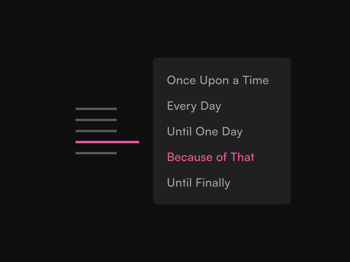
MokuToc is live: a minimal table of contents component built around progressive disclosure.

Readers need orientation constantly, but the full outline only occasionally. That tension became the starting point for the component.

On desktop, the structure is reduced to a quiet rail of thin dashes. It keeps a sense of position and progress visible, while the full list of headings only appears when the reader reaches for it.

On mobile, the same idea becomes a sticky current-section bar, with the wider structure available on tap.

Underneath, MokuToc reads the H2 and H3 headings already on the page, creates anchors, and follows the active section as the reader moves through the content.

The aim was to make navigation present enough to support orientation, but quiet enough for the content itself to remain the main experience.

Mokujiro Studio
Mokujiro Studioin Marketplace·1mo

MokuToc is out.

A minimal table of contents for long-form pages. On desktop, a slim dash rail expands into the full list on hover. On mobile, the current section stays visible in a sticky bar.

Connect it to your content layer and MokuToc automatically reads its H2 and H3 headings. Light and dark modes are built in.

Mokujiro Studio
Mokujiro Studio1mo

A change of direction for Mokujiro Studio.

We’ve renewed the site to better bring together our client work, experiments and the products we’re building in Framer, including MokuDocs and MokuGraph.

The practice continues to evolve across product design, complex systems, identity and products of our own.

mokujirodesign.space

Mokujiro Studio
Mokujiro Studio2mo

MokuDocs 2.0 is everything we’ve learned since—rebuilt from the ground up.

A more minimal, linear reading experience that keeps readers focused on the content, not the interface.

Documentation and changelogs now live in a single Framer project, powered entirely by Framer CMS. No plugins. No switching between systems.

Built for teams that ship products—from startups and established product teams to indie developers.

Mokujiro Studio
Mokujiro Studioin Marketplace·2mo

Shipped MokuDocs 2.0. CMS-driven docs, changelog, and glossary in one Framer project, plus saved highlights so readers can save and revisit any passage. A full rebuild from 1.0, built for teams that don't want an engineer in the loop every time content changes.

Mokujiro Studio
Mokujiro Studio3mo

Update to MokuPhoto's SeriesViewer.

View page

Added a new Development tab that visualises Lightroom edit data.

The edit values are extracted from each photo's XMP sidecar, stored in the CMS, and rendered as a visual meter instead of a list of numbers.

Seeing Exposure at +0.85 or Highlights at −64 doesn't mean much until you can see where they sit in the adjustment range. A simple visual indicator makes the data much easier to scan and compare.

Small feature, but it makes the metadata feel much more useful.

Mokujiro Studio
Mokujiro Studio3mo

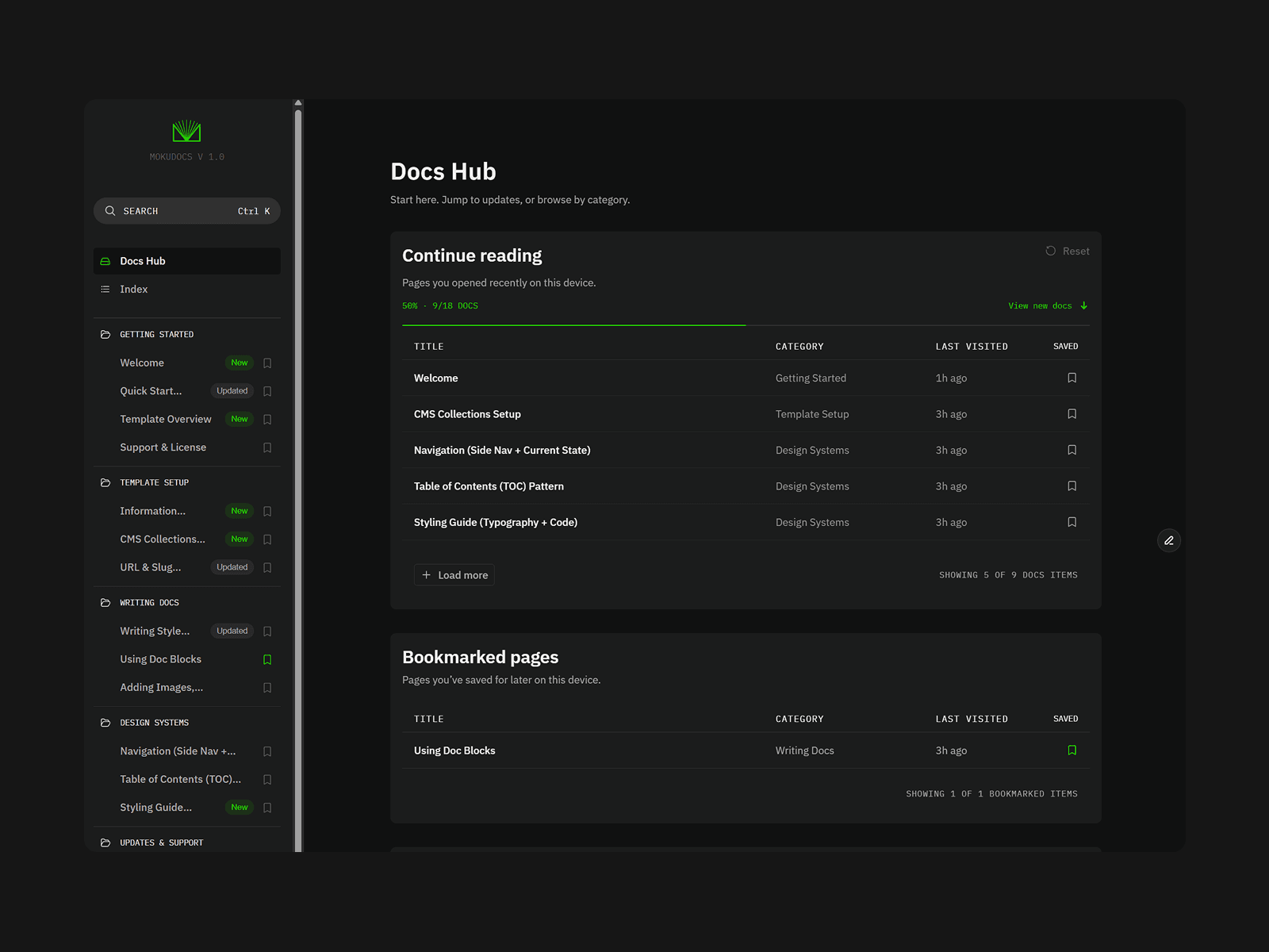
MokuDocs - CMS Docs Template

As a UX Lead working on SaaS products, I've learnt how important well-structured documentation is for teams. MokuDocs is built to make documentation easier to manage and maintain, while creating a better reading experience.

CMS-driven sidebar navigation

Cmd + K search

Light & Dark Mode

Bookmark any page

Reading progress tracking

Table of contents

Copyable code blocks

Breadcrumbs

CMS-managed New & Updated tags

Reusable Doc Blocks powered by CMS

Filter by category

18+ sample docs included

Built with Framer CMS and ready to publish from day one.

Mokujiro Studio
Mokujiro Studio3mo

Exploring Framer beyond traditional websites.

https://mokujirodesign.space/photography

An AI-assisted photography publishing workflow combining Lightroom, Claude Code and Framer. The goal is to reduce repetitive publishing tasks, leaving more time behind the camera and developing photographs.

Workflow highlights:

• AI aperture estimation for vintage lenses

• AI-generated structured metadata

• Human review before manually publishing to Framer

Mokujiro Studio
Mokujiro Studioin Marketplace·5mo

Designed for teams. Built for readers.

MokuDocs helps teams manage documentation while giving readers features like bookmarks, reading progress, and search to make it easier to find and continue where they left off.