Markus Petzold
Markus Petzold

Markus Petzold

By and for precious people.

Creator2 Components
Markus Petzold
Markus Petzold2d

I'm working at the moment on a music player. In addition to the general (music player) functionality, I've also implemented an interaction event for an overlay and a link button. As with the other code components, I've tried to make it as customizable as possible while keeping the property panel clear and easy to navigate.

Music Player

Markus Petzold
Markus Petzoldin Marketplace·1w

I was looking for a solution to have multiple images for a content inside of a carousel. This is my solution for it. A carousel inside of a carousel.

I had previously listed this component for sale. Now it's available for free.

Markus Petzold
Markus Petzold1w

CONTACT CAROUSEL - CHANGELOG

Version ONE.one - 2026-09-24

Fixed

Lightbox was clipped inside relative Framer overlays. Framer Motion applies a transform to the animated card, and a transformed element becomes the containing block for position: fixed descendants. The lightbox was therefore positioned against the card instead of the viewport. It is now rendered into document.body via createPortal, fully detached from the transformed tree.

Scroll lock stayed active after the first close. lightboxExiting was set on open but never reset. The outer AnimatePresence now calls onExitComplete={() => setLightboxExiting(false)}, so the state is clean after the exit animation.

Clicking the backdrop reliably closes the lightbox when dismissible: On.

Changed

Lightbox moved out of rootRef; it is now returned as a sibling via a lightboxPortal.

renderPhosphorIcon moved above the component (was only reachable through hoisting).

Added import { createPortal } from "react-dom".

Unchanged

All property controls, style groups, hooks, effects, types, and constants.

Error boundary, export default setup, autoplay, filter, live filter, panel overlay, keyboard navigation, and swipe.

Known behaviour (not a bug)

Inside a relative Framer overlay with Dismiss on Click Outside: auto, a click on or next to the lightbox can be treated as "outside" and close the overlay. That is Framer behaviour, not component behaviour. Workaround: set the overlay's dismiss option to Off, or use a regular absolute-positioned layer instead.

Markus Petzold
Markus Petzold1mo

Here's another update for the CardCarousel. This time, I have added a live filter and filter properties to set variables. I am using it for a timeline. My project has multiple pages for different locations. I added all the content/sections to one component and set a variable for the initial filter value. Visitors can filter by location or select all. You can see this in the pictures.

CardCarousel ONE

Version ONE.five - updated 25 August 2026

Live Filter A new filter button beside the menu lets visitors switch the selection themselves. Options are defined as label and value pairs, so a button can read "Germany" while matching "DE". The button and its overlay reuse the existing Control and Overlay styling, so there is nothing extra to style.

Filter Value and Filter Start Value Two plain fields above the General group. Being outside a group, they can be bound to a variable, which lets one component serve several pages: Filter Value fixes the selection, Filter Start Value only preselects it and leaves the visitor free to change it.

Order of precedence: what the visitor picks, then Filter Start Value, then Filter Value, then the Filter group.

Filter › Match Filter values can now be compared against each section's Filter field, its visible Tags, or both. Tags are matched as whole words, so a value has to read exactly like the tag.

Lightbox indicator dots on by default The dots already existed but started switched off, so galleries gave no hint of how many images followed.

Markus Petzold
Markus Petzold1mo

CardCarousel ONE

Version ONE.four - updated 19 August 2026

Fixed: tapping the backdrop did not close the lightbox An invisible box around the enlarged image covered the backdrop and absorbed taps, which was most noticeable on phones where the image leaves a lot of empty space around it. The backdrop receives them again.

Fixed: blue flash when tapping Mobile browsers showed their button highlight when tapping the lightbox backdrop or the card image. Both are full-size tap targets, where that flash read as a glitch rather than as feedback.

Escape always closes the lightbox The Dismiss Escape switch has been removed. Escape is expected behaviour for a full-screen dialog, and turning it off could leave visitors without a way out.

Markus Petzold
Markus Petzold1mo

Regarding my last message. It works now. The multi-reference field with a component to show multiple individual icons.

Markus Petzold
Markus Petzold1mo

Hello everyone, I have a component for a CMS list. In this component I want to implement icons with a multi-reference. But I'm struggling a bit with this. I don't no how to set up, so that the icons can be shown.

Markus Petzold
Markus Petzold1mo

CardCarousel ONE - Update

Version: ONE.three (updated 15 August 2026)

Removed unused size options: Image › Size no longer offers Min Width, Max Width and Min Height. Widths were measured against the card, whose width is already set under General › Max Width, and a minimum height had no useful effect on a cropped image. Width, Height, Ratio and Max Height remain.

Clarified: The description of Card › Min Height no longer refers to page jumping, which was fixed in the previous version. It now simply describes what the setting does: giving short and long sections a shared minimum height.

Markus Petzold
Markus Petzold1mo

Card Carousel ONE • Feature: Sections and Filter

Sections

A section is one card. The carousel shows one at a time; visitors move between them with the buttons, the menu overlay, arrow keys or swipe.

Each section holds a Button label for the menu, a Title, a Subtitle, optional Tags, a Caption, one or more Filter values, and any number of Images shown as a gallery inside the card.

Title, Subtitle and Caption accept two asterisks for bold and one for italic, plus manual line breaks. Sections appear in the order you list them, with no limit on how many you add.

No CMS collection needed: add a section, fill in the fields, done. For content that also needs its own pages, more details, more options, and URLs, a collection is still the better tool.

Filter

The Filter group decides which sections appear, so the same component can sit on several pages and show a different selection on each.

Leave All on Yes to show everything. Set it to No and list the values you want under Values.

How matching works:

One hit is enough. A section shows if its Filter field matches any value in your list.

Case is ignored. DE, de and De are the same.

Both sides take several values, separated by space, comma, semicolon, slash or pipe: DE, KE or DE / KE.

An empty list shows everything, and so does the value all.

Sections without a filter value are left out while filtering. They return when All is set back to Yes.

Example

SectionFilterDöbeln officeDEColol farmIDTrade fairDE, ID

German page, Values DE → Döbeln office and Trade fair. Indonesian page, Values ID → Colol farm and Trade fair. Overview page, All on Yes → all three.

Update:

I reduced the price from 12$ to 8$.

Markus Petzold
Markus Petzold2mo

I've updated the code component - CardCarousel ONE

Changelog:

Version ONE.two — 11 August 2026

Static rendering Autoplay, the Ken Burns effect and all transitions are now switched off while Framer renders on the canvas or exports a page. Image preloading and the viewport observer are skipped there as well.

Fixed: controls jumping on section change The card area could briefly be empty while switching sections, which collapsed the height and made the buttons and progress bar move. The outgoing card now stays visible outside the layout flow while the new one takes its place.

Animation The Fade mode has been removed — it caused the height jump described above. Crossfade, Zoom and Swipe remain, available for the card, the image and the lightbox. Crossfade is the new default, and the card transition now runs at 0.6 s.

New properties

Control: Icon Size, Padding

Overlay › Button: Padding

Image › Arrows: Hover Effect

Changed

Overlay buttons use the same padding as the control buttons

Image placeholder colour is now transparent instead of light grey

Icon Size now sits directly after Icon Weight in Control, Image › Arrows and Lightbox › Close Button

Markus Petzold
Markus Petzold2mo

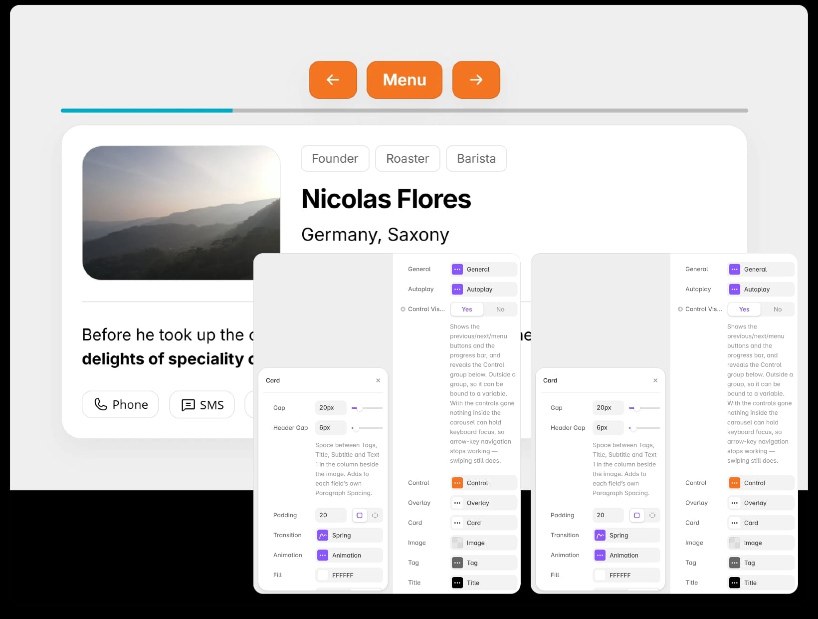
I started creating a timeline component with AI, and in the end I saw the potential for other use cases. I did my best to make it as responsive and customisable as possible.

This framer code component is a deep customizable Multi-Image Card Carousel for different use cases - product overview, timeline and more.

I will make this code component available on the marketplace in the next few days.

Workstation • Card Carousel