madebyMal [ Hoang  Lam ]

madebyMal [ Hoang Lam ]

I design and build Framer templates for modern brands. Clean, fast, and built to convert.

Creator5 Templates
madebyMal [ Hoang  Lam ]
madebyMal [ Hoang Lam ]in Marketplace·9h

A Framer template for companies that own more than one brand.

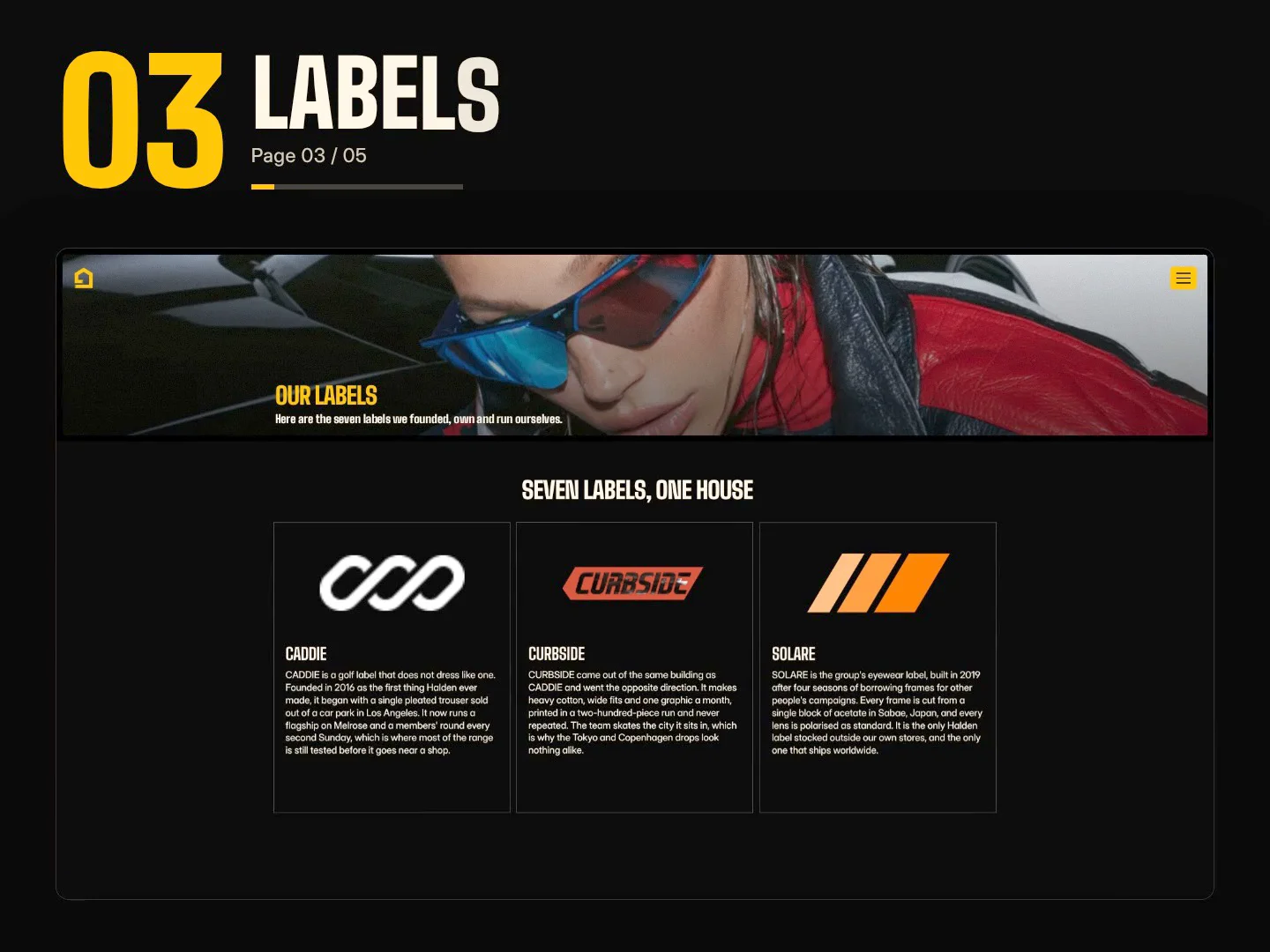
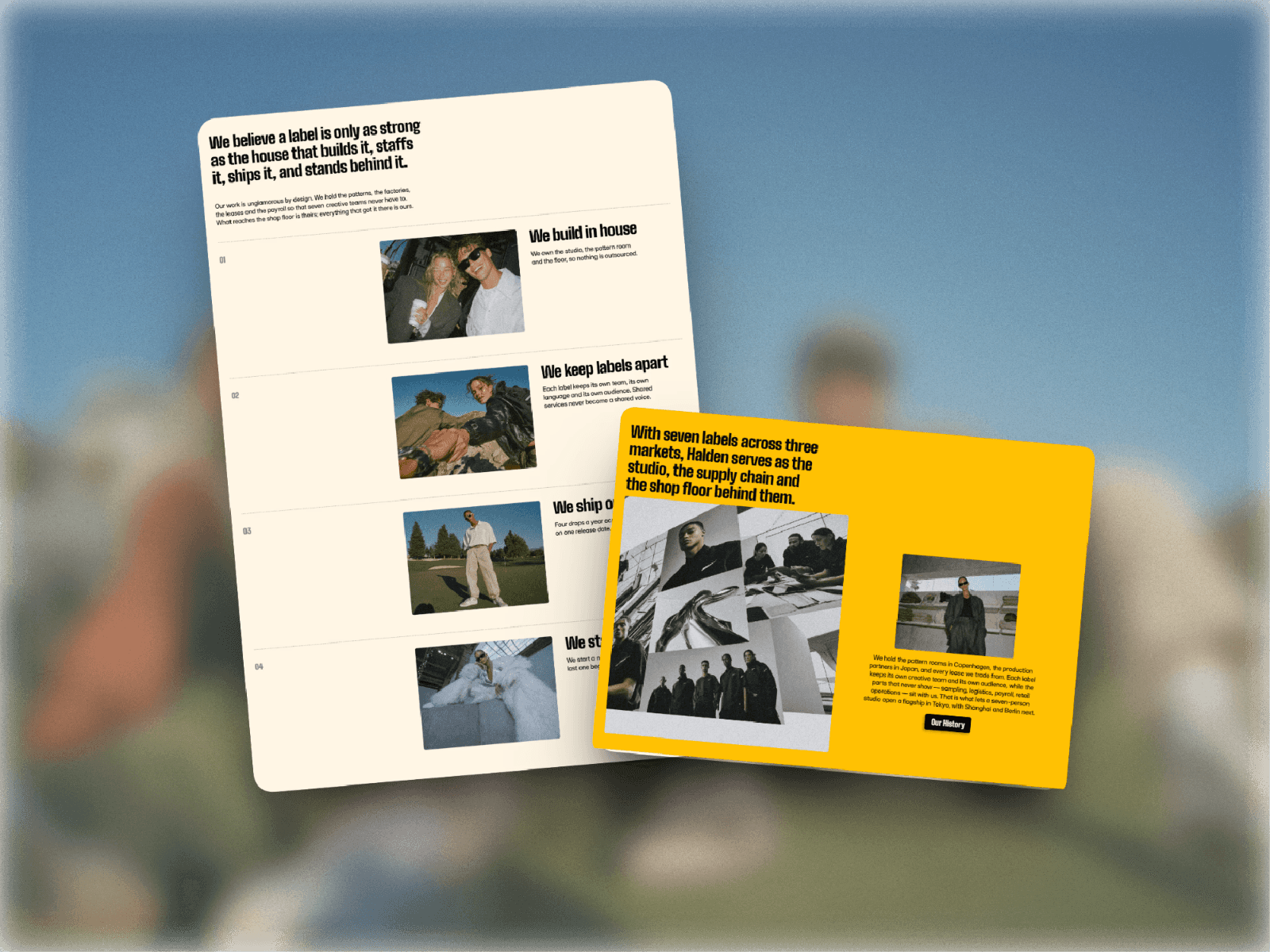
Most parent-company sites open on a claim, with the brands they own below the fold. Halden opens on the brands a seven-slot logo sequence, then the statement at display scale, then the film full-bleed. Proof before claim.

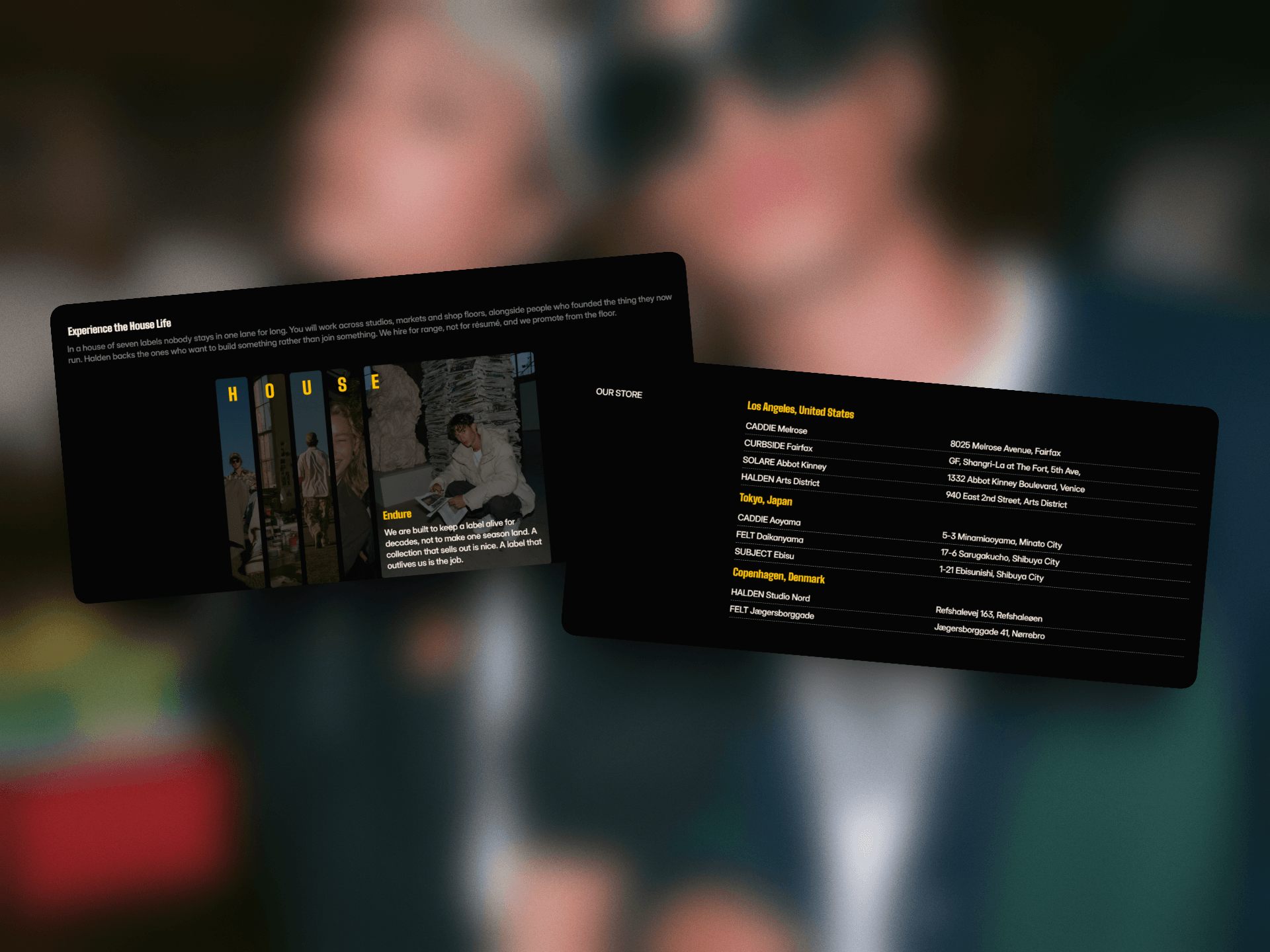
5 pages. Careers runs on a CMS collection.

Seven label worlds with wordmarks, imagery and copy already written so you are not inventing a fake brand at 11pm.

For fashion and lifestyle groups, holding companies, and for anyone building a site for a client whose individual brands are better known than the company itself.

Reposted by madebyMal [ Hoang Lam ]
Cristian Mielu
Cristian MieluPro Expert3w

Spent a while going through the independent Framer template stores and wrote up what I found.

The Marketplace is where most of us list and it does its job well. But alongside it there's a whole set of stores run by single designers, and the work in them deserves all attention.

21 in total. Six to start with:

• @Anton Drukarov (Templatoria)

• @Tymofii Bak (OneTwoFrame)

• @Anatolii Dmitrienko (Templifica)

• @Tamas Bodo (Framerpod)

• @Joseph Alexander (LaunchNow)

• @Hamza Ehsan

Read the article

madebyMal [ Hoang  Lam ]
madebyMal [ Hoang Lam ]1mo

I started this project by researching TKG Lifestyle and their business.

They operate a portfolio of premium lifestyle brands, and I realized that their strongest asset was actually the brands themselves.

But on the original homepage, this proof was pushed below the fold while the hero led with a more abstract statement.

So I decided to bring their portfolio to the very first impression.

The brand names became the preload experience, setting the context before transitioning into the main “We are Life Stylers” statement.

Rather than adding motion just for visual impact, I wanted the interaction to communicate something about the business.

madebyMal [ Hoang  Lam ]
madebyMal [ Hoang Lam ]1mo

Lately most of my hours belong to client work. But there's one file I keep open on the second screen. It's a store locator. A list of shop names and addresses. Every version I built read the same way. Rows of text. Nothing to look at. Nothing that made you want to go. So I added a photo preview on hover. It followed the cursor, the way most of them do. It looked alive. It read worse. My eye chased the image around the screen instead of reading the list I opened the page for. Today I tried the opposite. I locked the preview into one corner and let only the photo change. Now your eye stays on the names. The images sit still and swap quietly beside you, like someone flipping through their trip photos while you read. A list of addresses turned into a set of places you can picture yourself in. Still tuning the timing, but I like where this is heading. What's the last hover effect that actually made you slow down?

madebyMal [ Hoang  Lam ]
madebyMal [ Hoang Lam ]1mo

Something small happened today that I want to write down, mostly for anyone here who started recently.

A referral commission came in. The number is small. The step isn't.

I started with Framer a few months ago. In that time the marketplace changed, the community changed, and the way things get found changed more than once. You learn how something works, and then it stops working that way.

That's the part nobody warns you about. It isn't that the work is hard. It's that you're trying to find your footing on ground that keeps moving.

So at this stage every result counts — not for what it's worth, but because it's the only signal I have about whether any of this is landing.

Today one of them said yes.

For those of you further along: was there a point where the ground stopped moving, or do you just get better at standing on it?

madebyMal [ Hoang  Lam ]
madebyMal [ Hoang Lam ]1mo

The like and comment buttons are gone from templates.

Here is what replaced them tested rather than assumed.

The mechanism

Every template gets a post in the Community feed when it's published. That post still has like and comment buttons. A template's like count is a live mirror of the likes on that post.

Like the post, the template count rises by one. Remove the like, it drops back. It updates immediately, in both directions. I checked this on five templates and got the same result each time.

What does not work

Posting a template's share link as a new post likes there don't register against the template

The marketplace link can't be posted to the feed at all

The original publish post can't be re-uploaded

So every template has exactly one post that counts, created once, at publish. There is no way to stack it. I think that's deliberate, and right it removes any reason to spam the feed with the same resource.

Two things worth knowing

The count is not cumulative history. It is the current state of one post, which means it can decrease. Every other signal a template carries only accumulates views, previews, remixes, purchases. Likes are now the only one that can move backwards.

And because that post is created at publish and then sinks down the feed like any other post, the count mostly reflects the reach you had on the day you launched. There is no mechanism to earn more later.

What I could not determine

Whether any of this reaches ranking. The ranking help page still lists likes and comments as signals, and was last updated on 7 August before the buttons were removed. Either the page hasn't caught up, or post-based likes still feed it. That can't be worked out from the outside.

Worth noting: Framer's visibility guide already advises creating a Community post when you publish. This change makes that advice load-bearing rather than optional.

If anyone has a clearer answer on the ranking side, I'd like to hear it. That's the one piece I couldn't test.

madebyMal [ Hoang  Lam ]
madebyMal [ Hoang Lam ]1mo

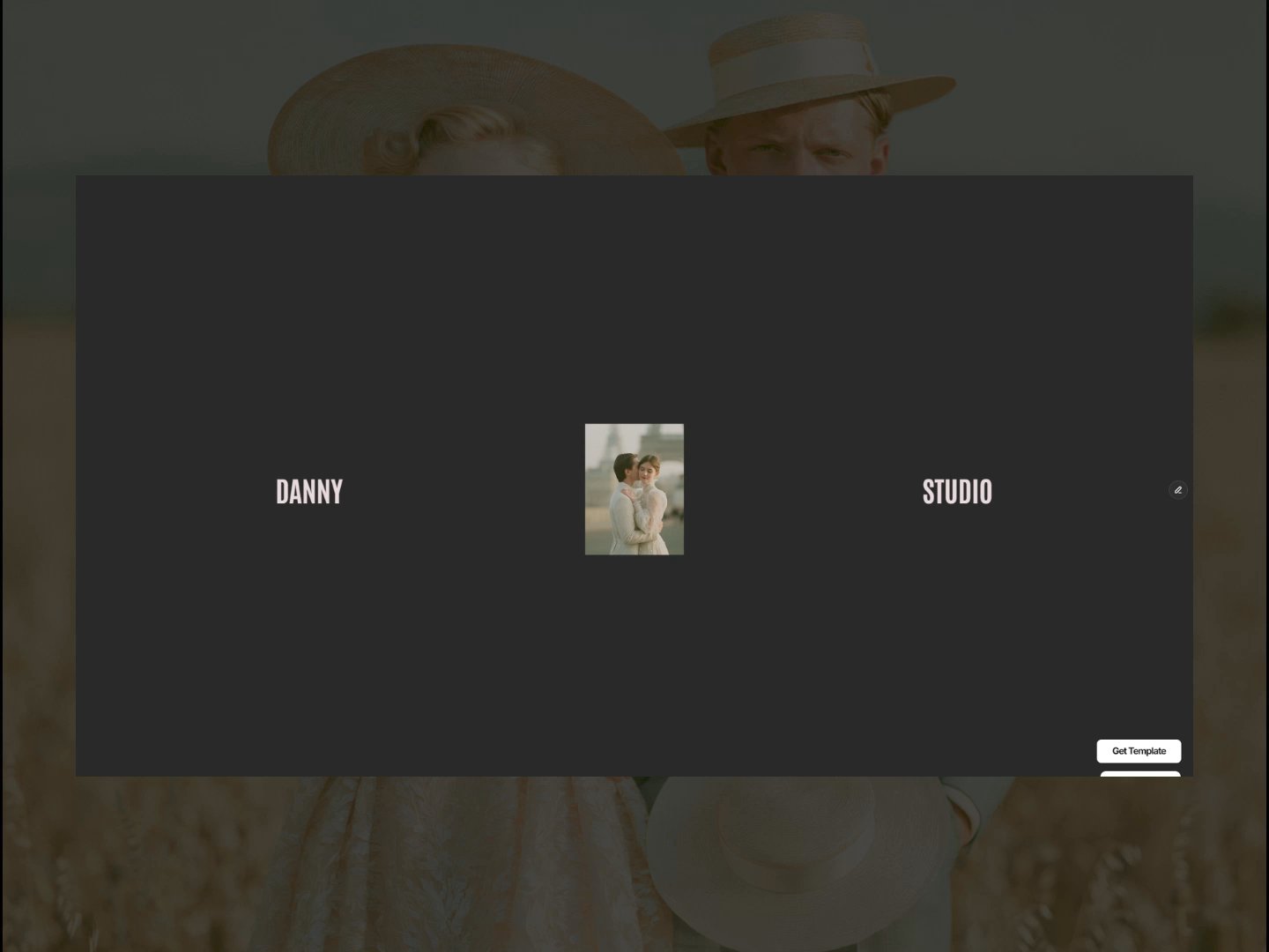
Danny Studio has been remixed 72 times. Thank you to everyone who pulled it into their own project.

Rather than just post the number, here is the thing those remixes taught me: a template gets designed twice.

Once by me, when I build it. Once by the person who opens it and starts deleting things.

The second build is the one that decides whether the template is any good. It's also the one that's easiest to design against without noticing.

Three decisions that turned out to matter most.

Be opinionated about structure, quiet about surface. Layout, flow and pacing are the thing you are actually selling, so those should be decided. Colour, type and imagery are not yours to decide. Every choice I made too specifically became a choice somebody had to undo before they could start.

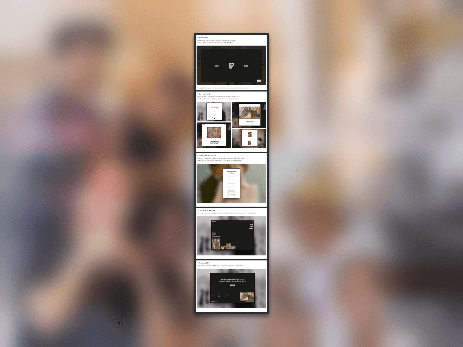
Build the CMS for someone else's volume, not the demo's. Danny Studio's home is an infinite loop of album covers. It has to hold up with six albums and with sixty. Designing to your own demo content is how a template breaks on first contact with a real client.

No paid plugins. A dependency you can't see is a dependency the person remixing you inherits. Keeping it native means the file behaves the same in their account as it does in mine.

The templates that get remixed most aren't the most finished ones. They're the ones with room left in them.

For anyone here publishing templates what's the first thing you find yourself deleting when you remix someone else's file?

madebyMal [ Hoang  Lam ]
madebyMal [ Hoang Lam ]1mo

A full-screen video navigation, and what it costs to load

I built a full-screen menu with video behind it. The type is blended into the footage, so the words pick up their colour from whatever frame is playing. Video below.

I like where it landed. What I don't like is the price.

The video is a Vimeo embed right now, and the page is noticeably slower with it in. So the most memorable thing on the site is also the most expensive thing on it.

What I'm weighing:

Self-hosted mp4 instead of an embed

Mounting the video only when the menu opens, not on page load

A poster frame first, video swapped in after

Shorter loop, smaller resolution, harder compression

If you've shipped a video-backed section in Framer that still opens fast, I'd like to know what you actually did and what you gave up to get there.

madebyMal [ Hoang  Lam ]
madebyMal [ Hoang Lam ]1mo

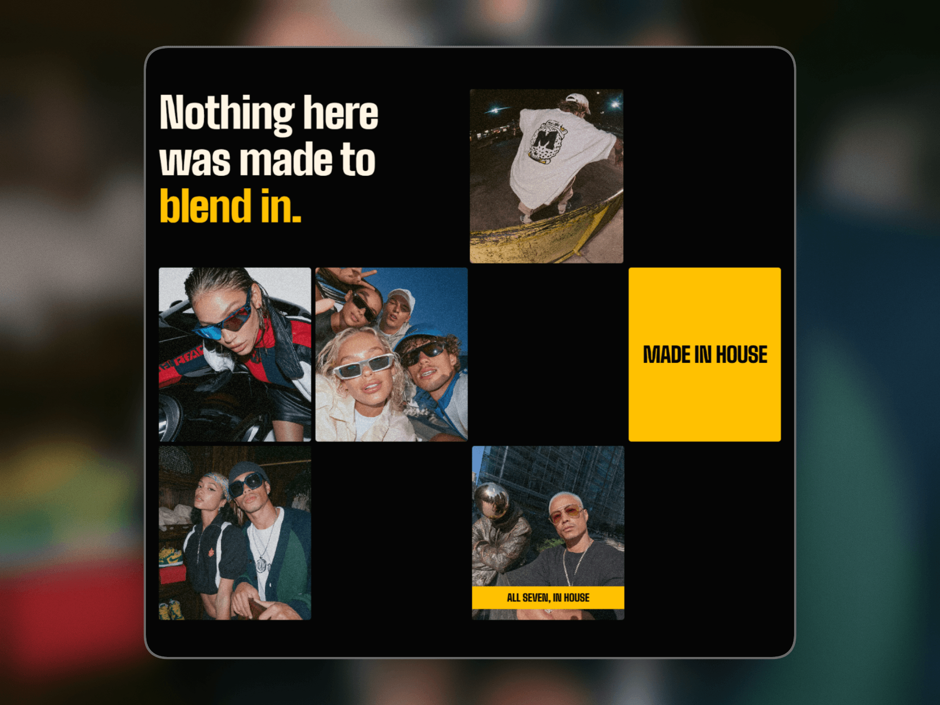
Still exploring layouts for one section of a site I'm rebuilding. The company runs a portfolio of streetwear, coffee and fitness brands, so the section has to carry a lot of different worlds at once.

The original puts the headline on top of a photo, then lays eight images out in an even grid. I wanted to test the opposite of both.

Three decisions I'm trying:

1. Type gets its own cell. The yellow blocks aren't captions or overlays. They sit in the grid as tiles, the same weight as a photo. Nothing is layered over anything, so nothing competes for the same spot.

2. Empty cells stay empty. The instinct is to fill the grid. Leaving holes is what makes it read as a collage instead of a gallery.

3. Mobile isn't the desktop grid squeezed. It repacks tighter, taller, and the yellow block changes proportion instead of just scaling down.

What I'd like eyes on is the desktop version. There's a line between airy and unfinished and I'm not sure which side of it I'm on. Would you tighten those gaps or push them further apart?

madebyMal [ Hoang  Lam ]
madebyMal [ Hoang Lam ]1mo

I have a section that pins while a scroll-linked transform runs through it. Tuned on a 1200px viewport, it lands exactly where I want.

On anything wider it stops somewhere else. The wider the screen, the further off it lands. Past a certain width the element ends up almost outside the frame.

My guess at the cause: the two sides of the mapping don't share a unit. The scroll distance comes from the pinned section and scales with the viewport, while the travel distance is a fixed value that doesn't. Same progress, different place at every width.

What I'd like to hear: how do you set travel distance on a pinned scroll transform so the end position holds at any width?

Do you derive it from the element's own size, from the viewport, or do you set values per breakpoint and accept the maintenance?

madebyMal [ Hoang  Lam ]
madebyMal [ Hoang Lam ]1mo

A video hero and a headline can't share the same second. The motion always wins.

I rebuilt one to see what happens when you stop making them compete.

The starting point was a lifestyle group's homepage, full-bleed video, headline and CTA layered on top. Good footage, confident line. I never once read the line.

There was a second problem under it. This company runs a portfolio of brands people recognise on sight. That's their strongest asset, and it sat below the fold, under the claim.

So the rebuild adds nothing. It only changes the order things arrive in.

The brand names first, alone on black. Proof lands before the claim.

The headline at display scale, one letter fills the frame, so you read it by travelling through it instead of glancing at it. A sentence you travel through is a sentence you finish.

The video enters last. It rises from the bottom and scales out to full screen, after the line is done.

Nothing is layered. Each part owns the screen for its own moment, so there is nothing left to compete.

Same footage as the original. It just stopped being the first thing you see and became the last, a payoff instead of a backdrop.

madebyMal [ Hoang  Lam ]
madebyMal [ Hoang Lam ]in Marketplace·1mo

Porfolio Product, a quiet portfolio for product designers, free to remix.

Built for people who like clean and minimal, and who care about how much someone has to process before they understand you.

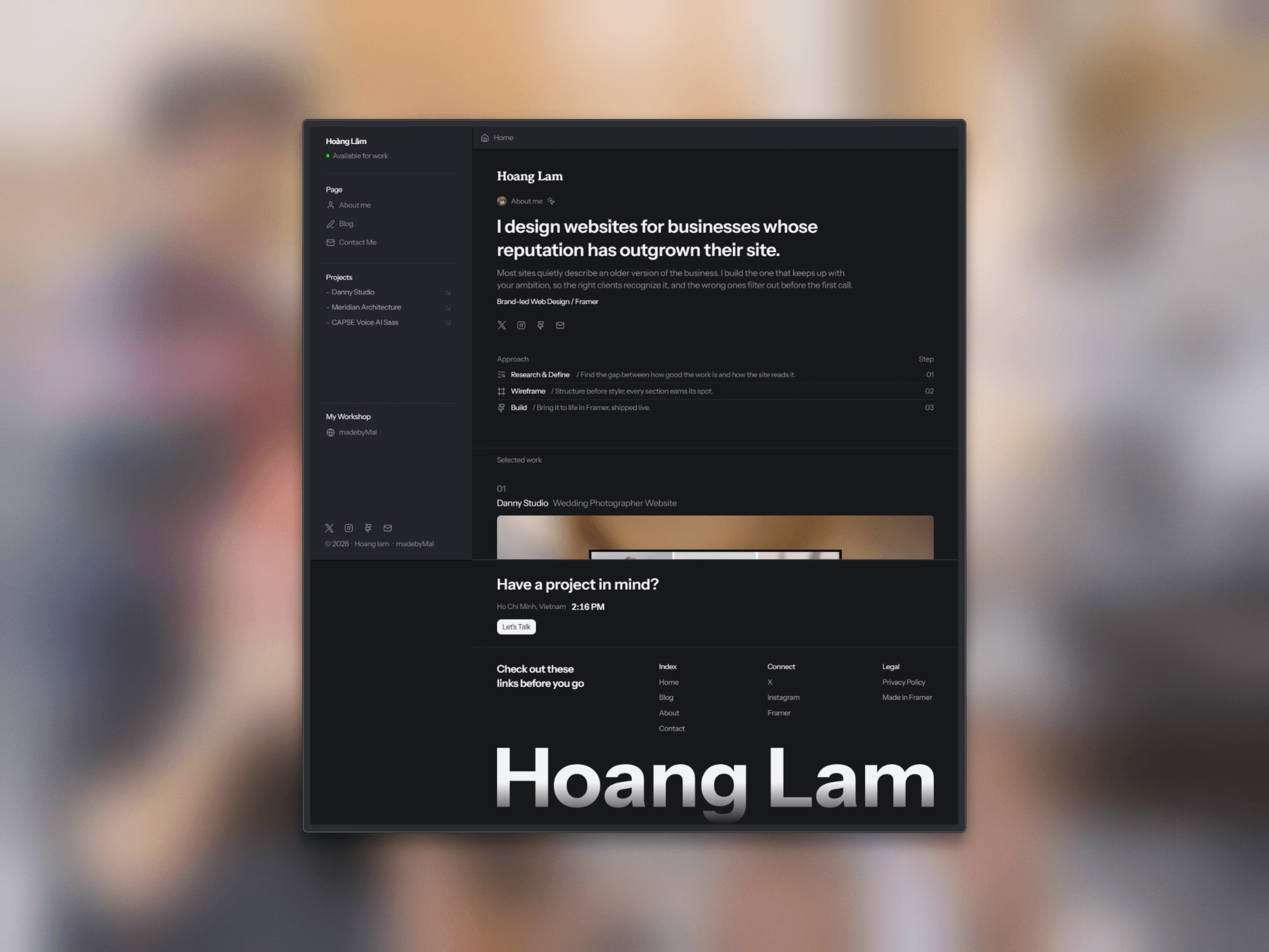
Light and dark mode background, so the work is the only thing holding color. A sidebar that never moves, so every page stays one glance away and the site reads as one continuous space instead of a stack of separate pages. One column for reading, with wide margins and a single clear title at a time.

The structure is meant to be easy to take over. Sections are named the way you'd expect, the type scale is already set, and swapping in your own work doesn't mean rebuilding the layout around it.

Free to remix, personal or commercial.

Get The Template

First time giving away something I use daily. Curious what people build with it.

madebyMal [ Hoang  Lam ]
madebyMal [ Hoang Lam ]1mo

Just finished a new Framer template.

I wanted to build something for product designers who care more about clarity and reading than flashy animations.

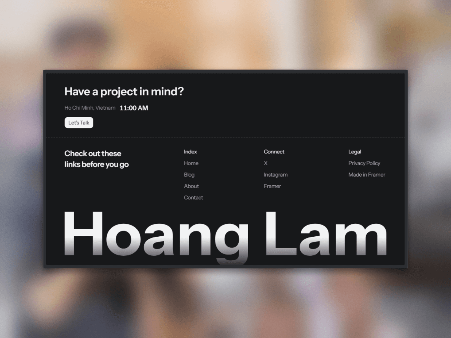
The layout is intentionally minimal: → Fixed sidebar for quick navigation → Clear typography and content hierarchy → A structured approach section → Selected work that stays focused on the projects → Simple CTA and footer

No unnecessary effects. No animation for the sake of animation.

The idea is simple: give designers a solid structure so they can spend less time building the website and more time on their work.

Just replace the content, add your projects, and make it yours.

I’m submitting it to the Framer Marketplace today/tomorrow. Will share the link when it’s live.

Reposted by madebyMal [ Hoang Lam ]
madebyMal [ Hoang  Lam ]
madebyMal [ Hoang Lam ]2mo

Meridian Architect a Framer template for architecture & interior studios, built to turn visitors into inquiries, not just admirers.

A few decisions behind it:

One project at a time, not a dense grid. Most studio templates front-load a big project grid. Architech gives each space a full, single-focus section paced like walking through a real room. Attention compounds instead of scattering across thumbnails.

Scroll-linked reveals that serve the decision, not decoration. Motion is quiet and directional each reveal nudges the eye down the page toward a persistent "book a call" path. No parallax noise for its own sake.

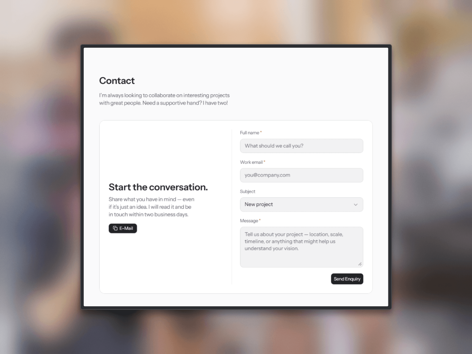
The contact path is designed into the scroll, not bolted onto the footer. The reason a studio site exists is to start a client relationship, so the path to reach out stays reachable the whole way down not hidden at the bottom.

Curious how others here handle the "showcase vs. convert" tension in portfolio-style templates do you optimize for volume of work shown, or for the single next action?

Meridian  Architect: Responsive Real Estate Website Template by…
framer.link · Architecture & Interior Studio — Meridian Ar…
Reposted by madebyMal [ Hoang Lam ]
madebyMal [ Hoang  Lam ]
madebyMal [ Hoang Lam ]2mo

Built this one for photographers, and the whole design came down to a single idea: the photos should be the way in, not the decoration.

Most portfolio sites treat images like wallpaper beautiful, but you can't step into them. So I made two calls: the gallery never ends, so browsing momentum never hits a wall every photo opens its album, so the images themselves become the navigation

The goal was a site that lets people fall into the work instead of scrolling past it.

Would love feedback from the community on the gallery flow and how it feels on mobile. Link below 👇

Danny Studio: Free Photography Website Template by madebyMal [ Hoang…
framer.link · Wedding Photography Portfolio — Danny Studio …
madebyMal [ Hoang  Lam ]
madebyMal [ Hoang Lam ]2mo

A calm, dark portfolio for designers and studios who want the work to lead, not the layout.

This is the portfolio I actually use, cleaned up and made free.

A few decisions behind it:

– Fixed sidebar navigation. The site reads as one continuous space instead of a stack of separate pages name, status and every section stay one glance away as people move through.

– A narrow, reading-first content column. Wide margins, one clear title, room between the lines, and a single bold image per project. The restraint is the point: nothing competes with the work.

– Work lives inside the template. Each project holds a small gallery + short write-up, so it fits any creative photographer, illustrator, brand designer not just people who can link out to a live site.

– Easy To Scan. Nobody studies a portfolio, they skim it in seconds. So the layout is built to lower the mental effort: clear labels, one idea per section, nothing to work out. People find what they came for before their attention runs out.

Free to use. If you want the version with CMS and dedicated case-study pages, that's on my profile too.

madebyMal [ Hoang  Lam ]
madebyMal [ Hoang Lam ]2mo

First look at the portfolio I'm building in Framer.

I wanted it to feel calm, not loud. A dark, near-black background, so the work carries all the color.

The layout is two parts.

A fixed sidebar on the left name, status, every page always in reach. It makes the site read as one space, not separate pages.

A single narrow column on the right, built for reading. Wide margins, one clear title, room between the lines.

One bold image per article is the only place color takes over restraint everywhere else makes it hit harder.

Layout is how I show the way I think. Minimal here isn't a trend it's so nothing sits between the reader and the idea.

Building in public, and I'll share this as a Framer template once it's ready. Fixed sidebar or classic top nav for a portfolio what's your take?

madebyMal [ Hoang  Lam ]
madebyMal [ Hoang Lam ]2mo

Meridian jumped 1,134 spots in a day. It's sitting at #181 now.

The part I keep looking at isn't the rank.

It's that Meridian is the only one of my templates with a price on it. $79, while the other two are free and it's the one climbing fastest.

I built Meridian around a single idea: that studios lose money not because their work is worth less, but because their site makes people guess. Large imagery. Calm layout. A clear path through every page. Feel the value before the number comes up.

Apparently that works on the people buying the template too.

Price was never the obstacle. Being hard to read was.

Good day. Back to building.

When did you last pay more for something because it was instantly obvious it was worth it?

madebyMal [ Hoang  Lam ]
madebyMal [ Hoang Lam ]2mo

One week of numbers on Danny Studio: 16,546 impressions, 533 views, 30 remixes.

The one I'm proud of isn't the reach. It's that roughly 1 in 18 people who actually looked went on to remix it opened the file and pulled it into their own project.

A view costs nothing. A remix means someone decided the template was worth building on, not just looking at. That's the signal I was hoping for when I built it around one rule: the work leads, nothing decorative, every gallery image opens something real.

Curious what ratio you all watch, views to remixes, or something else, when you're figuring out if a template actually landed.

madebyMal [ Hoang  Lam ]
madebyMal [ Hoang Lam ]2mo

A small milestone I didn't expect: my first commission from Framer's partner program.

I'm sharing it for what it taught me, not the amount.

If you're building here and wondering whether quietly sharing your work is worth it this is a small sign that it is. The recommendation people trust is the one you never turned into a sales line.

Still early for me. Back to it.

For the makers here what's the most useful thing you've shared that you almost didn't post?