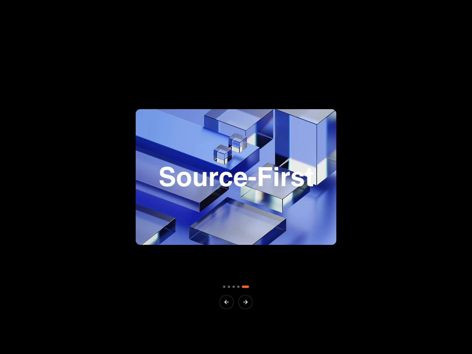
Dimensional Switch: a slider where the image card flips in 3D and the headline swaps with it. Horizontal or vertical flip, arrows, dots and optional autoplay that pauses off-screen. Empty slides show placeholders until you add images.


Hyperiux Vault is a source-first library of React & Next.js interaction effects, animations, transitions and microinteractions ready to ship
Dimensional Switch: a slider where the image card flips in 3D and the headline swaps with it. Horizontal or vertical flip, arrows, dots and optional autoplay that pauses off-screen. Empty slides show placeholders until you add images.
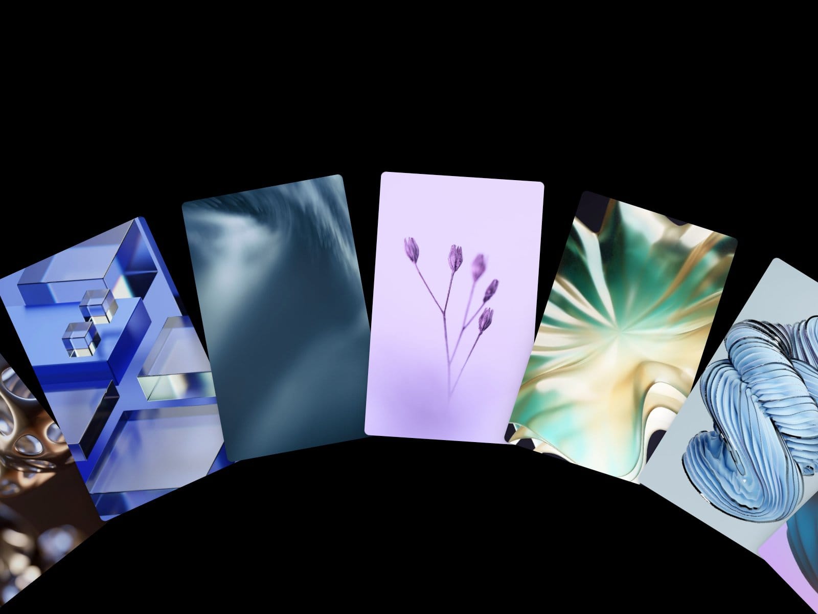
Arc Flow Carousel: drag, flick or scroll image cards around an arc. Nearby cards follow with a slight lag. Snap, auto-rotation, hover captions and keyboard control included.
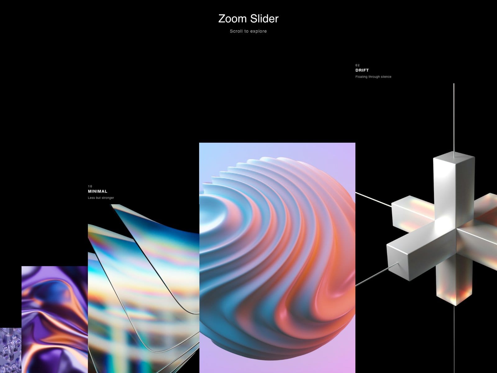
Zoom Slider: an endless image strip where cards grow as they come in. Scroll, drag or swipe; hover for a line-by-line caption reveal.
Orbit Flip Slider: a ring of cards you can view four ways: Flat, Tilt, Ring or Gallery. Every card animates to its new spot when you switch. Slow idle spin, hover pop, and each mode is adjustable.
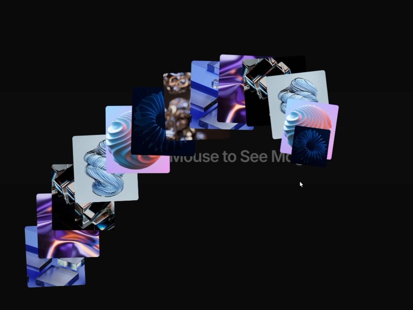
Ellipse Carousel: cards orbit an ellipse, largest on the right. Autoplay steps one card at a time; drag to spin it yourself. Mix images and text tiles.
Phantom Image Trail: images pop in under your cursor and fade out as you move. Idle spawning, tilt, scale and timing are all adjustable, and on touch devices a tap spawns an image.
Component #5: Stack Spread
Eight cards start clustered in a pile, then scatter across the screen as you scroll - each one on its own rotation and depth, with a little cursor drift once they've settled. A headline fades in partway through the scatter.
Built on framer-motion's scroll and spring hooks, not GSAP. Scroll length, stack scale, card radius, cluster rotation, background and text color are all exposed as controls. Respects reduced motion - rotation and the headline's scale-in flatten, cursor parallax turns off.
Hyperiux Strip Slide - a full-bleed image slider where the transition does the talking.
Click either half of the frame to move forward or back. The incoming image reveals through a staggered vertical strip wipe while it zooms in, with a thin progress bar tracking position at the top.
Each slide carries a chapter label and a title whose characters slide into place individually, plus a counter and a custom cursor that rotates to show which way a click will go.
Strip count, reveal speed, stagger timing, zoom amount, and accent color are all property controls, along with toggles for the progress bar, counter, and click controls. Autoplay is available, off by default.
Respects prefers-reduced-motion, and stays static on canvas/export.
Hyperiux Flip Card - a stack of cards that flips open into a gallery.
Click the stack and it spreads into a hero image with a rail of thumbnails, using GSAP's Flip plugin - same DOM nodes, no remount. Click any thumbnail to swap it into the hero spot, same transition. Each card can carry its own title, meta line, description, and caption, and the text fades out and reveals line-by-line (via SplitText) whenever the selection changes.
Arrow keys move between cards while it's open, Escape or clicking the background collapses it back to the stack. Falls back to a static layout under prefers-reduced-motion, and switches to a stacked mobile layout below 700px.
Free in the Hyperiux Vault.
Free component #2 in the Hyperiux Vault: Shiny Button.
The border is a conic gradient on a slow rotation, with a dot-pattern texture underneath so it reads as brushed metal instead of a screensaver. Hover it and the arc widens, brightens, and a glow breathes up from the bottom edge before settling back down.
Colour, sweep speed, border width, and corner radius are all property controls — no code, no override needed. It's pure CSS under the hood, so it costs you nothing to run.
Free in the Vault, install and go.
Hyperiux Vault is a source-first library of React & Next.js interaction effects, animations, transitions and microinteractions ready to ship
Dimensional Switch: a slider where the image card flips in 3D and the headline swaps with it. Horizontal or vertical flip, arrows, dots and optional autoplay that pauses off-screen. Empty slides show placeholders until you add images.
Arc Flow Carousel: drag, flick or scroll image cards around an arc. Nearby cards follow with a slight lag. Snap, auto-rotation, hover captions and keyboard control included.
Zoom Slider: an endless image strip where cards grow as they come in. Scroll, drag or swipe; hover for a line-by-line caption reveal.
Orbit Flip Slider: a ring of cards you can view four ways: Flat, Tilt, Ring or Gallery. Every card animates to its new spot when you switch. Slow idle spin, hover pop, and each mode is adjustable.
Ellipse Carousel: cards orbit an ellipse, largest on the right. Autoplay steps one card at a time; drag to spin it yourself. Mix images and text tiles.
Phantom Image Trail: images pop in under your cursor and fade out as you move. Idle spawning, tilt, scale and timing are all adjustable, and on touch devices a tap spawns an image.
Component #5: Stack Spread
Eight cards start clustered in a pile, then scatter across the screen as you scroll - each one on its own rotation and depth, with a little cursor drift once they've settled. A headline fades in partway through the scatter.
Built on framer-motion's scroll and spring hooks, not GSAP. Scroll length, stack scale, card radius, cluster rotation, background and text color are all exposed as controls. Respects reduced motion - rotation and the headline's scale-in flatten, cursor parallax turns off.
Hyperiux Strip Slide - a full-bleed image slider where the transition does the talking.
Click either half of the frame to move forward or back. The incoming image reveals through a staggered vertical strip wipe while it zooms in, with a thin progress bar tracking position at the top.
Each slide carries a chapter label and a title whose characters slide into place individually, plus a counter and a custom cursor that rotates to show which way a click will go.
Strip count, reveal speed, stagger timing, zoom amount, and accent color are all property controls, along with toggles for the progress bar, counter, and click controls. Autoplay is available, off by default.
Respects prefers-reduced-motion, and stays static on canvas/export.
Hyperiux Flip Card - a stack of cards that flips open into a gallery.
Click the stack and it spreads into a hero image with a rail of thumbnails, using GSAP's Flip plugin - same DOM nodes, no remount. Click any thumbnail to swap it into the hero spot, same transition. Each card can carry its own title, meta line, description, and caption, and the text fades out and reveals line-by-line (via SplitText) whenever the selection changes.
Arrow keys move between cards while it's open, Escape or clicking the background collapses it back to the stack. Falls back to a static layout under prefers-reduced-motion, and switches to a stacked mobile layout below 700px.
Free in the Hyperiux Vault.
Free component #2 in the Hyperiux Vault: Shiny Button.
The border is a conic gradient on a slow rotation, with a dot-pattern texture underneath so it reads as brushed metal instead of a screensaver. Hover it and the arc widens, brightens, and a glow breathes up from the bottom edge before settling back down.
Colour, sweep speed, border width, and corner radius are all property controls — no code, no override needed. It's pure CSS under the hood, so it costs you nothing to run.
Free in the Vault, install and go.
Dimensional Switch: a slider where the image card flips in 3D and the headline swaps with it. Horizontal or vertical flip, arrows, dots and optional autoplay that pauses off-screen. Empty slides show placeholders until you add images.
Arc Flow Carousel: drag, flick or scroll image cards around an arc. Nearby cards follow with a slight lag. Snap, auto-rotation, hover captions and keyboard control included.
Zoom Slider: an endless image strip where cards grow as they come in. Scroll, drag or swipe; hover for a line-by-line caption reveal.
Orbit Flip Slider: a ring of cards you can view four ways: Flat, Tilt, Ring or Gallery. Every card animates to its new spot when you switch. Slow idle spin, hover pop, and each mode is adjustable.
Ellipse Carousel: cards orbit an ellipse, largest on the right. Autoplay steps one card at a time; drag to spin it yourself. Mix images and text tiles.
Phantom Image Trail: images pop in under your cursor and fade out as you move. Idle spawning, tilt, scale and timing are all adjustable, and on touch devices a tap spawns an image.
Component #5: Stack Spread
Eight cards start clustered in a pile, then scatter across the screen as you scroll - each one on its own rotation and depth, with a little cursor drift once they've settled. A headline fades in partway through the scatter.
Built on framer-motion's scroll and spring hooks, not GSAP. Scroll length, stack scale, card radius, cluster rotation, background and text color are all exposed as controls. Respects reduced motion - rotation and the headline's scale-in flatten, cursor parallax turns off.
Hyperiux Strip Slide - a full-bleed image slider where the transition does the talking.
Click either half of the frame to move forward or back. The incoming image reveals through a staggered vertical strip wipe while it zooms in, with a thin progress bar tracking position at the top.
Each slide carries a chapter label and a title whose characters slide into place individually, plus a counter and a custom cursor that rotates to show which way a click will go.
Strip count, reveal speed, stagger timing, zoom amount, and accent color are all property controls, along with toggles for the progress bar, counter, and click controls. Autoplay is available, off by default.
Respects prefers-reduced-motion, and stays static on canvas/export.
Hyperiux Flip Card - a stack of cards that flips open into a gallery.
Click the stack and it spreads into a hero image with a rail of thumbnails, using GSAP's Flip plugin - same DOM nodes, no remount. Click any thumbnail to swap it into the hero spot, same transition. Each card can carry its own title, meta line, description, and caption, and the text fades out and reveals line-by-line (via SplitText) whenever the selection changes.
Arrow keys move between cards while it's open, Escape or clicking the background collapses it back to the stack. Falls back to a static layout under prefers-reduced-motion, and switches to a stacked mobile layout below 700px.
Free in the Hyperiux Vault.
Free component #2 in the Hyperiux Vault: Shiny Button.
The border is a conic gradient on a slow rotation, with a dot-pattern texture underneath so it reads as brushed metal instead of a screensaver. Hover it and the arc widens, brightens, and a glow breathes up from the bottom edge before settling back down.
Colour, sweep speed, border width, and corner radius are all property controls — no code, no override needed. It's pure CSS under the hood, so it costs you nothing to run.
Free in the Vault, install and go.