Nadeem Ahmad
Nadeem Ahmad

Nadeem Ahmad

🚀 Crafting premium, responsive, and interactive Framer assets to speed up your workflow.

Creator7 Components
Nadeem Ahmad
Nadeem Ahmadin Marketplace·1d

Neo Press Button

The Framer button people can't stop pressing.

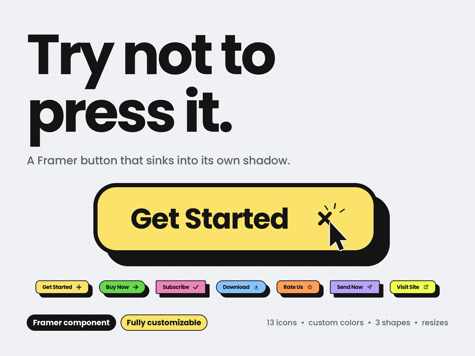
A chunky, tactile button that sinks into its own hard shadow. Hover and it dips, press and it lands flat, release and a spring pops it back. It feels like a real key, and visitors click it just to feel it again.

Why you'll love it

Three states, spring motion: rest, hover and pressed, each with natural spring physics

Icons that react: the plus spins into a cross, the star twirls, the heart pulses, the download drops, the send flies off

Soft light sweep across the face on hover

Haptic buzz on supported phones

Drop in and go: paste it, set the label, link it, done

Customize everything

Color: Yellow, Green, Pink, Blue, Orange, Lilac, or Custom with your own fill, text and border + shadow colors

Shape: Rounded, Pill or Sharp

Resize to scale: drag the component bigger or smaller and the text, icon, padding and shadow scale together

13 icons: Plus, Arrow, Check, Star, Heart, Download, Send, Cart, Play, Mail, Sparkle, External link or None

Label, link and new-tab toggle, plus a click event for your interactions

Any font and weight

Border width and shadow depth

Hover sink: choose how far it dips before you press

Spring controls: stiffness, damping and mass, from snappy to bouncy

Shine and haptic switches

Built the Framer way

Fits its label automatically, or fills any width you set

Static render and export safe: nothing animates there

Respects reduced-motion settings

Clear keyboard focus ring

Works as a real link or button

Perfect for

Hero calls to action, pricing cards, sign-up forms, portfolios, landing pages and neo-brutalist designs.

Set up in 30 seconds

Paste the component into Assets > Code

Drag it onto your page

Pick a color, shape and size in the properties panel

Add your link and hit Preview to feel the press

Add it once, restyle it anywhere.
Nadeem Ahmad
Nadeem Ahmadin Marketplace·2d

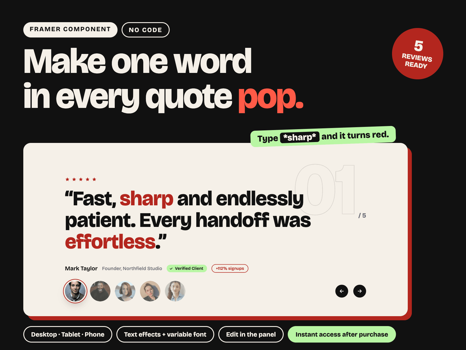
Your best testimonials deserve more than a quote in a box. Highlight Testimonial Slider makes the one word that sells glow in color, so visitors see the proof before they finish reading.

TYPE WORD. IT LIGHTS UP. Wrap any word in stars inside the quote and it turns into a highlight. "Fast, sharp and endlessly patient." Add as many as you like. No code, no layers to dig through.

EVERYTHING IS A PROPERTY CONTROL

5 reviews, each with image, quote, name, role and result chip

Text color, highlight color and font

Variable font controls: optical size and width axis

Text effect: mask reveal, fade up or blur in

Highlight style, duration, stagger and delay

BUILT TO CONVERT

Star rating row and Verified Client badge

Result chip for proof like "+112% signups"

Big outlined counter that shows there is more to read

Active avatar ring so people know who is speaking

WHY IT WORKS Social proof only works when people notice it. Highlighting the strongest words pulls the eye to your results, builds trust faster and gives your page a bold, memorable look.

FEELS ALIVE Visitors click any avatar or use the Next and Back arrows. Every review replays its text animation, so each testimonial lands with impact.

RESPONSIVE OUT OF THE BOX Desktop, Tablet and Phone variants are ready, with type and spacing tuned for each size. Drop it into a page and it just works.

MAKE IT YOURS IN 3 STEPS 1. Drop the component on your page 2. Swap the photos, names and quotes in the properties panel 3. Put stars around the words you want to highlight

WHAT YOU GET

Slider with Desktop, Tablet and Phone variants

5 ready-to-edit reviews

Clickable avatars and Next / Back interactions

PERFECT FOR SaaS landing pages, agency sites, portfolios, pricing pages, product launches and any page where social proof closes the sale, from freelancers to full product teams.

Nadeem Ahmad
Nadeem Ahmadin Marketplace·3d

Stop showing your products in a boring grid.

Infinite Collection turns any set of images into a never-ending, scroll-driven gallery. Columns glide at different speeds, skew with your scroll velocity, and reveal each item's details on hover. Visitors keep exploring instead of bouncing.

WHY IT CONVERTS

- Never-ending loop: every visit shows more of your work or products

- Info on hover: category, title, price and an arrow appear on the card

- Focus effect: other cards fade back, so attention stays on one

- Link on every card: send visitors straight to a product or page

WHAT YOU GET

- Mouse wheel and touch scrolling with smooth inertia, plus gentle idle drift

- You can add many items as you like. The component loops through them continuously.

- Columns with different speeds and alternating directions

- Velocity-based skew that makes scrolling feel physical

- Two hover styles: frosted slide-up panel or fade-in panel

- Editable cards: image, title, category, price and link

- Up to 8 columns, with a separate mobile column count

- Controls for gap, radius, card height, edge fade, colours and font

- Pauses off-screen and respects reduced-motion settings

NO CODE NEEDED

Drop it on the canvas and edit everything from the properties panel.

PERFECT FOR

Fashion lookbooks, product catalogues, portfolios, photography, agency case studies, real estate and any collection page that needs to feel alive.

QUICK START

1. Add the component to your page

2. Add your images and details in Items

3. Adjust speed, columns and style, then publish

TIP

Set the height to a fixed value or Fill. Turn off Capture wheel if the component sits mid-page, so visitors can scroll past it.

FAQ

Does it work on mobile? Yes, with touch scrolling and its own mobile column setting.

Can I link each card? Yes, every card has its own link.

Can I turn off skew or drift? Yes, set them to zero.

Nadeem Ahmad
Nadeem Ahmadin Marketplace·1w

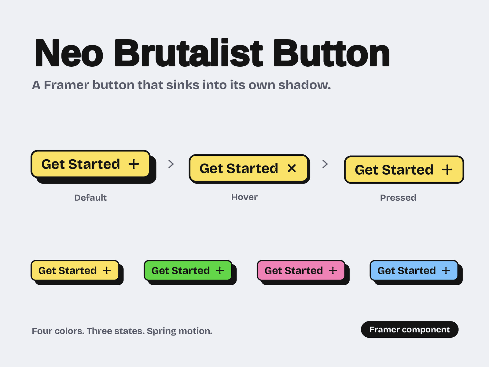
One button, Four Colors, and a press so satisfying people click twice. A Neo-brutalist CTA that sinks into its own shadow, built for Framer.

Feels Physical, Not Flat

A bold hard shadow gives the button real weight. Hover and it sinks toward the shadow, press and it locks flat, then it springs back with a natural bounce.

Spring-powered hover and press, tuned to feel like a real key

Icon flips from + to × on hover for instant feedback

Smooth and lightweight on every device

Four Colors, Ready to Go

Yellow, Green, Pink and Blue come built in. Switch between them from one Variant dropdown.

Every color includes Primary, Hover and Pressed states

Twelve hand-built states, with nothing to set up

Bold ink borders and shadows that keep every color crisp

Make It Yours in Seconds

Everything you need is a property control, so you never open the component.

Add your link and change the title, title color and font size

Adjust the button background, border, radius and padding

Plug into Framer triggers for custom interactions

Perfect for

Landing pages, sign-up and booking CTAs, pricing tables, portfolios and launch pages.

Nadeem Ahmad
Nadeem Ahmadin Marketplace·1w

Neo Brutalism Testimonial Carousel (100% Native Custom Made-Zero Code)

Neo Brutalism Testimonial Carousel is a bold, fully responsive testimonial slider for Framer — built to make client reviews feel like a design statement instead of an afterthought.

Combines a scattered "polaroid" photo stack, star ratings, and a large portrait image into one punchy, editorial-style card.

Fully editable via property controls and adapts cleanly across Desktop,Laptop and Phone breakpoints with zero extra setup.

HOW TO USE

Drop the Neo Brutalism Testimonial Carousel component onto your canvas — it comes preloaded with 5 testimonial slots, fully editable straight from the Framer properties panel (no need to touch layers or variants).

For each slide, use the numbered fields to customize your content: Image 1–5, Rating 1–5, Quote 1–5, Name 1–5, and Role 1–5.

Click "Clear" next to any image field to remove a photo and upload your own client/team portrait.

Set each rating from the dropdown (supports 1–5 stars per slide).

The prev/next arrows and slide counter (e.g. 01/05) are wired in by default — no manual linking needed.

Preview across Desktop and Phone breakpoints to confirm your text lengths and images look right at every size.

KEY FEATURES

Responsive layouts optimized for Desktop, Laptop and Phone breakpoints.

Stacked "polaroid" avatar strip for a scrapbook-style visual hook.

Bold pull-quote typography that stays readable and skimmable.

Built-in prev/next navigation with auto-updating slide counter (e.g. 01/05).

Client-safe editing — perfect for handoff, since anyone can update testimonials without touching the design.

WHY NEO BRUTALISM TESTIMONIAL CAROUSEL?

Works equally well for agencies, studios, personal brands, or product landing pages needing authentic, easy-to-maintain social proof.

Property-panel editing means less time explaining "how to use the component"

Pre-Made Breakpoint Layouts no manual responsive tweaking required.

Nadeem Ahmad
Nadeem Ahmad1w

Your testimonials deserve better than a fade.

Guillotine Split is a testimonial carousel that does something no other component on the marketplace does: each reviewer's photo physically splits in half and slides apart to reveal the next one underneath — a cinematic, deliberate reveal that turns a section visitors normally scroll past into one they actually watch.

No code. No plugins. Drop it in, drop in your reviews, and it just works — on desktop, on tablet, on phone.

🧩 Where this component actually gets used

This isn't a single-purpose widget — it's a testimonial section built generically enough to carry almost any brand voice. Real customer photos and reviews that build trust faster than a star rating alone. A few ways buyers are dropping it in:

SaaS landing pages, Agencies & Studios, Coaches & Consultants, E-Commerce & Product Sites, Real Estate, Courses & Education Platforms, Personal Portfolios etc.

📦 What's included

The full Guillotine Split component, pre-built for 5 reviews

Desktop, Tablet, and Phone breakpoints, each tuned individually

Autoplay with pause-on-scroll-away, plus manual dot and arrow navigation

A written guide for extending from 5 to 7 (or more) reviews

Clean, documented Component Properties

Nadeem Ahmad
Nadeem Ahmadin Marketplace·1w

Proof is a polished, ready-to-drop testimonial carousel for Framer — built for portfolios, agencies, SaaS landing pages, and recruiter or coaching sites that need social proof to feel credible, not generic. It pairs a striking black-and-white portrait with a star rating, a logo/project/company callout, and an interactive avatar picker so visitors can browse real feedback at a glance. Fully responsive across desktop, laptop, and phone breakpoints — no code required.

⭐ Key Features

Clean two-column layout: full-bleed photo panel + quote, rating, and meta content

Star rating display (1–5 stars, fully editable per testimonial)

Project / Company callout for instant context and credibility

Clickable avatar picker with an active-state ring — jump straight to any testimonial

Prev / next arrow navigation plus a minimal page counter (01 – 05 style)

Smooth, subtle transitions between testimonials — no jarring content jumps

📱 Responsive by Default

Fully rebuilt breakpoints for Desktop, Laptop, and Phone — not just scaled-down text

Touch-friendly tap targets on mobile for the avatar picker and arrows

Photo and quote panel gracefully restack on smaller screens instead of cramming

Looks intentional at every width, not just the one you designed it at

Nadeem Ahmad
Nadeem Ahmad1w

100% Native Custom Made (Zero Code), Split Reveal Carousel turns a simple image slider into a moment of surprise. Each card's image is divided into five equal parts, and on reveal, every strip glides from bottom to top with its own delay — creating a fluid, cascading motion instead of a flat cut. Underneath, your hidden content — text, a photo, a detail shot — comes into view.

Features:

5-part split image reveal with staggered delay animation

Smooth bottom-to-top strip motion

Reveals hidden content behind each image

Next/previous navigation with auto-reset on outgoing cards

Fully responsive across all breakpoints (desktop, tablet, mobile)

Customize instantly using variables — no code required

Easy to restyle — swap images, colors, and content in seconds

Nadeem Ahmad
Nadeem Ahmadin Marketplace·2w

100% Native Custom Made (Zero Code), Split Reveal Carousel turns a simple image slider into a moment of surprise. Each card's image is divided into five equal parts, and on reveal, every strip glides from bottom to top with its own delay — creating a fluid, cascading motion instead of a flat cut. Underneath, your hidden content — text, a photo, a detail shot — comes into view.

Features:

5-part split image reveal with staggered delay animation

Smooth bottom-to-top strip motion

Reveals hidden content behind each image

Next/previous navigation with auto-reset on outgoing cards

Fully responsive across all breakpoints (desktop, tablet, mobile)

Customize instantly using variables — no code required

Easy to restyle — swap images, colors, and content in seconds

Nadeem Ahmad
Nadeem Ahmad2w

Guillotine Split is a testimonial carousel that does something no other component on the marketplace does: each reviewer's photo physically splits in half and slides apart to reveal the next one underneath — a cinematic, deliberate reveal that turns a section visitors normally scroll past into one they actually watch.

📦 What's included

The full Guillotine Split component, pre-built for 5 reviews

Desktop, Tablet, and Phone breakpoints, each tuned individually

Autoplay with pause-on-scroll-away, plus manual dot and arrow navigation

A written guide for extending from 5 to 7 (or more) reviews

Clean, documented Component Properties

100% Native without touching a single line of code

https://guilotinesplittestimonial.framer.website