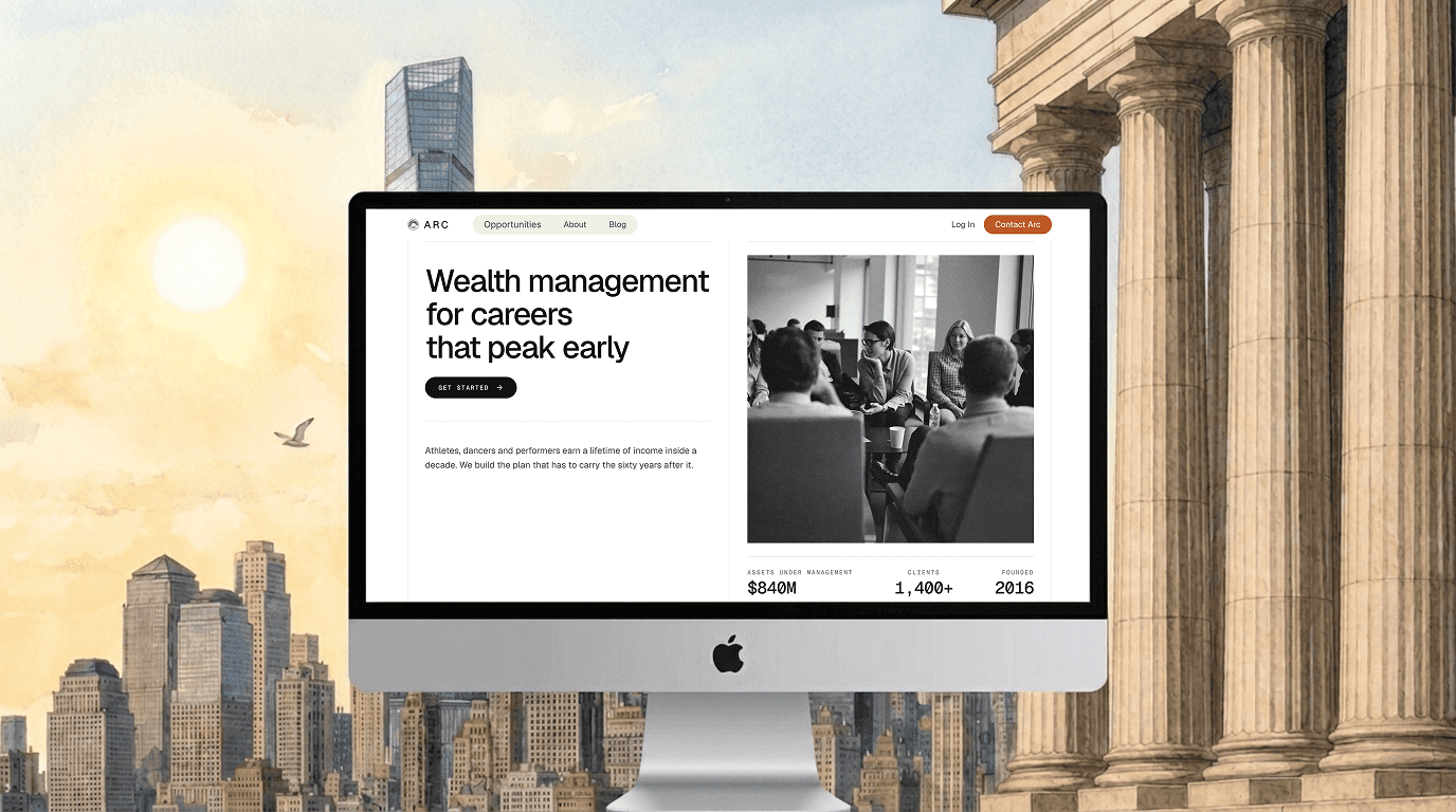
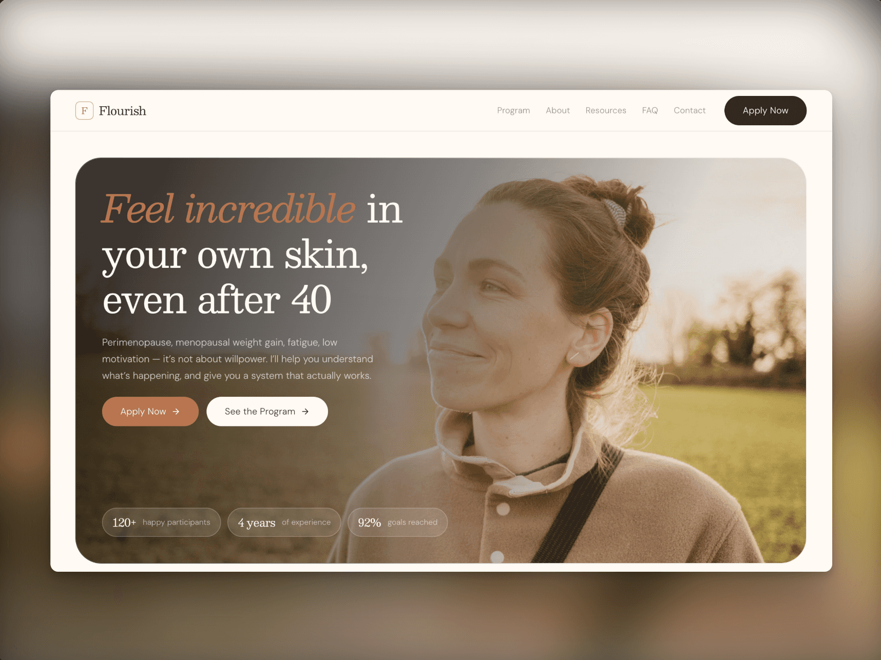
Introducing Arc — an editorial template for brands that handle things that matter.
Most financial and advisory sites reach for the same tools to signal trust: glossy hero photos, gradient blobs, big confident claims. Arc goes the other way.
It's built around a "ledger" design system — thin rule lines, bordered grid sections, warm paper tones, and hand-set typography that reads more like a well-kept archive than a SaaS landing page. Engraving-style illustrations replace stock photography, so the whole site speaks in one voice. A single accent color, used deliberately. Motion that's physics-based and quiet, never bouncy.
Eight fully responsive pages:
Home, About, Opportunities, Blog, Blog Article, Login, Contact, and a 404 that's actually on-brand. Two live CMS collections for case studies and articles, real schema, ready to fill. Reusable components and a synced Nav/Footer so the whole thing stays consistent as you build.
Arc is made for wealth managers, RIAs, advisors, and fiduciary firms — but it fits any brand whose pitch is "we're careful with something that matters" rather than "move fast."
Considered, unhurried, specific. Have a look.