About WebX Bento Grid
✦ Bento Grids That Feel Alive
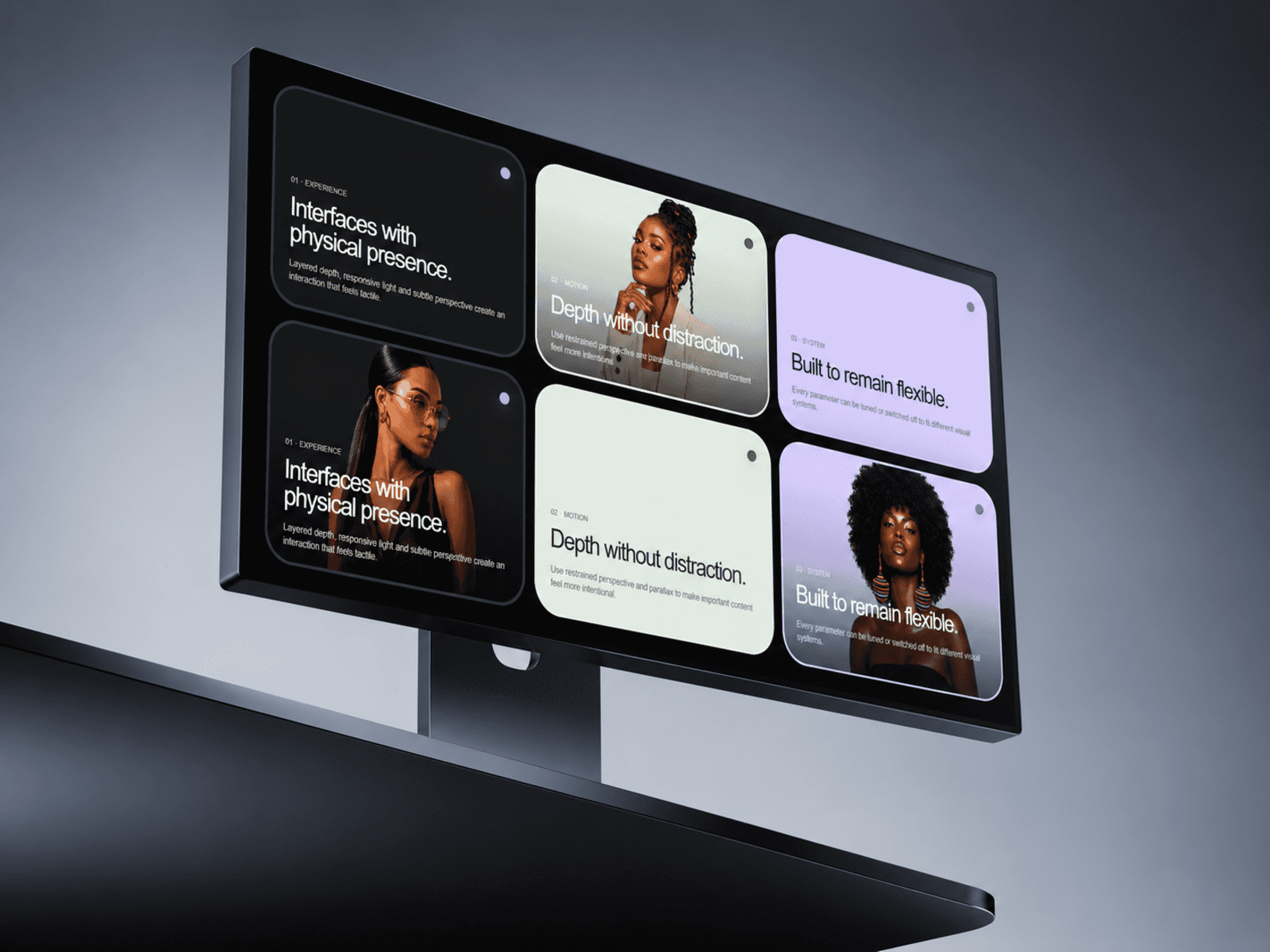
WebX Interactive Bento Grid turns a static card layout into a responsive, motion-rich experience with depth, hover movement, image zoom, pointer tilt and interactive spotlight effects.
Instead of manually building complex card interactions, you get a flexible bento system that is ready to customize directly inside Framer.
Use it for portfolios, product features, services, editorial layouts, landing pages, showcases and premium website sections.
Customize Every Card
Add and arrange cards directly from the Framer property panel.
For each card you can control:
Title
Description
Image
Background color
Text color
Column span
Row span
Link
Create asymmetric layouts, large feature cards, compact supporting cards, or mix both in the same grid.
Responsive by Design
The grid automatically adapts across desktop, tablet and mobile.
Control:
Desktop columns
Tablet columns
Mobile columns
Breakpoints
Row height
Gap
Corner radius
Padding
Cards intelligently reflow as the available space changes.
Interactive Motion
Give the grid a more physical feel with carefully tuned pointer interactions.
Adjust:
Hover lift
Hover scale
Pointer tilt
Tilt strength
Image zoom
Spotlight size
Spotlight intensity
Spotlight color
Motion respects reduced-motion preferences and uses a static fallback where appropriate.
✦ Built-In Playground
Enable the optional Playground to let visitors experiment with the component directly.
They can adjust a small set of high-impact controls including Lift, Tilt, Zoom and Glow while seeing the results instantly.
It’s useful for demos, component showcases and interactive landing pages.
Additional Styling
Fine-tune typography, overlays, borders and shadows directly from the property panel.
WebX Interactive Bento Grid is designed to give you a polished starting point while still leaving plenty of room to make the layout your own.
Support - hello@bodilum.com