About UI Component Card
Here is a detailed description of the UI component card based on the image:
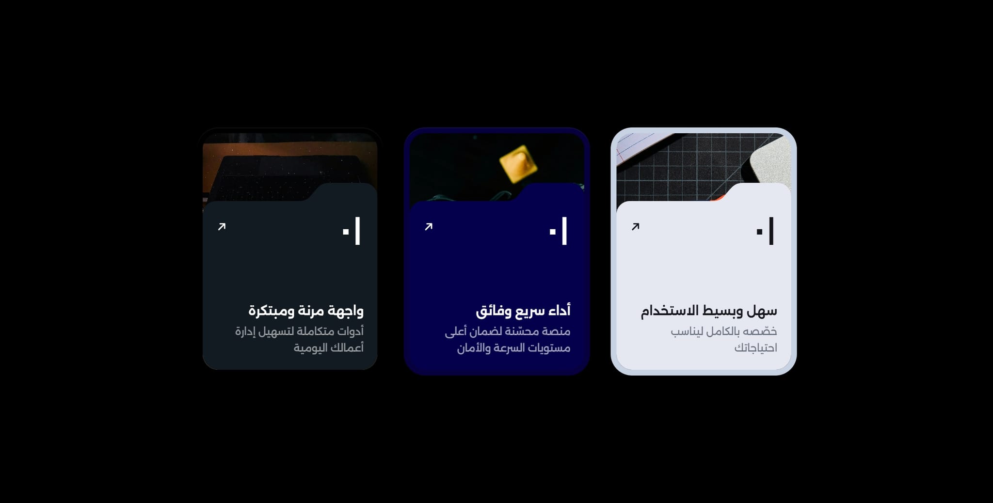
Layout & Structure: A close-up view of a single UI component card with rounded corners.
Top Section: Features a dark, grainy vignette showing a texture of a laptop keyboard or a music production desk.
Bottom Section: A solid charcoal-colored overlay panel that rounds into the vignette above.
Typography: Centered Arabic text inside the dark panel, featuring "سهل وبسيط الاستخدام" (larger and bold at the top) and "خصصه بالكامل ليناسب احتياجاتك" (smaller and lighter below).
Icons: An arrow icon pointing up and to the right in the top-left corner of the dark panel, and a vertical slider icon in the top-right corner. All text and icons are in crisp white.
Lighting: Dramatic lighting that accentuates the texture of the upper background.
Would you like to adjust or format this description for a specific use case?