About Scroll Sections Pro
Scroll Sections Pro
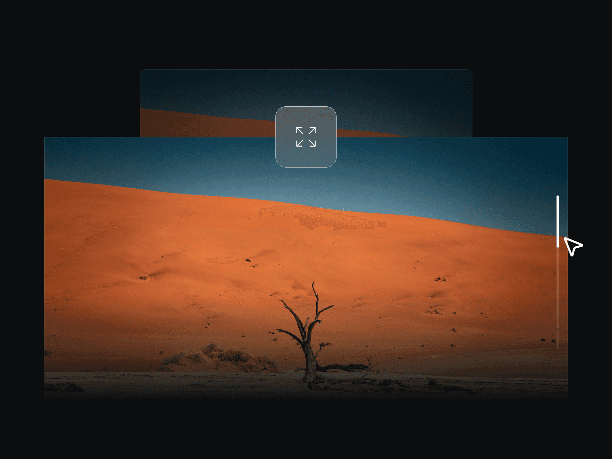
A scroll-driven section that pins to the viewport while your slides move through it. Each slide wipes its image or video across the media column while the heading beside it reveals word by word. Built for services lists, portfolios, case studies, process steps and feature tours. Everything is a property
control: no code, no CSS, no dependencies.
MEDIA — Every slide takes an image or a video. Video accepts an uploaded file or a URL, with poster frame, loop and mute. A video plays only while its slide is on screen and rewinds when it leaves, so five clips never run at once. Cover or contain fit, plus a focal point per slide.
MOTION — Five reveals: wipe left, right, up, down, or crossfade. Set easing, text duration, word stagger, wipe length, and how long the first and last slide hold. Add a travelling accent edge, reveal zoom, reveal blur and a slow Ken Burns drift.
NAVIGATION — Progress rail in four styles: ticks, numbers, slide titles, or a bar. Either side, or off. Click any item to jump to that slide. Optional counter, scroll progress bar and arrow-key stepping.
RESPONSIVE — Separate tablet and mobile breakpoints, each with its own padding, type scale and stacked media height. Breakpoints are measured from the component's own width, so it breaks correctly on the Framer canvas too. Pick svh, vh or dvh to beat the mobile URL bar.
LAYOUT — Media left or right. Column width, gap, padding, radius and inset. Copy aligns top, middle or bottom and left, centre or right. Extended font controls, three CTA styles, per-slide accent and backdrop tint. Optional section header plus two filler sections with show/hide toggles. Sticky-nav offset. Respects reduced motion.
sticky scroll, scroll animation, pinned section, scrollytelling, scroll slider, image reveal, video section, sticky slider, showcase, services section, case study, portfolio, storytelling, parallax, scroll effect, responsive section, feature list, process steps