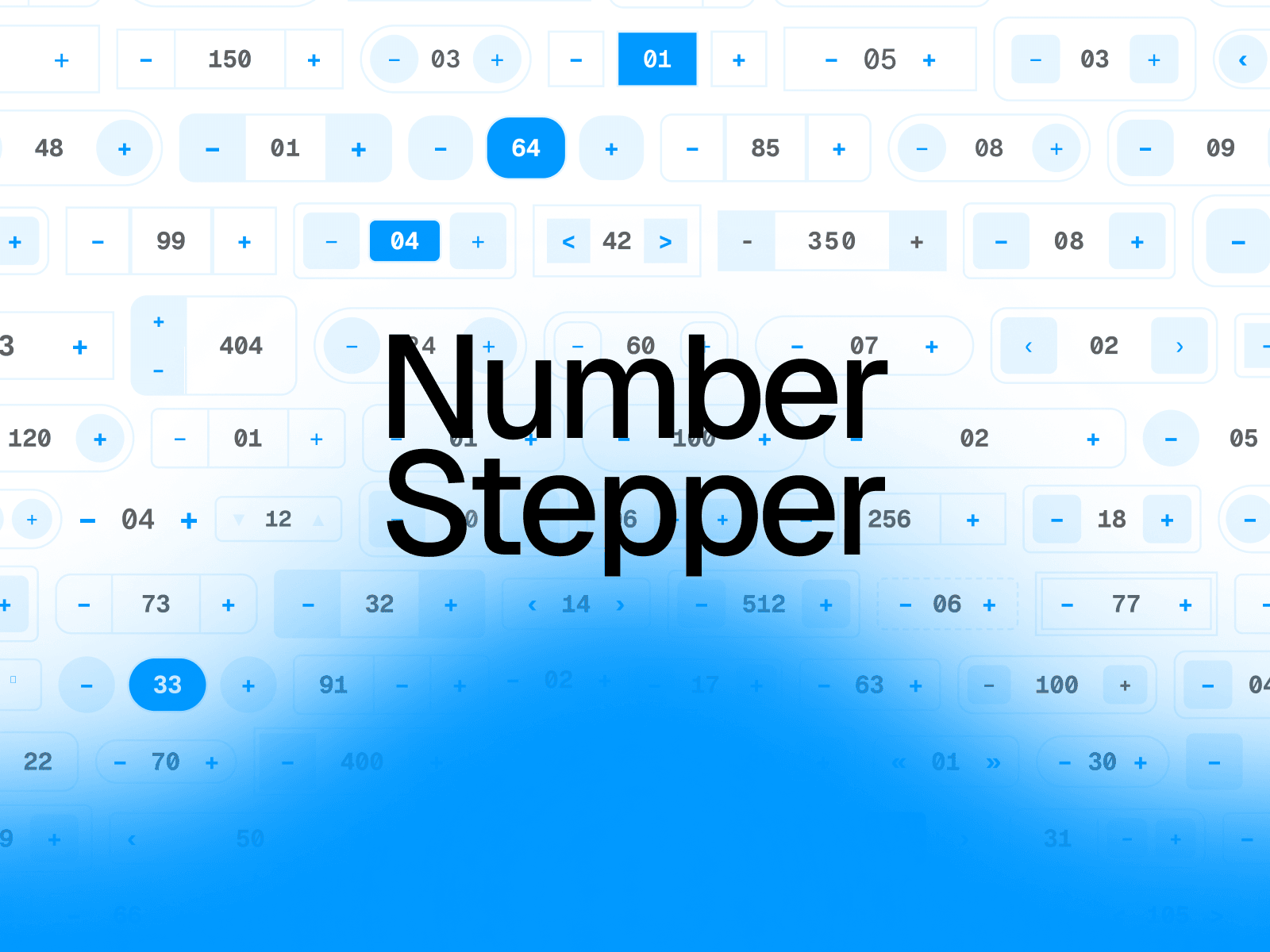
About Number Stepper
Building a quantity selector, price input, or booking widget in Framer means manually stacking buttons next to a text field — then praying it doesn't break when you resize, change fonts, or hit edge cases like "user holds the button" or "value hits zero." Number Stepper eliminates that entire mess. It's a single, self-contained component with real logic: min/max clamping, step increments, hold-to-repeat acceleration, keyboard shortcuts (arrows, Shift+×10, Home/End), and proper ARIA roles for screen readers. You get the behavior of a coded component with the simplicity of a Framer layer.
Perfect For
E-commerce — Product quantity selectors (1–99, step 1)
Bookings & Travel — Guest count, room count, night count
SaaS Dashboards — Numeric filters, seat counts, usage limits
Checkout Flows — Tip amounts, donation values, price adjusters
Forms — Any required numeric field with validation
Design Systems — A reusable numeric input primitive for client projects
Features
8 Style Presets — Classic, Soft, Pill, Minimal, Split, Outline, Solid, Dark
5 Layout Arrangements — Both sides, number-first, number-last, spinner (▲▼), stacked
Full Color Control — Custom background, hover, pressed, text, icon, and error colors
Min / Max / Step Limits — Clamp values, set increment size, support decimals
Prefix & Suffix — $, USD, %, kg, etc. with adjustable spacing
Keyboard Support — ↑↓ arrows, Shift+×10, Home, End
Editable or Buttons-Only — Toggle typing on/off
Custom Icons — +/−, chevrons, uploaded SVG/image, or your own Framer layer
Divider Lines — Optional separators with color, width, inset, and style
Focus Ring — Customizable thickness and color, auto-swaps to error color
Shadow Support — Full box-shadow control
Framer Variables — Connect value to a Variable for two-way binding
Responsive Sizing — Fit, Fixed, or Fill for both width and height