About Hover Bump Trigger
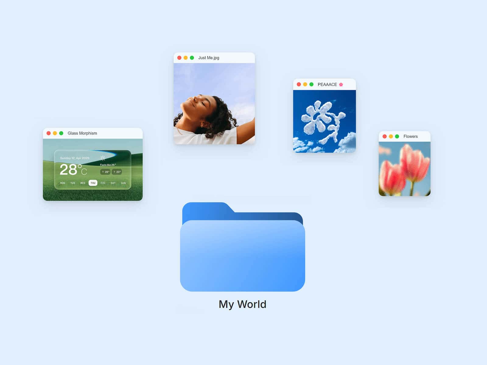
Hover Bump Trigger wraps a springy, physics-based hover reaction around anything you connect to it: an image, a video, a card, a shader, even another Framer component or stack. Hover over it and the linked content kicks away from your cursor with a satisfying bump, then eases back into place.
Made to Be Yours
Link a single component for a pure hover accent, or connect several and clicking cycles between them, each one inheriting the same bump. Every part of the motion is tunable, from how reactive it feels to how far it kicks, plus an ambient float, drop shadow, border, padding, and background so it blends right into your design.
Key Features
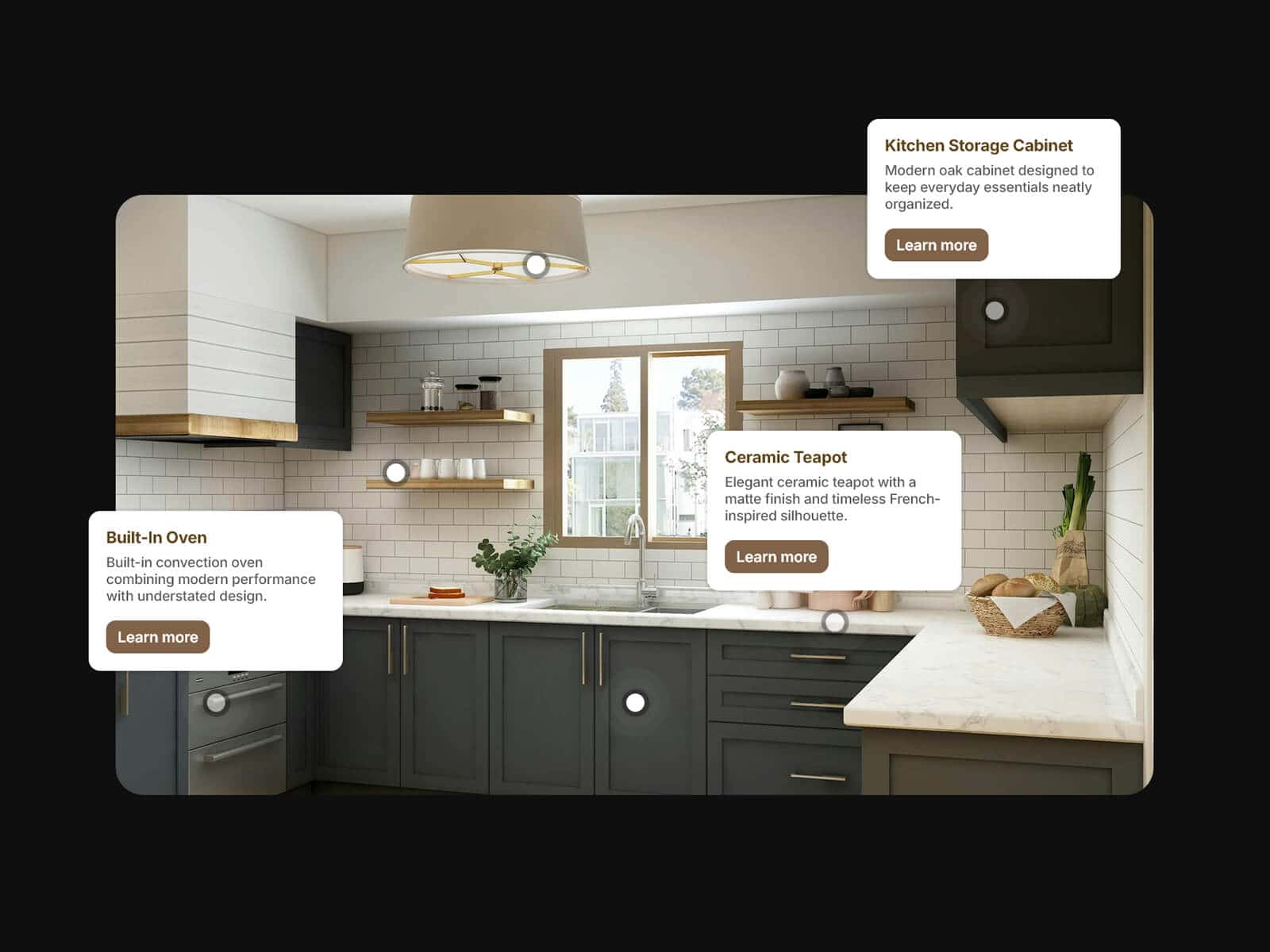
Connect Anything
Link images, videos, shaders, cards, buttons, or entire Framer stacks
Connect several components and click to cycle between them, sequential or random
Works as a wrapper: linked content keeps its own size and styling
Bump Physics
Reactivity, max offset, and max rotation shape how hard the kick feels
Smoothness controls how directly it responds to cursor speed
Optional ambient float for a subtle idle motion when nothing’s hovered
Style
Drop shadow, border, padding, background, and corner radius, all adjustable
Zoom transition when switching between linked components
Custom cursor for the hover state
Usage note
Give the trigger’s parent stack or frame an Overflow of Visible, otherwise the bump gets clipped at the edges. Avoid linking a component with its own click interaction (like a button) alongside other components, since clicking would cycle between them instead of triggering it.
How to Set Up
Drag Hover Bump Trigger onto your canvas
Connect one or more components under Components
Adjust Bump, Float, and Style to match your design
Publish
Refund Policy
All sales of digital products are final and non-refundable. Questions? Contact hellonostromostudio@gmail.com before purchasing. Enjoy!