About Gradient Glow CTA
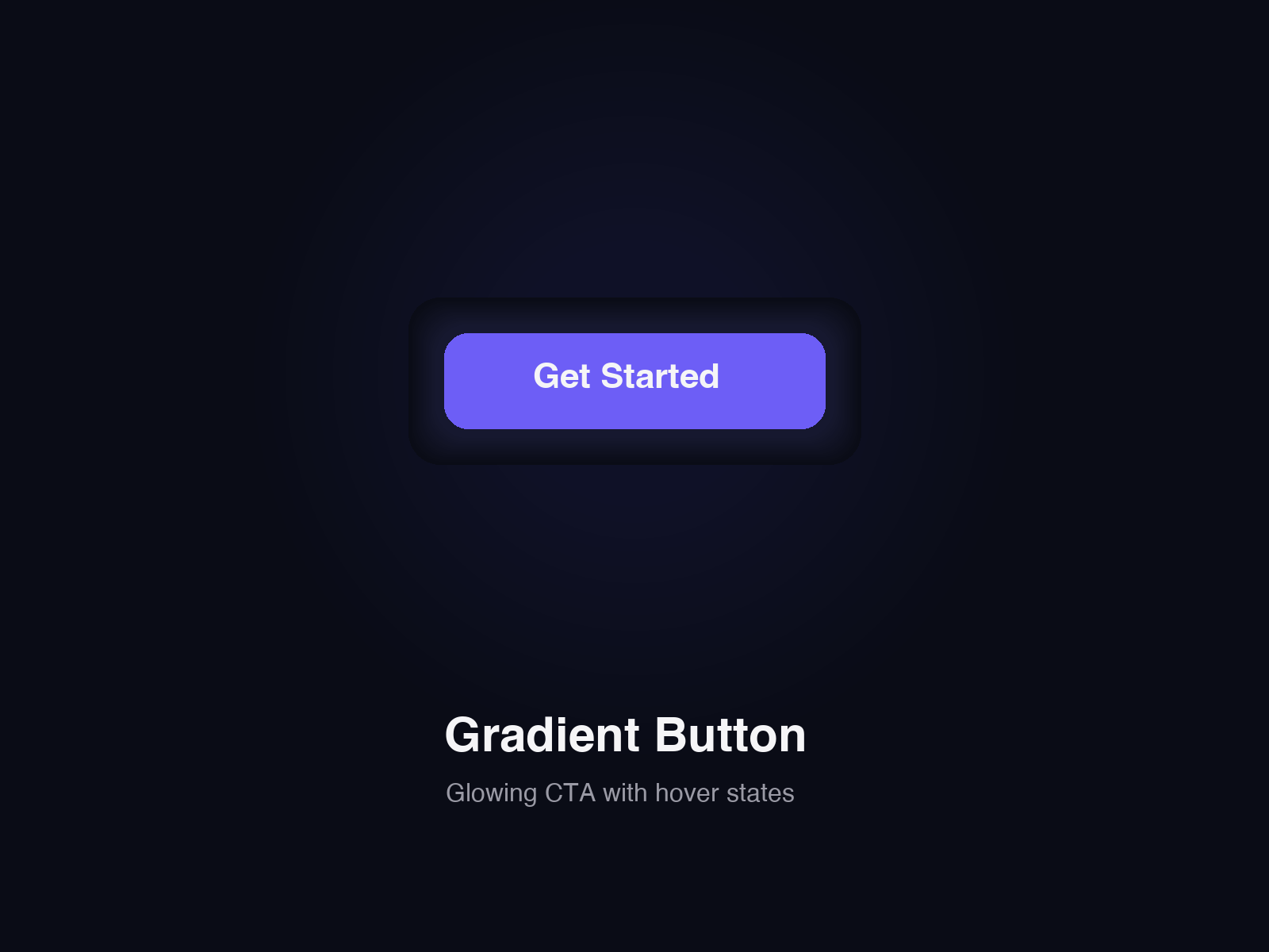
A gradient call-to-action button with a soft glow behind it. On hover or keyboard focus, the gradient slides across the button and the button grows slightly.
Features:
- Gradient sweep on hover and keyboard focus (pure CSS transition)
- Optional glow made from your two gradient colors, with a Glow intensity control (0 to 100)
- Optional slow pulse on the glow, which you can switch off
- Works as a link (Link control, optional new tab) or as a plain button when no link is set
- Visible focus ring for keyboard users
- Label, font, size, radius, angle and color controls, plus a Fill frame option
- Respects reduced motion: no sweep animation, no pulse, glow stays still
- Static on the canvas and in exports: same size and layout, no animation
How to use:
1. Drop the component on your page and set the label.
2. Add a link, or leave it empty for a plain button.
3. Pick the From and To colors and the angle.
4. Set Glow intensity, and turn Pulse on or off.