About Deckshift
An interactive stack of image-led cards that springs open around the project or service you’re exploring.
Built for portfolios, galleries, features and service sections that need more personality than a standard card grid — without turning the interaction into a distraction.
How it works
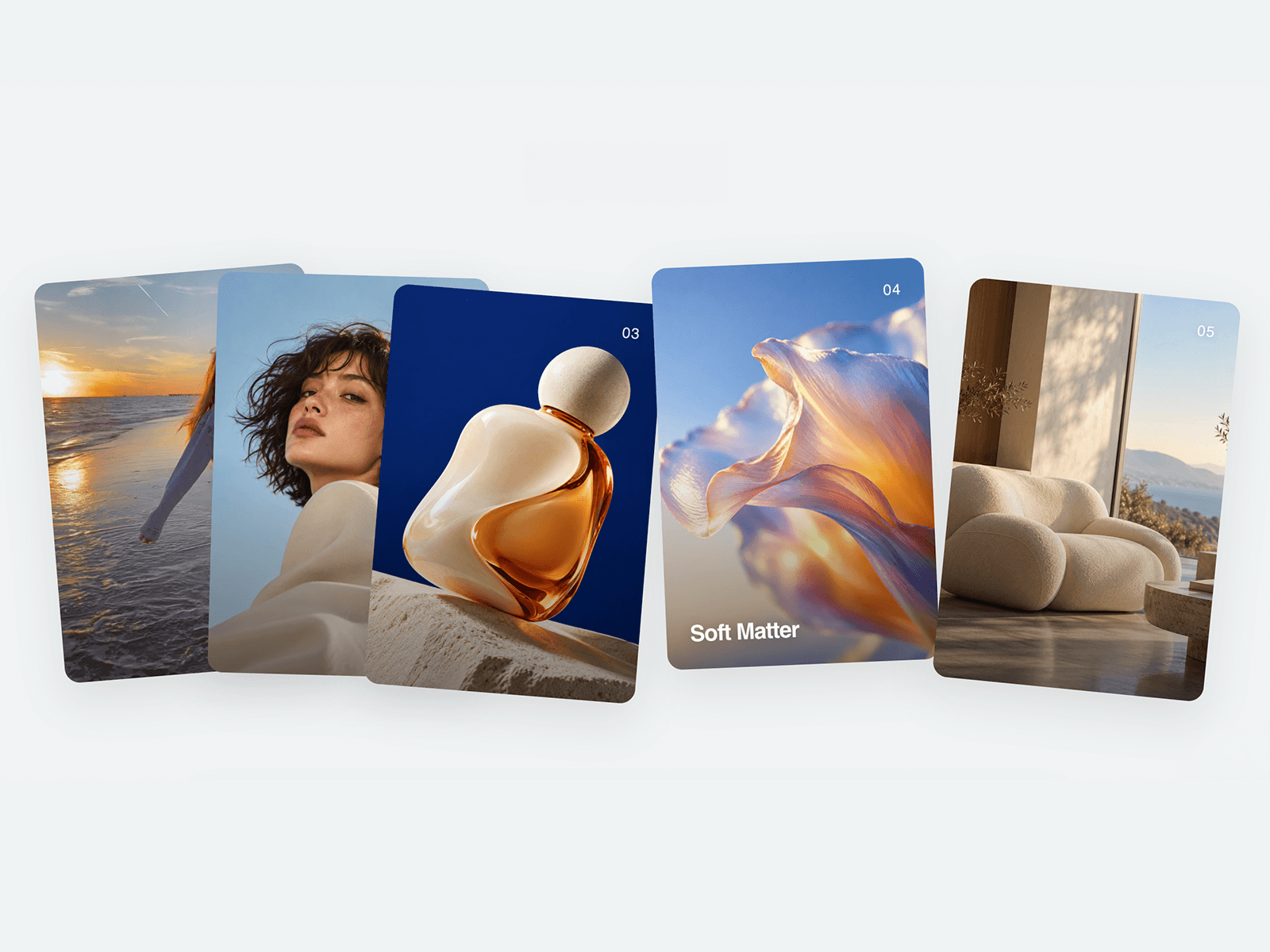
Cards sit naturally overlapped at rest. Hover a card on desktop or tap it on tablet, and the surrounding cards push apart with a tuned spring response while the selected card stays in focus.
On mobile, the stack automatically becomes a simple vertical layout for easier browsing.
What's included
Projects mode: Full-image or video cards with project number, title and individual links
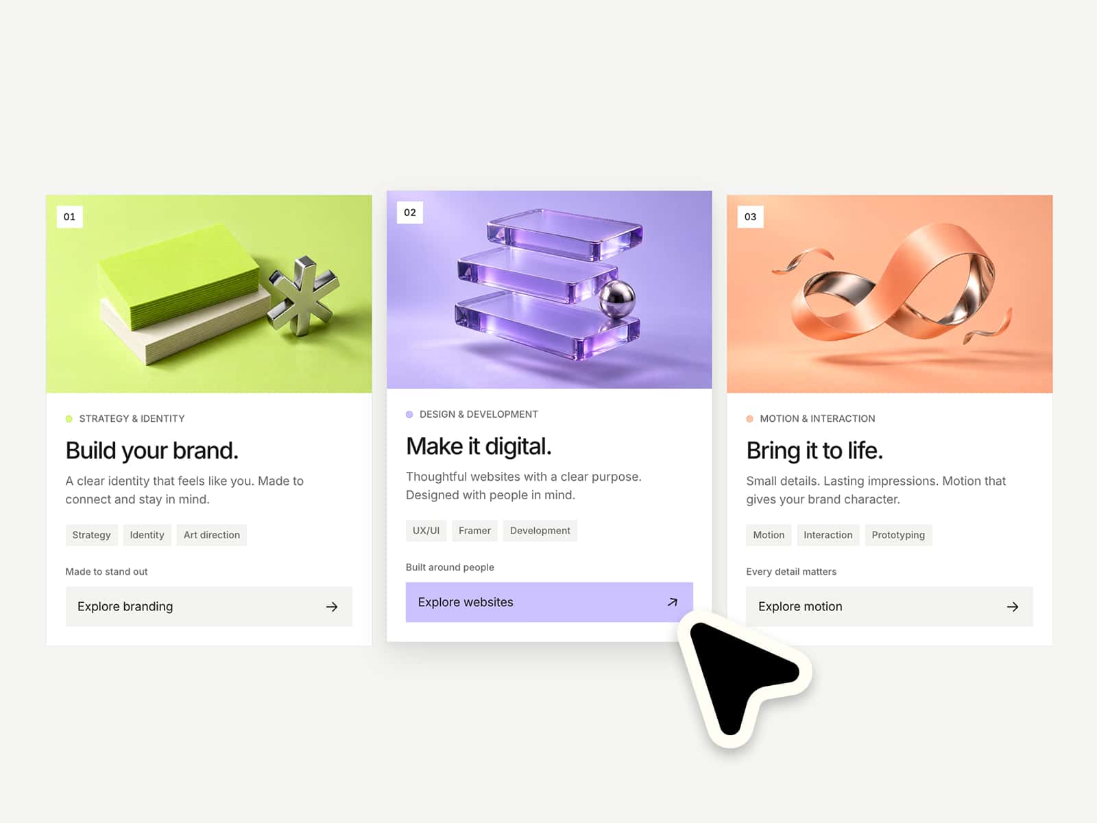
Services mode: Large customisable icons with service titles
Spring interaction: Tuned push-apart movement with subtle overshoot and recoil
Natural card variation: Individual card tilts keep the stack from feeling mechanically uniform
Responsive behaviour: Hover on desktop, tap interaction on tablet, clean stacked layout on mobile
Flexible media: Replace project visuals with your own images or videos
Custom icons: Swap service icons and adjust their size directly from the properties panel
Individual links: Connect cards to project pages, CMS items or any URL
Exposed controls: Adjust card content, spacing, interaction distance and motion without digging into the code
Perfect for
Creative portfolios, agencies, studios, photographers, architects, product showcases and service-led websites.
Drop it into your Framer project, replace the content, and make an otherwise ordinary grid feel much more alive.
Support & Questions
Built and tested for seamless integration. If you have questions before or after purchasing, reach out any time via email.