About Date Input Field
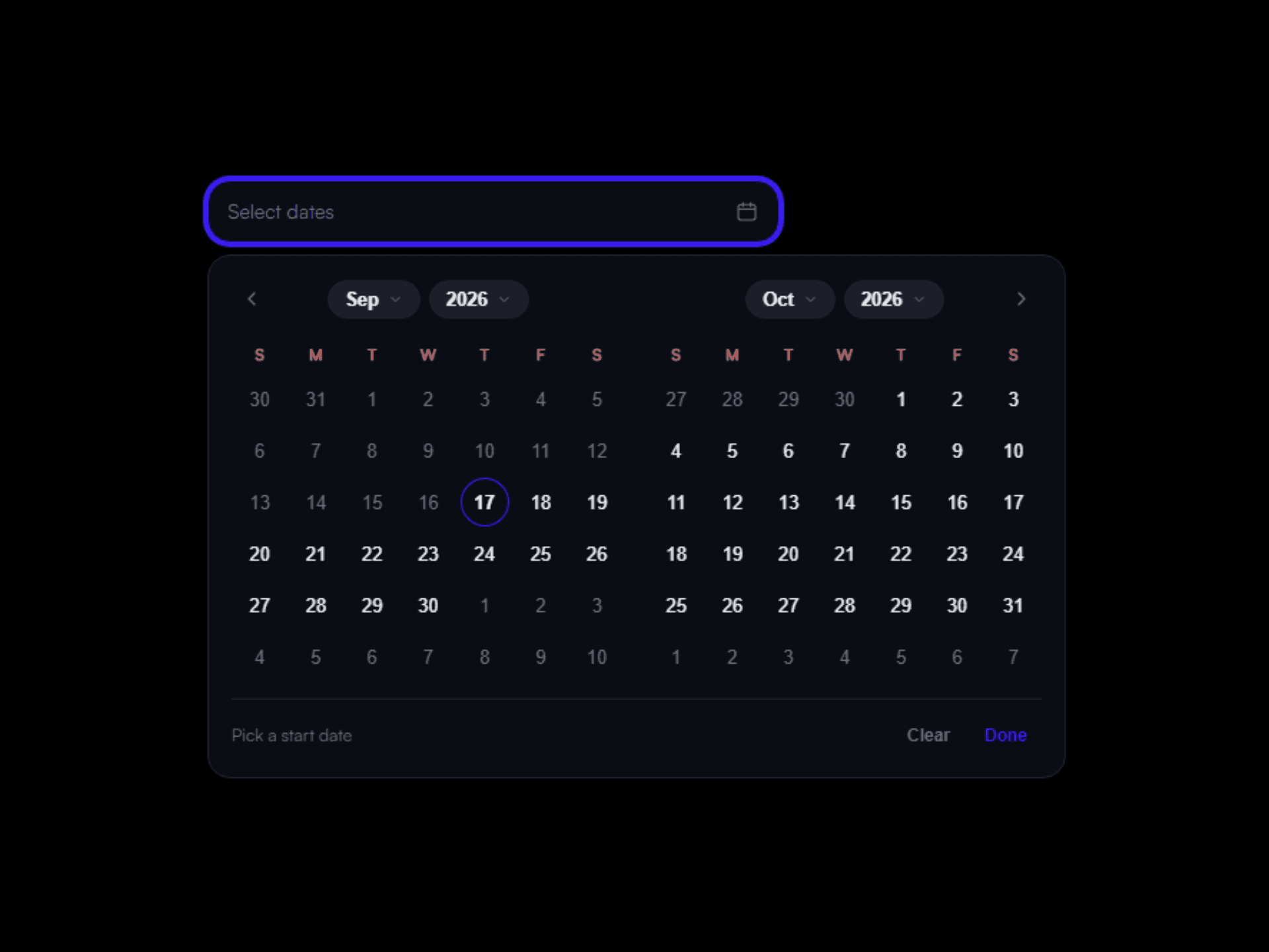
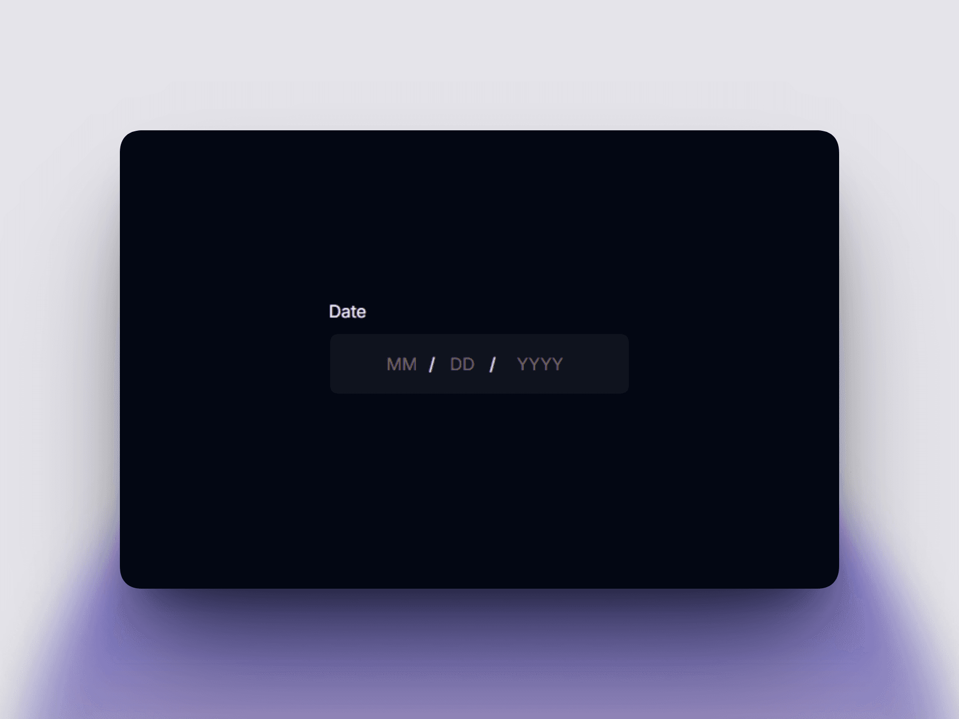
Most date pickers force a calendar popup — clunky on mobile, hard to style, overkill for simple fields like date of birth or checkout. Date Input Field does it differently: three independent, typed segments — Month, Day, Year — that feel like a native app input.
Built for real forms Plugs into Framer's Native Form — no extra setup. Set a Field Name and it posts a clean value to your inbox, like a built-in field.
Real calendar math Every date accepted actually exists. Leap years calculate correctly, and impossible dates like February 30th can't be typed — the day segment clamps live as you type.
Keyboard-first
Type a digit, field auto-advances
Arrow keys move between segments
Backspace on empty segment jumps back
Click a segment to auto-select
Min/Max dates that constrain input Set a min and max date, and the component restricts what's typeable live — not just on submit. Great for bookings that can't be past-dated, or 18+ registrations. Allow Past / Allow Future toggles handle "today" automatically.
Three formats, one source of truth MM/DD/YYYY, DD/MM/YYYY, or YYYY-MM-DD. Internally stored as clean ISO, so your data stays consistent.
States that make sense Default, Focus, Error, Success — independently colorable, plus Disabled and Read Only. Validation fires only after the user leaves the field, never mid-typing.
Fully styleable, zero code Font, colors, border, radius, padding — all property controls. Match your design system in seconds.
What you get:
Independent Month/Day/Year segments
Leap-year and month-length validation
Live Min/Max range enforcement
Allow Past / Allow Future toggles
3 date formats, leading-zero toggle
Required, Disabled, Read Only states
Accessible error messaging
Full Native Form compatibility, fully responsive
If your form needs a date, this gets a clean, validated field in under a minute — no calendar widget required.