

The best small business websites make the value of the business clear quickly. These 12 examples use strong positioning, focused navigation, and distinctive visual systems to build trust without trying to look like a much larger company.
What these small business websites get right
Explain what the business does in one clear opening message.
Show the work, product, or proof early instead of hiding it behind navigation.
Use type, color, and imagery to make the business recognizable.
Keep the path to a quote, booking, purchase, or contact easy to find.
Give every page a job, so the design supports the next action.
12 best small business website examples
Orwell
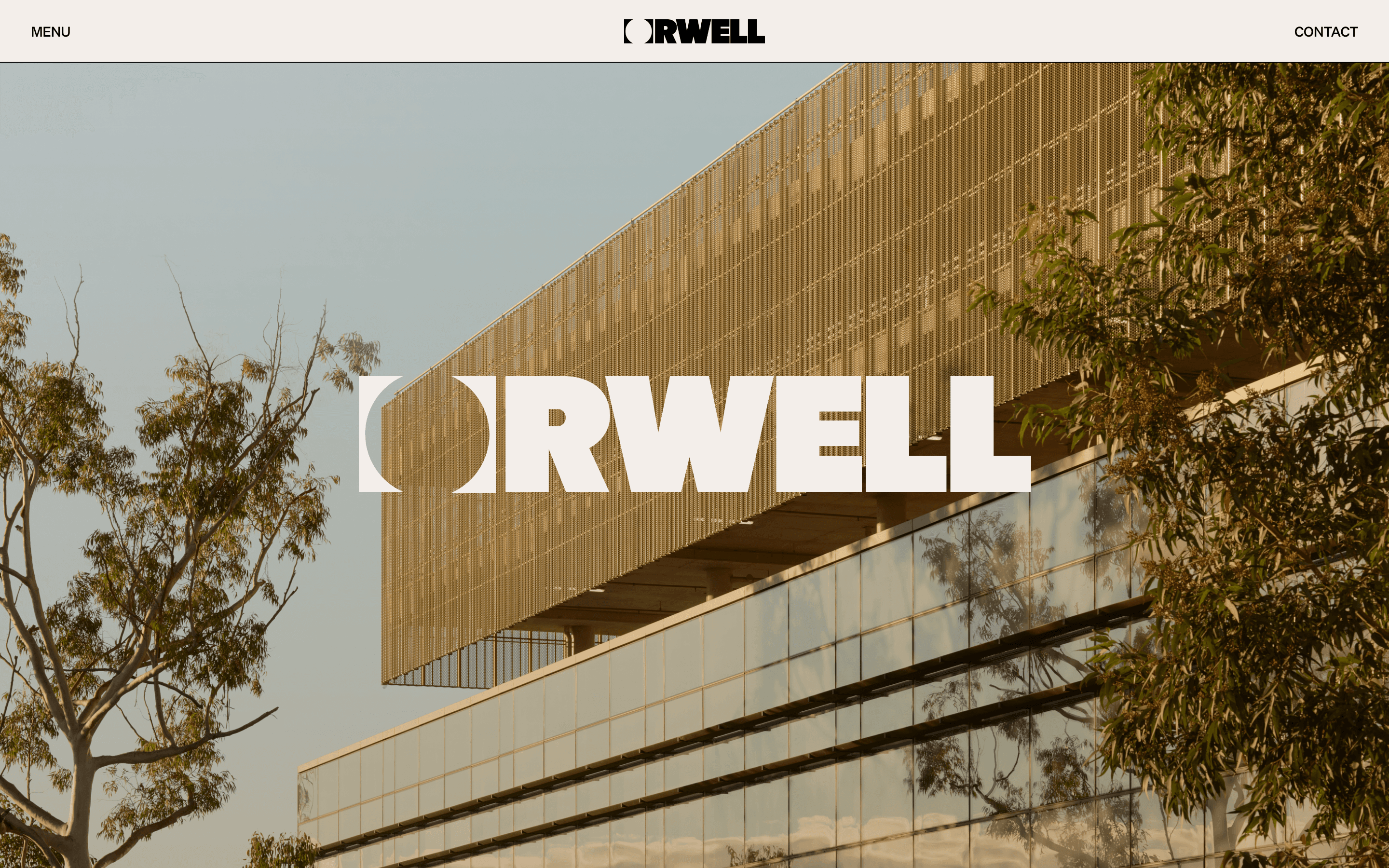
Orwell opens with a strong architectural image and lets the work establish the mood before the copy does. The restrained navigation and generous scale make a specialist business feel confident without crowding the first screen.
Dirtverse
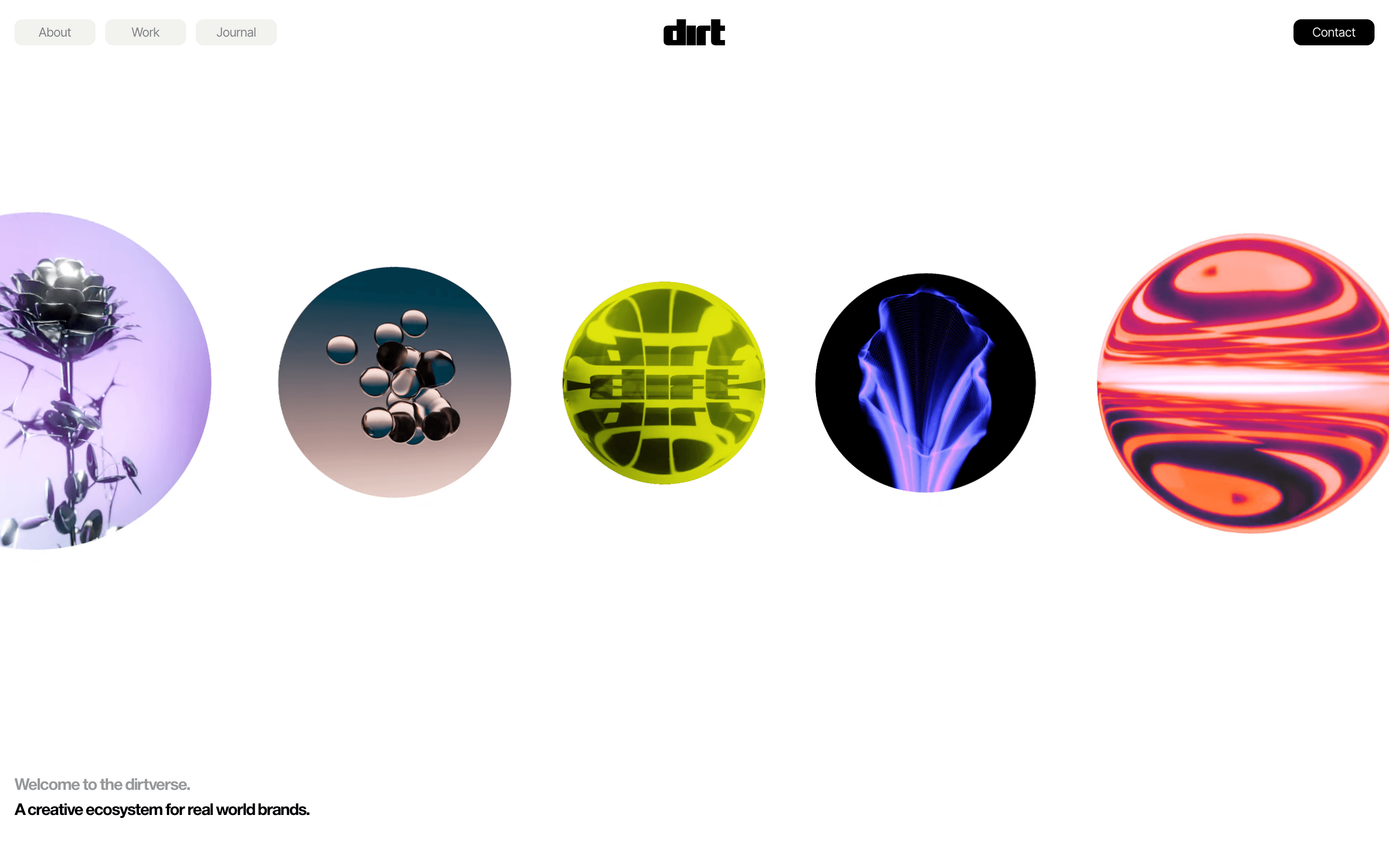
Dirtverse makes a creative studio feel like an ecosystem rather than a list of services. The playful moving forms, simple navigation, and clear “real world brands” positioning give a small team a distinctive point of view without making the site difficult to use.
Interior Design Arch
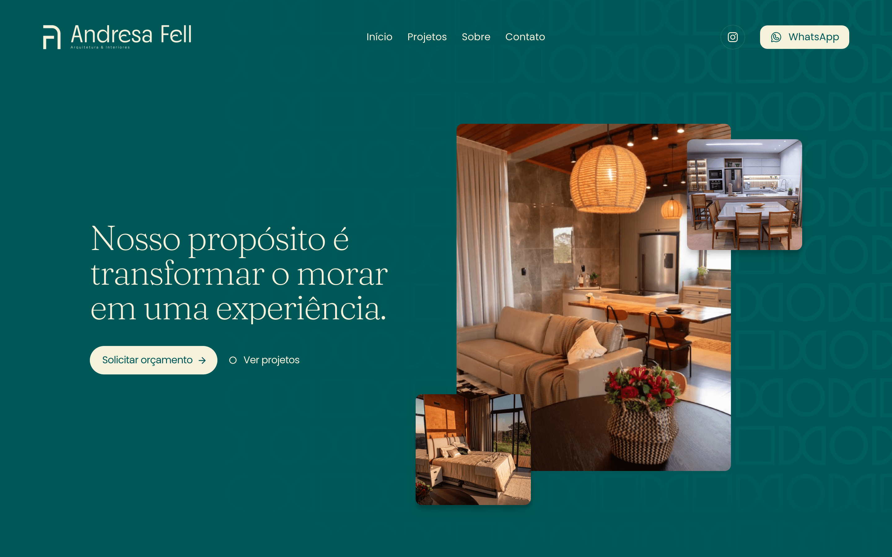
Interior Design Arch uses a calm editorial layout to frame residential architecture as a considered process. Large project imagery, short labels, and a clear rhythm help visitors understand the studio before they dive into individual work.
Default Studio
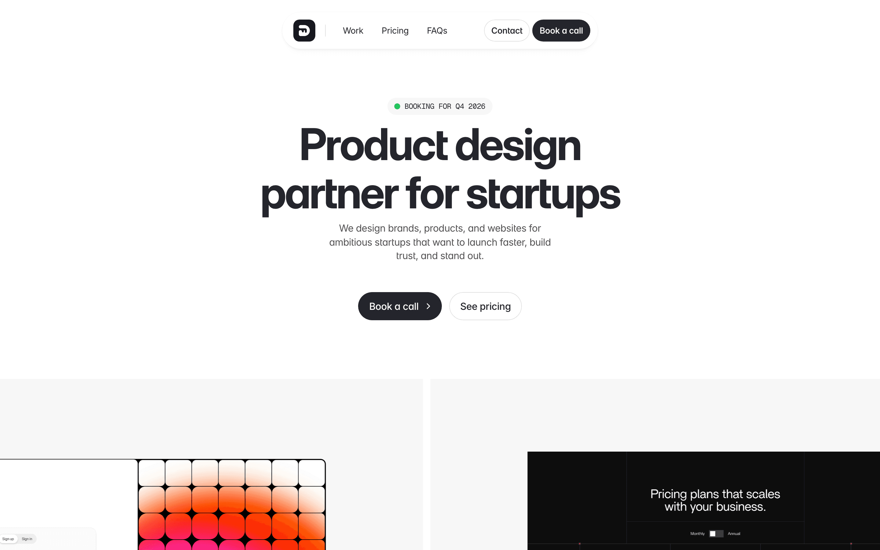
Default Studio makes its offer unmistakable: product design for ambitious startups. A concise headline, supporting proof, and two clear calls to action give the page a useful structure for any small service business.
Luxury Clone

Luxury Clone leads with the product and the feeling around it. The immersive visual treatment creates a premium first impression while the simple path through the site keeps the business easy to understand.
ZPP
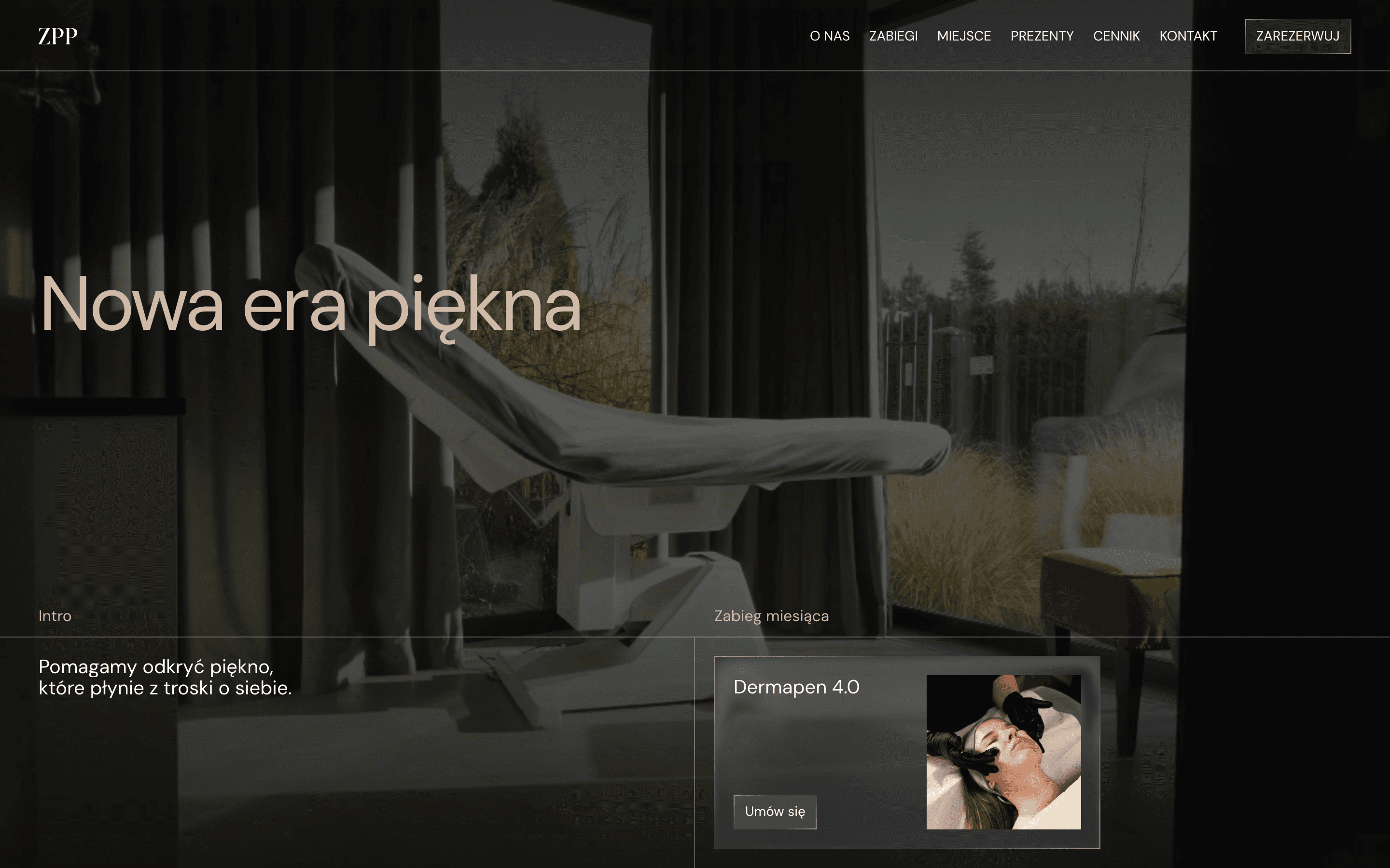
ZPP uses a focused palette and oversized type to give a boutique brand a clear point of view. The opening screen feels distinctive without hiding the navigation, which is a useful balance for customer-facing small businesses.
Wind Stream AI

Wind Stream makes a technical product feel approachable through a simple promise and a compact visual system. The page gives the headline room to work, then uses focused sections to explain the offer without a wall of copy.
Tenbooks
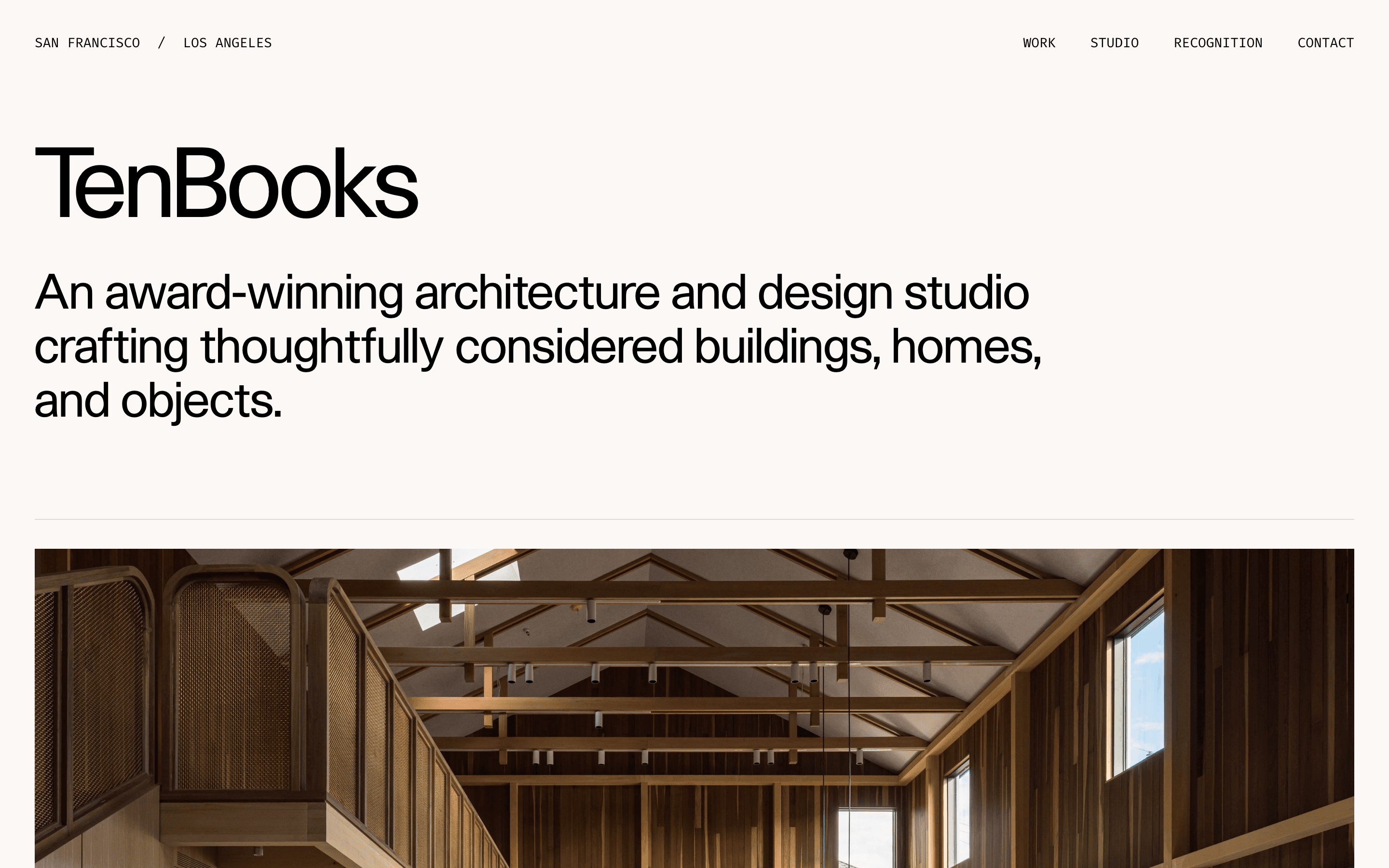
Tenbooks shows how an architecture studio can combine editorial typography with strong project photography. The headline explains the practice in plain language, while the first project image gives visitors an immediate sense of quality.
onebyzero
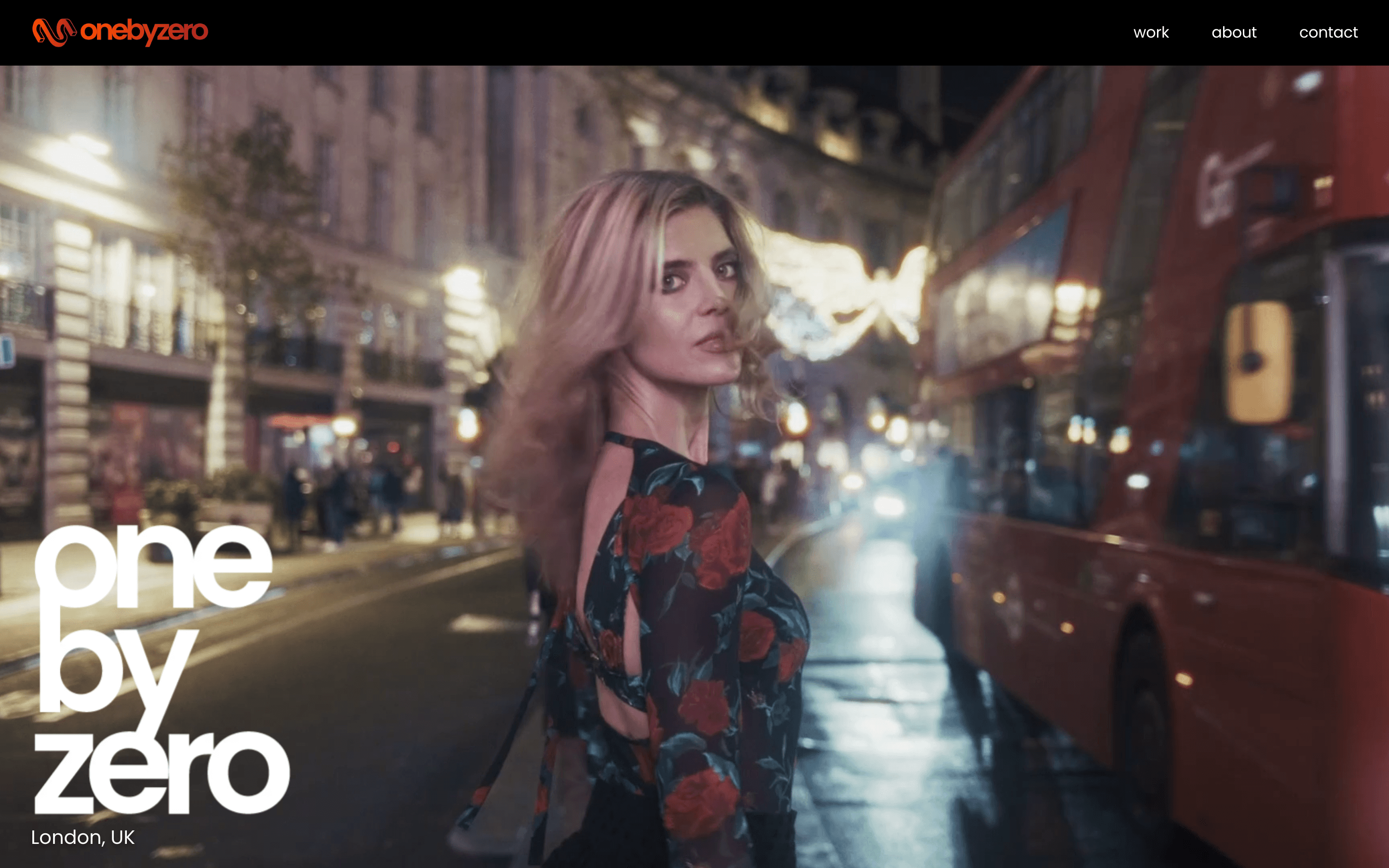
onebyzero treats its production work like a portfolio and a pitch at the same time. A bold opening frame, concise navigation, and immediate visual evidence help a small creative business make its value obvious.
C1rcus Web Store

C1rcus uses a strong graphic language to make a shop feel like a brand world. The contrast and oversized forms are expressive, but the product-led layout keeps the experience grounded in what visitors can explore next.
ANTAEUS PERFORMANCE

ANTAEUS PERFORMANCE makes a specialist service feel energetic and credible from the first viewport. Its bold typography, dark treatment, and direct positioning show how a focused business can own a category with a clear visual voice.
Pinboard
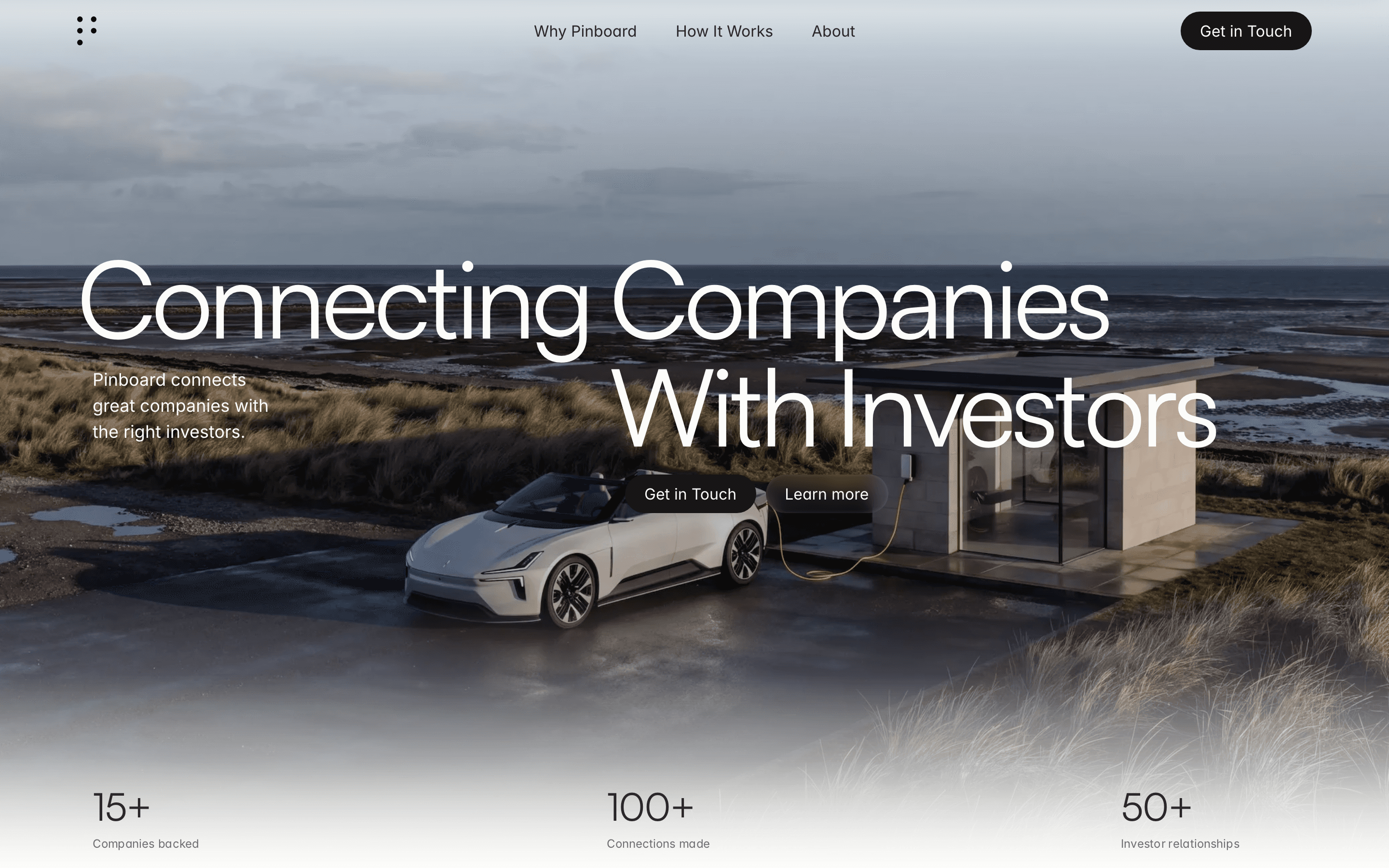
Pinboard leads with a clear business outcome: connecting companies with investors. The message is easy to scan, the visual system stays restrained, and the site gives a high-consideration service a straightforward path to contact.
Find more live examples in Framer’s Business Gallery.
