
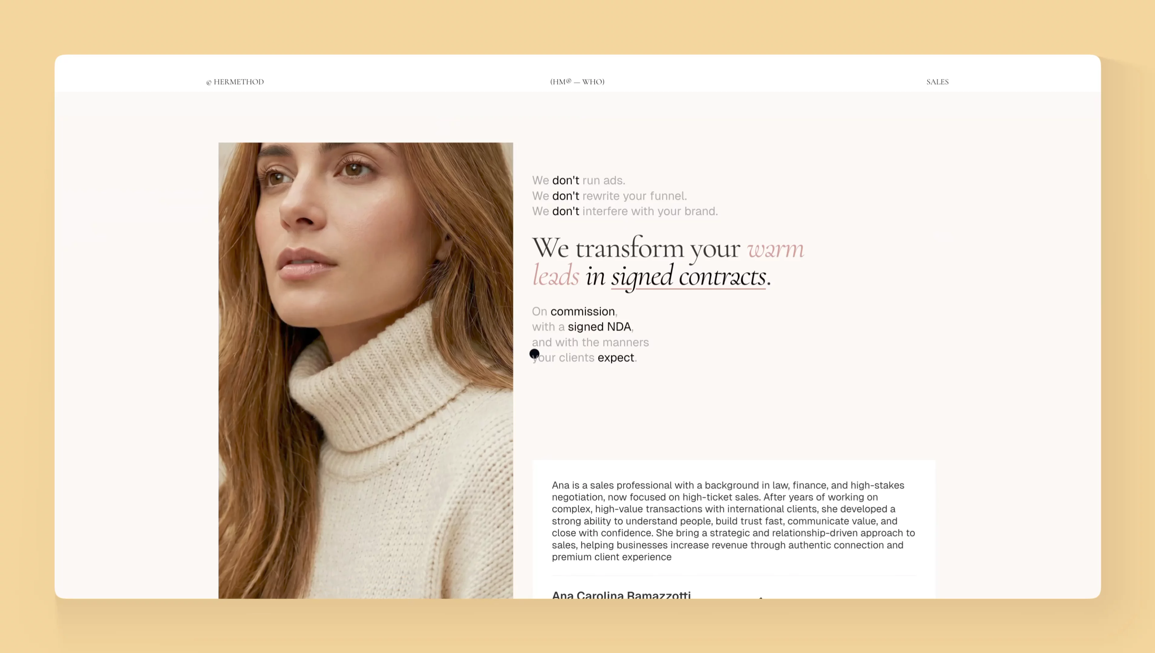
About Her Method
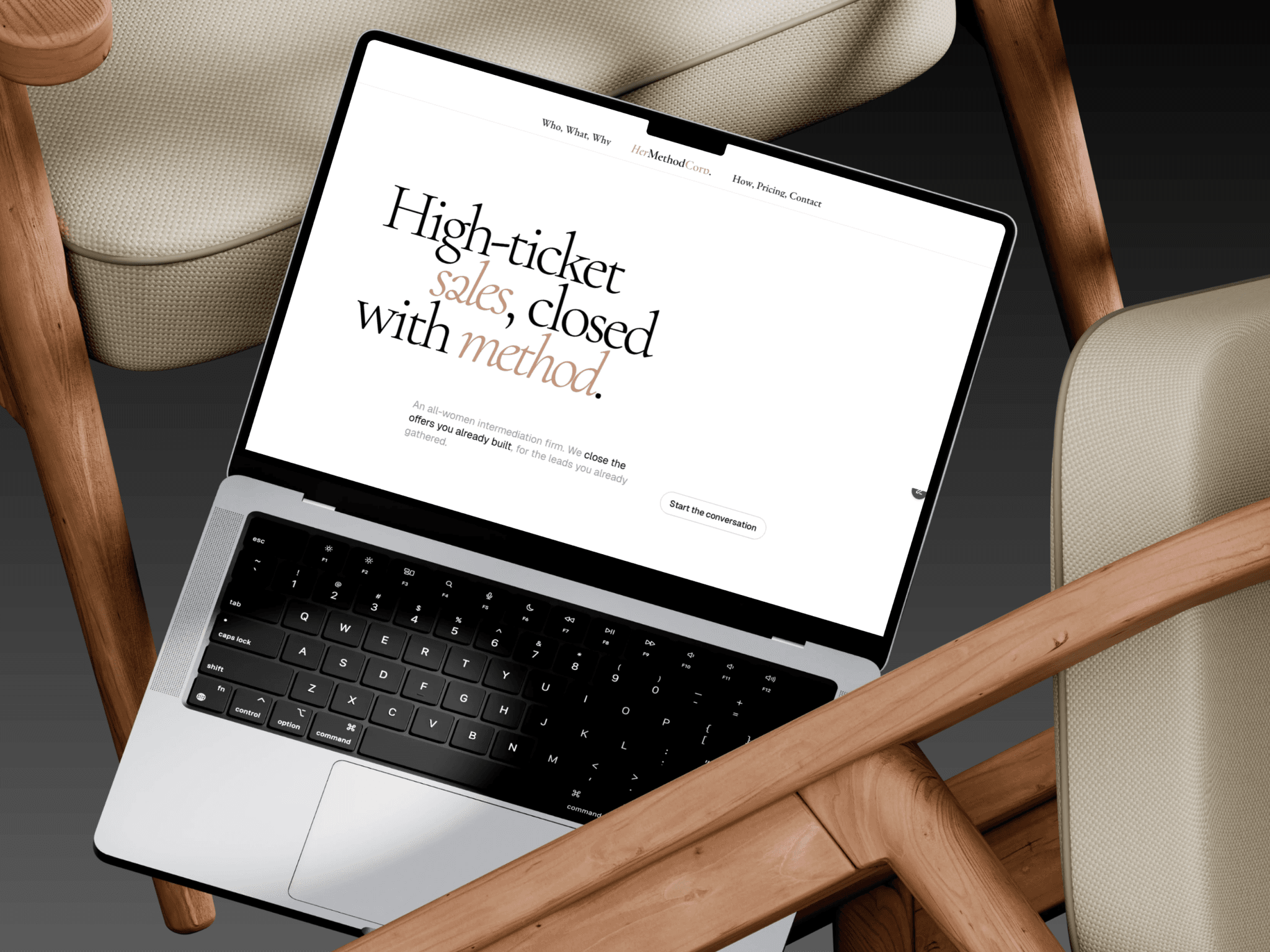
It feels like a private members’ club crossed with a high-end law office: quiet, expensive, and deliberately unbothered. The site sells confidence more than services, big, slow typography, lots of air, and copy that speaks in short, assured sentences.
The overall mood
Think black-and-white editorial luxury with a feminine, slightly cinematic edge. It doesn’t look like a typical sales agency website; it looks like a firm that already knows the deal is happening and is simply deciding whether to take your call.
There’s a strong “old money meets modern creative studio” energy: restrained, composed, polished, but not sterile. The all-women positioning gives it warmth and character, while the legal/finance-inspired language, NDAs, agreements, negotiation, contracts, adds seriousness and authority.
Typography and rhythm
The typography is the personality. Words are broken across lines almost like poetry or a fashion campaign: “High-ticket / sales, closed / with method.” It forces you to slow down, which matches the brand’s promise of considered, high-stakes closing.
The oversized headings feel sculptural rather than decorative. They create a rhythm of pauses, almost like someone speaking calmly, with intention, rather than shouting a sales pitch.
The feeling it creates
Exclusive: You are not being chased; you are being selected.
Composed: Every section feels controlled, from the copy to the spacing.
Feminine without being soft: It leans into women-led power, but through precision and poise rather than clichés.
Premium: The site behaves like the service it sells, no clutter, no urgency banners, no desperate selling.
Editorial: It reads closer to a fashion magazine or boutique consultancy than a SaaS landing page.