Cristian MieluPro Expert


Spain. es/en/fr 🍉
How component variants keep template sites from looking the same
- Every section as a component with multiple variants
- Small shifts on one grid, so any combination works
- Framer Skills that help AI agents pick the right variants

infinite FAQs section

Hey guys! Has anyone here ever migrated a client’s website from WordPress to Framer?
I’m currently working on a potential migration for a website that’s around 10 years old, and I’d love to hear about your experience.
What were the biggest challenges you encountered, especially when migrating an older WordPress site? Things like SEO, redirects, CMS/content migration, URL structure, or anything else that might not be obvious at first.
Would really appreciate any insights or lessons learned from your experience. Need more insight on this one 🙏

✦ Papery : an interactive 3D bookshelf for Framer. Real books that tilt, pull out, and open on click. Not rectangles in book costumes.
✦ How it works:
Drop it on your canvas, shelve as many books as you like, and dress each one in your own spine, cover, and (if you're showing off) a backface. No code. The fun stuff works out of the box.
✦ Why it's unique: Every book is a real, editable 3D object on your canvas, and every cover opens into its own little story. Unlimited shelf space included.
Portfolios, pricing pages, changelogs: everything looks better on a shelf. Go build yours. We'll be judging the covers.

That's a very smart way to be reactive and promote a brand, from a Marketing / Comms point of view. Pure data. Congrats to @Cédric!
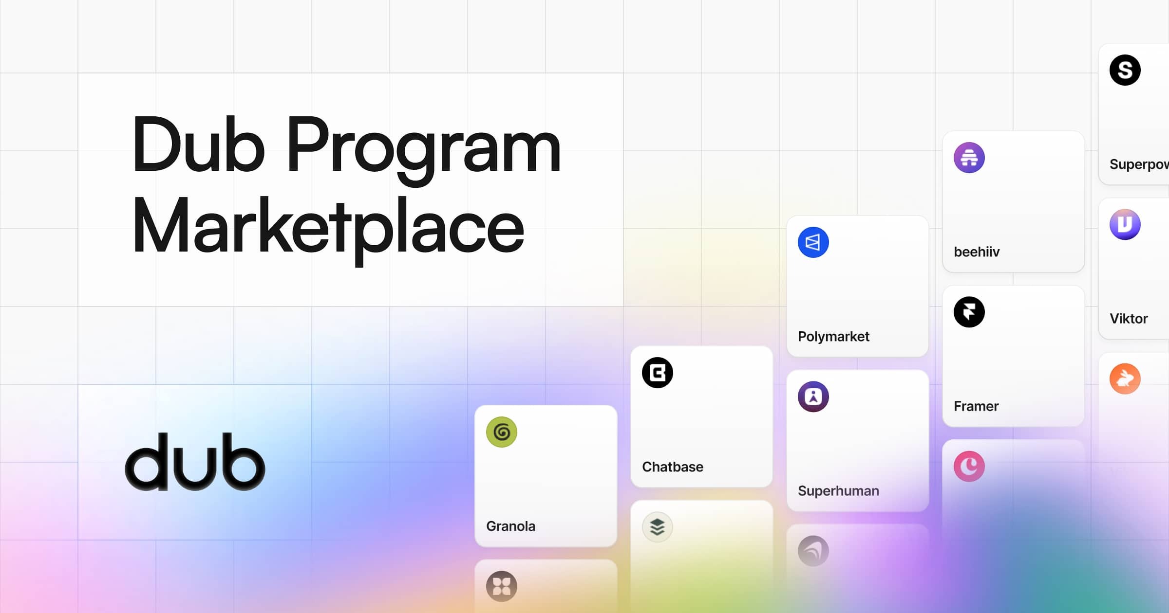
Steven Tey has announced the Dub.com Program Marketplace → https://dub.co/marketplace: "Discover the best affiliate programs in AI, Fitness, Marketing, Fintech, Design, DevTools, and more. Featuring world-class companies like Beehiiv, Wispr Flow, Framer, Granola, Polymarket, Viktor and more." #affiliate marketing

Remix Link : https://framer.link/Iu8faxN
Small Update: Afterform Studio Template's Statistic Section is Now 3D on Desktop & Tablet Screens
Great news for the F team: designer @Lee Jay Robertson just joined Framer.
#updates Framer does not think publishing product / company updates in the Framer Community is a priority —and, to my knowledge, there is no official Framer newsletter—, so here's a couple of reposts from X:
Projects can be pinned to the sidebar.
https://x.com/maxxthedesigner/status/2099588532767764644
Also, the Framer Academy has been updated!

We're launching our first plugin: Drop
Drop turns a JSON tokens file into real Framer styles. Drag a file in, and Drop creates matching Styles in your project's Assets — light and dark variants for colors included. Keep your design system as the source of truth; let Drop keep Framer in sync.
Odin LLM is now free for a limited time. Go grab it, test it and integrate to your Framer site in less than 10 minutes. Also published a deep step by step guide to integrating it.
Guide: https://yoab.framer.website/articles/i-gave-my-framer-site-a-brain-(and-you-can-steal-it)

All my components are free now. 28 of them.
Navigation (Navbar Pill, IslandMenu, Staggered Menu FX, Drawer Popup, TabsCard, InstallTabs), forms (AuthCard, Calendar, MultiSelectCombobox, RadioGroupCards, PricingCard), media (Scroll Video Sync, Video Player Pro, VideoImagePlayer, Video Bento Box, Instagram Video Card), and effects (SpatialWave, GridMosaic, StochasticSwarm, Pixel Blast, Grid Scan, Liquid Ether, Radiant Beams, Floating Lines, Text Cursor FX, Bar Chart, Team Card Flip, AppStoreButtons).
Copy Component → paste → tweak in the property panel. That's it.
Enjoy and ship.

Framer + Shopify: checkout externo, rastreamento certinho.
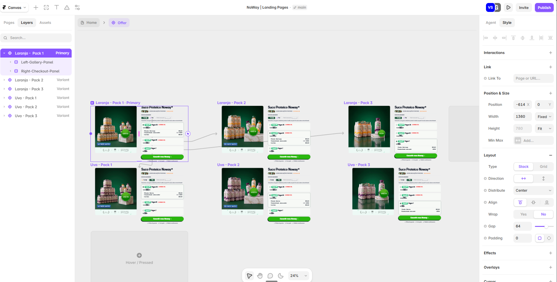
Montei uma LP no Framer com checkout externo no Shopify (sem carrinho nativo, fluxo direct response, poucos cliques até o checkout abrir). Documentei tudo que aprendi no processo:
- Como usar Framer + Shopify assim (sem plugin de sincronização, via cart permalink) vs quando faz mais sentido usar o Frameship
- Como montar os links de carrinho do Shopify do zero (caminho completo no admin)
- Como trackear certinho em GA4 (add_to_cart, begin_checkout) sem quebrar quando o Framer troca de variante
- Como fazer repasse de UTM pro checkout sem perder atribuição
O perigo real de eventos passivos (scroll, load) carregando valor de produto errado e enviesando otimização de campanha no Meta/Google Ads
Tudo com código, print e checklist de validação. Detalhes aqui:
Passou por algo parecido? Comento com prazer.
I was watching this oldie @Framer video on YouTube titled "Build your Documentation Website in Framer" and it turns out the Documentation category no longer exists in the marketplace (?).
Also, I'm seeing actual Documentation templates labelled as SaaS just because they can be used as, or are promoted as, a SaaS docs/help template. But docs and help pages are not just for SaaS! 🤦🏻♂️
The cat/tag convo still isn't polished. I mean, WordPress was a nightmare, but I swear to Jakob Nielsen, you used to be able to find anything, for any purpose, in the WP directories. Because of proper tagging.
#marketgate #marketpocalypse #marketplace #documentation

Re: #marketplace
If you click on the Plugins sections to check out the Recent plugins, you will find, in the first row, popular plugins that have been around for quite some time with September 2026 publication dates. Am I missing something or are the dates wrong?
#feedback cc @Framer

"How big is it?" Every artist gets that question. 🖼
Art Gallery Wall answers it. Type the size of each piece in cm and it hangs your work true to scale in a real room, at eye level, never over the sofa. Ten rooms or your own photo, frames, captions, sold pill, lightbox.
Some of the features:
- 10 room photos: Measured with furniture blocked out, a drawn wall, or your own photo with your own blocked squares.
- 4 ways to hang: exposition, salon, grid and manual.
- 5 Frames Styles
- Eye level, gap and alignment in centimetres.
- Red sold dot, or a sold pill on the work.
- And more!

Took our own components and adapted them for a client project.
📎 Grab this here and make it uniquely yours. For you or your clients. 📎

We just won Site of the day on Awwwards for our latest website for Pangram Pangram. Go check it out!
Hi @Jorn van Dijk. You asked for feedback re: the marketplace re-do. As a journalist/designer, this is my two cents: 1. Much better! 2. There is still room for improvement in the tagging results.
Please re-evaluate how the templates in the Publishing tag arrived there in the first place.: I see lots of portfolio templates (which are not publishing templates) and other templates that look like anything but a professional or an informal media.
Since publishing is one of the most important purposes a CMS can serve, @Framer needs to make sure that anything in that category is exactly what a publisher (prospective or active ) needs, because they will evaluate the eligibility of Framer as a publishing tool according to these criteria, I would say:
1. The tool itself (that rocks already).
2. Available templates that are fit for publishing.
3. The UI frameworks and design systems management options.
4. The assets ecosystem, including connectivity with existing tech and media-targeted solutions.
5. Media-friendly pricing.
(Willing to review publishing templates and to point out the ones that would actually entice an actual newspaper or magazine publisher, and to work in a selection of publishing-related mktplace assets).
Spain. es/en/fr 🍉
How component variants keep template sites from looking the same
- Every section as a component with multiple variants
- Small shifts on one grid, so any combination works
- Framer Skills that help AI agents pick the right variants
infinite FAQs section
Hey guys! Has anyone here ever migrated a client’s website from WordPress to Framer?
I’m currently working on a potential migration for a website that’s around 10 years old, and I’d love to hear about your experience.
What were the biggest challenges you encountered, especially when migrating an older WordPress site? Things like SEO, redirects, CMS/content migration, URL structure, or anything else that might not be obvious at first.
Would really appreciate any insights or lessons learned from your experience. Need more insight on this one 🙏
✦ Papery : an interactive 3D bookshelf for Framer. Real books that tilt, pull out, and open on click. Not rectangles in book costumes.
✦ How it works:
Drop it on your canvas, shelve as many books as you like, and dress each one in your own spine, cover, and (if you're showing off) a backface. No code. The fun stuff works out of the box.
✦ Why it's unique: Every book is a real, editable 3D object on your canvas, and every cover opens into its own little story. Unlimited shelf space included.
Portfolios, pricing pages, changelogs: everything looks better on a shelf. Go build yours. We'll be judging the covers.
That's a very smart way to be reactive and promote a brand, from a Marketing / Comms point of view. Pure data. Congrats to @Cédric!
Steven Tey has announced the Dub.com Program Marketplace → https://dub.co/marketplace: "Discover the best affiliate programs in AI, Fitness, Marketing, Fintech, Design, DevTools, and more. Featuring world-class companies like Beehiiv, Wispr Flow, Framer, Granola, Polymarket, Viktor and more." #affiliate marketing
Remix Link : https://framer.link/Iu8faxN
Small Update: Afterform Studio Template's Statistic Section is Now 3D on Desktop & Tablet Screens
Great news for the F team: designer @Lee Jay Robertson just joined Framer.
#updates Framer does not think publishing product / company updates in the Framer Community is a priority —and, to my knowledge, there is no official Framer newsletter—, so here's a couple of reposts from X:
Projects can be pinned to the sidebar.
https://x.com/maxxthedesigner/status/2099588532767764644
Also, the Framer Academy has been updated!
We're launching our first plugin: Drop
Drop turns a JSON tokens file into real Framer styles. Drag a file in, and Drop creates matching Styles in your project's Assets — light and dark variants for colors included. Keep your design system as the source of truth; let Drop keep Framer in sync.
Odin LLM is now free for a limited time. Go grab it, test it and integrate to your Framer site in less than 10 minutes. Also published a deep step by step guide to integrating it.
Guide: https://yoab.framer.website/articles/i-gave-my-framer-site-a-brain-(and-you-can-steal-it)
All my components are free now. 28 of them.
Navigation (Navbar Pill, IslandMenu, Staggered Menu FX, Drawer Popup, TabsCard, InstallTabs), forms (AuthCard, Calendar, MultiSelectCombobox, RadioGroupCards, PricingCard), media (Scroll Video Sync, Video Player Pro, VideoImagePlayer, Video Bento Box, Instagram Video Card), and effects (SpatialWave, GridMosaic, StochasticSwarm, Pixel Blast, Grid Scan, Liquid Ether, Radiant Beams, Floating Lines, Text Cursor FX, Bar Chart, Team Card Flip, AppStoreButtons).
Copy Component → paste → tweak in the property panel. That's it.
Enjoy and ship.
Framer + Shopify: checkout externo, rastreamento certinho.
Montei uma LP no Framer com checkout externo no Shopify (sem carrinho nativo, fluxo direct response, poucos cliques até o checkout abrir). Documentei tudo que aprendi no processo:
- Como usar Framer + Shopify assim (sem plugin de sincronização, via cart permalink) vs quando faz mais sentido usar o Frameship
- Como montar os links de carrinho do Shopify do zero (caminho completo no admin)
- Como trackear certinho em GA4 (add_to_cart, begin_checkout) sem quebrar quando o Framer troca de variante
- Como fazer repasse de UTM pro checkout sem perder atribuição
O perigo real de eventos passivos (scroll, load) carregando valor de produto errado e enviesando otimização de campanha no Meta/Google Ads
Tudo com código, print e checklist de validação. Detalhes aqui:
Passou por algo parecido? Comento com prazer.
I was watching this oldie @Framer video on YouTube titled "Build your Documentation Website in Framer" and it turns out the Documentation category no longer exists in the marketplace (?).
Also, I'm seeing actual Documentation templates labelled as SaaS just because they can be used as, or are promoted as, a SaaS docs/help template. But docs and help pages are not just for SaaS! 🤦🏻♂️
The cat/tag convo still isn't polished. I mean, WordPress was a nightmare, but I swear to Jakob Nielsen, you used to be able to find anything, for any purpose, in the WP directories. Because of proper tagging.
#marketgate #marketpocalypse #marketplace #documentation
Re: #marketplace
If you click on the Plugins sections to check out the Recent plugins, you will find, in the first row, popular plugins that have been around for quite some time with September 2026 publication dates. Am I missing something or are the dates wrong?
#feedback cc @Framer
"How big is it?" Every artist gets that question. 🖼
Art Gallery Wall answers it. Type the size of each piece in cm and it hangs your work true to scale in a real room, at eye level, never over the sofa. Ten rooms or your own photo, frames, captions, sold pill, lightbox.
Some of the features:
- 10 room photos: Measured with furniture blocked out, a drawn wall, or your own photo with your own blocked squares.
- 4 ways to hang: exposition, salon, grid and manual.
- 5 Frames Styles
- Eye level, gap and alignment in centimetres.
- Red sold dot, or a sold pill on the work.
- And more!
Took our own components and adapted them for a client project.
📎 Grab this here and make it uniquely yours. For you or your clients. 📎
We just won Site of the day on Awwwards for our latest website for Pangram Pangram. Go check it out!
Hi @Jorn van Dijk. You asked for feedback re: the marketplace re-do. As a journalist/designer, this is my two cents: 1. Much better! 2. There is still room for improvement in the tagging results.
Please re-evaluate how the templates in the Publishing tag arrived there in the first place.: I see lots of portfolio templates (which are not publishing templates) and other templates that look like anything but a professional or an informal media.
Since publishing is one of the most important purposes a CMS can serve, @Framer needs to make sure that anything in that category is exactly what a publisher (prospective or active ) needs, because they will evaluate the eligibility of Framer as a publishing tool according to these criteria, I would say:
1. The tool itself (that rocks already).
2. Available templates that are fit for publishing.
3. The UI frameworks and design systems management options.
4. The assets ecosystem, including connectivity with existing tech and media-targeted solutions.
5. Media-friendly pricing.
(Willing to review publishing templates and to point out the ones that would actually entice an actual newspaper or magazine publisher, and to work in a selection of publishing-related mktplace assets).
How component variants keep template sites from looking the same
- Every section as a component with multiple variants
- Small shifts on one grid, so any combination works
- Framer Skills that help AI agents pick the right variants
infinite FAQs section
Hey guys! Has anyone here ever migrated a client’s website from WordPress to Framer?
I’m currently working on a potential migration for a website that’s around 10 years old, and I’d love to hear about your experience.
What were the biggest challenges you encountered, especially when migrating an older WordPress site? Things like SEO, redirects, CMS/content migration, URL structure, or anything else that might not be obvious at first.
Would really appreciate any insights or lessons learned from your experience. Need more insight on this one 🙏
✦ Papery : an interactive 3D bookshelf for Framer. Real books that tilt, pull out, and open on click. Not rectangles in book costumes.
✦ How it works:
Drop it on your canvas, shelve as many books as you like, and dress each one in your own spine, cover, and (if you're showing off) a backface. No code. The fun stuff works out of the box.
✦ Why it's unique: Every book is a real, editable 3D object on your canvas, and every cover opens into its own little story. Unlimited shelf space included.
Portfolios, pricing pages, changelogs: everything looks better on a shelf. Go build yours. We'll be judging the covers.
That's a very smart way to be reactive and promote a brand, from a Marketing / Comms point of view. Pure data. Congrats to @Cédric!
Steven Tey has announced the Dub.com Program Marketplace → https://dub.co/marketplace: "Discover the best affiliate programs in AI, Fitness, Marketing, Fintech, Design, DevTools, and more. Featuring world-class companies like Beehiiv, Wispr Flow, Framer, Granola, Polymarket, Viktor and more." #affiliate marketing
Remix Link : https://framer.link/Iu8faxN
Small Update: Afterform Studio Template's Statistic Section is Now 3D on Desktop & Tablet Screens
Great news for the F team: designer @Lee Jay Robertson just joined Framer.
#updates Framer does not think publishing product / company updates in the Framer Community is a priority —and, to my knowledge, there is no official Framer newsletter—, so here's a couple of reposts from X:
Projects can be pinned to the sidebar.
https://x.com/maxxthedesigner/status/2099588532767764644
Also, the Framer Academy has been updated!
We're launching our first plugin: Drop
Drop turns a JSON tokens file into real Framer styles. Drag a file in, and Drop creates matching Styles in your project's Assets — light and dark variants for colors included. Keep your design system as the source of truth; let Drop keep Framer in sync.
Odin LLM is now free for a limited time. Go grab it, test it and integrate to your Framer site in less than 10 minutes. Also published a deep step by step guide to integrating it.
Guide: https://yoab.framer.website/articles/i-gave-my-framer-site-a-brain-(and-you-can-steal-it)
All my components are free now. 28 of them.
Navigation (Navbar Pill, IslandMenu, Staggered Menu FX, Drawer Popup, TabsCard, InstallTabs), forms (AuthCard, Calendar, MultiSelectCombobox, RadioGroupCards, PricingCard), media (Scroll Video Sync, Video Player Pro, VideoImagePlayer, Video Bento Box, Instagram Video Card), and effects (SpatialWave, GridMosaic, StochasticSwarm, Pixel Blast, Grid Scan, Liquid Ether, Radiant Beams, Floating Lines, Text Cursor FX, Bar Chart, Team Card Flip, AppStoreButtons).
Copy Component → paste → tweak in the property panel. That's it.
Enjoy and ship.
Framer + Shopify: checkout externo, rastreamento certinho.
Montei uma LP no Framer com checkout externo no Shopify (sem carrinho nativo, fluxo direct response, poucos cliques até o checkout abrir). Documentei tudo que aprendi no processo:
- Como usar Framer + Shopify assim (sem plugin de sincronização, via cart permalink) vs quando faz mais sentido usar o Frameship
- Como montar os links de carrinho do Shopify do zero (caminho completo no admin)
- Como trackear certinho em GA4 (add_to_cart, begin_checkout) sem quebrar quando o Framer troca de variante
- Como fazer repasse de UTM pro checkout sem perder atribuição
O perigo real de eventos passivos (scroll, load) carregando valor de produto errado e enviesando otimização de campanha no Meta/Google Ads
Tudo com código, print e checklist de validação. Detalhes aqui:
Passou por algo parecido? Comento com prazer.
I was watching this oldie @Framer video on YouTube titled "Build your Documentation Website in Framer" and it turns out the Documentation category no longer exists in the marketplace (?).
Also, I'm seeing actual Documentation templates labelled as SaaS just because they can be used as, or are promoted as, a SaaS docs/help template. But docs and help pages are not just for SaaS! 🤦🏻♂️
The cat/tag convo still isn't polished. I mean, WordPress was a nightmare, but I swear to Jakob Nielsen, you used to be able to find anything, for any purpose, in the WP directories. Because of proper tagging.
#marketgate #marketpocalypse #marketplace #documentation
Re: #marketplace
If you click on the Plugins sections to check out the Recent plugins, you will find, in the first row, popular plugins that have been around for quite some time with September 2026 publication dates. Am I missing something or are the dates wrong?
#feedback cc @Framer
"How big is it?" Every artist gets that question. 🖼
Art Gallery Wall answers it. Type the size of each piece in cm and it hangs your work true to scale in a real room, at eye level, never over the sofa. Ten rooms or your own photo, frames, captions, sold pill, lightbox.
Some of the features:
- 10 room photos: Measured with furniture blocked out, a drawn wall, or your own photo with your own blocked squares.
- 4 ways to hang: exposition, salon, grid and manual.
- 5 Frames Styles
- Eye level, gap and alignment in centimetres.
- Red sold dot, or a sold pill on the work.
- And more!
Took our own components and adapted them for a client project.
📎 Grab this here and make it uniquely yours. For you or your clients. 📎
We just won Site of the day on Awwwards for our latest website for Pangram Pangram. Go check it out!
Hi @Jorn van Dijk. You asked for feedback re: the marketplace re-do. As a journalist/designer, this is my two cents: 1. Much better! 2. There is still room for improvement in the tagging results.
Please re-evaluate how the templates in the Publishing tag arrived there in the first place.: I see lots of portfolio templates (which are not publishing templates) and other templates that look like anything but a professional or an informal media.
Since publishing is one of the most important purposes a CMS can serve, @Framer needs to make sure that anything in that category is exactly what a publisher (prospective or active ) needs, because they will evaluate the eligibility of Framer as a publishing tool according to these criteria, I would say:
1. The tool itself (that rocks already).
2. Available templates that are fit for publishing.
3. The UI frameworks and design systems management options.
4. The assets ecosystem, including connectivity with existing tech and media-targeted solutions.
5. Media-friendly pricing.
(Willing to review publishing templates and to point out the ones that would actually entice an actual newspaper or magazine publisher, and to work in a selection of publishing-related mktplace assets).